The footer, a content section located at the very bottom of the web page, is arguably one of the most important sections of your website. Despite its significance, web creators tend to overlook designing a footer, assuming it’s out of the way. If laid out properly, the footer can be a great conversion tool with a strong CTA. Luckily, it’s easy to build interactive footers with Divi. You can conveniently optimize your website footer that is converting and aesthetically pleasing.
Footers may not be the area that necessarily conveys the branding voice of your company, but it is a place where your audience can find the information unavailable elsewhere on the website. This includes aspects like the return policy, the “about us” section, social links, and more. The greater challenge, however, lies in its design. That’s precisely what I’ll delve into today.
I’ll share with you the best-practicing tips and tricks on how to make your Divi footer functional and visually engaging.
6 Insights to Create a User-Friendly Footer
First things first, determine what content should be on your Divi footer. Unsure about what to include? Don’t worry! I’m here to assist. What makes a footer section functional solely depends on what your visitors are looking for. Before we get into this, let’s understand the key to designing compelling footers with Tip #1.
1. Keep the design simple
My first tip to create a user-friendly Divi footer is to keep a minimal approach. The easiest way to achieve this is by opting for simpler design elements. Keeping your whole website simple is a good general rule, but when it comes to the Divi footer, less is always more. For example, use graphics very responsibly and mindfully. Use short titles or sentences, and keep the spacing between elements adequate. This makes the design both clean and easy to navigate. Check out these premade simple and beautifully designed footer layouts.

A Minimal Approach to a Footer Design
Chron kept a simple footer design with all the necessary pages linked. They’ve added monochromic details to their footer for a pleasant look.
Moreover, Design your Divi footer consistent with your website’s theme and color scheme. Consider using fewer colors and opting for darker text to make your footer look prominent and readable.
Now, let’s address what visitors desire in your footer with tip #2.
2. 3 Must-haves: Privacy Policy, Terms of Conditions & Copyright
When building a website, it’s important to display your legal information in your Divi footer. Not only it is essential for legal protection, but it also helps build trust with your visitors when they seek information about your company. With Divi, you can easily add a Privacy Policy, Terms of Conditions, and Copyright notice.
Copyright: If your footer had just one element, this might be it. This serves to deter anyone from stealing your content. On Divi websites, adding a single line across the bottom of the screen where it states the rights is common. Just ensure this does not take your visitor’s focus away from the footer.
Privacy Policy: This is a link to a page that details how you use and safeguard your visitors’ personal data and other information. The best practice is to position your privacy policy page in the footer where it’s visible.
Terms & Conditions: This page acts as a legal disclaimer stating what the visitor agrees to buy when using the site. It’s particularly crucial for significant companies to have visitors consent to specific terms. You’ll find Terms & Conditions placed in the footer of almost every website.

3 Must-haves for a Footer
3. The Major Content Elements
For content beyond the 3 must-haves, include all the major elements discussed below in your footer. Designing your Divi footer to incorporate elements like links, a sitemap, and contact information can be highly beneficial. It’s true that every footer has a specific need, but when it comes to the key elements, they’re essential for all. I’d recommend using fewer elements to keep the footer uncluttered and engaging. Now, let’s take a closer look at different elements you can incorporate using Divi.
Call to Action
By the time users reach the bottom of your website, they’re well familiar with your products or services. Adding Divi’s Call to Action (CTA) in the footer can be a final nudge to boost sales. Whether it’s a Monarch newsletter sign-up, an offer subscription, or providing free learning tools, selecting the right CTA can significantly impact your sales conversion. Don’t hesitate to offer a discount or a gift upon signing up. Additionally, make sure your Call-To-Action is catchy but straightforward, setting it apart from the rest.

Call To Action (CTA) in the Footer
Linking
Linking is easy with Divi. Incorporating links in your footer, such as to the “About Us” page, contact information or address can be crucial to rescuing falling visitors. Ensure that all links on your Divi site are functional, accurate, and up-to-date.
Moreover, a new style of footer called the “fat footer,” is trending nowadays. This means companies link more than just the standard items in their footer, often repeating links from the menu. As the user gets familiar with your content while scrolling, it gives them another chance to interact with your content. Just keep in mind to not overdo the linking.
Moreover, The organization of your links in the footer also says a lot about your website, so consider placing a set of relevant links under sections of your site. For example, keeping all the company-related links, such as About us, Blog, News, and Press Releases in one column.
Make it visual
Even if your Divi Footer has no CTA’s and links, it should remain visually compelling to draw attention. A well-crafted Divi footer serves as a touchpoint to reinforce your brand’s identity. For instance, when integrating your social links, use the Twitter icon rather than the word ‘Twitter’. Instead of listing a client’s name, display their logo. Similarly, consider featuring your own logo in the Divi footer like Avo. Not only is this aesthetically pleasing, but it also serves its intended purpose.
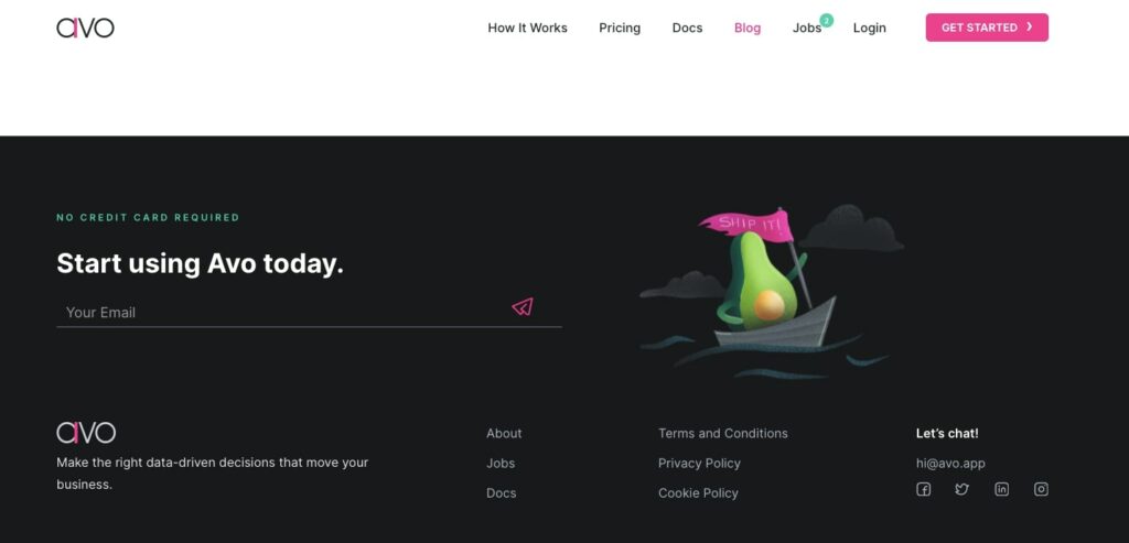
A Footer with a Company Logo and Social Icons
However, it’s essential to strike a balance. Too many visuals can make the footer look cluttered. Do not cross the fine line between visually appealing and visually cluttered. Find out beautiful pre-made footers here.
Contact Information
Your audience should have clear access to your contact information. Including details like your phone number and physical address not only facilitates communication for your visitors but also helps Google pinpoint your location based on your area code. This, in turn, can enhance your ranking for local customers.
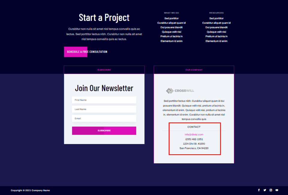
A Footer with Contact Information
Furthermore, I’d recommend making every link clickable so that your visitors can easily call you or fill out a contact form with a single click. it’s often more effective to add contact forms with fewer fields rather than providing an email address for queries. This enables your audience to submit their queries directly through your website. It’s also a great way to provide more CTA’s and branding messages.
4. Sense of Hierarchy
In terms of hierarchy, first comes the general placement of your Divi footer on the webpage. Your footer must fall at the bottom of the page. Every website typically follows the sequence of header, body, and footer. The footer signals the end of the page, showcasing the overall site hierarchy.
Then, within the Divi footer container, there’s also a distinct hierarchy. The most important elements like contact information, and social links should appear prominently. Meanwhile, standard information, like copyright notices, is typically presented in smaller text at the footer’s base.
Organize with purpose: A captivating way of organizing your Divi footer is by grouping your information in separate columns. By grouping related links within their respective columns, you can create a tidier and more sophisticated look. In the example of Grace Eleyae, the footer is thoughtfully divided into five columns: Customer Care, Inside Grace Eleyae, My Account, Top Searches, and a sign-up box.
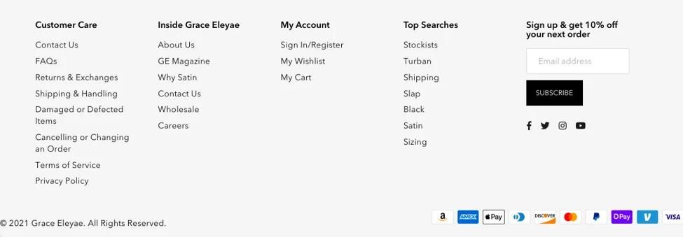
The Extensive List of Links Grouped in Categories in the Footer
Additionally, stick to clean elements, keep plenty of space, and consider incorporating a sub-footer. A Sub-footer comes in handy if you have a footer too dense with tons of information. A sub-footer is beneficial when your footer is densely packed with information. Distributing content between the footer and sub-footer creates a clearer hierarchy and adds dimension.
Check Out 80+ awesome premade Divi footer layout pack.
5. Check All Screen Sizes
Divi is highly responsive across various devices, such as desktops, tablets, and mobile phones. However, if your Divi footer is wide, containing multiple pieces of information, viewing it can translate into lots of scrolling and frustration for mobile users.
Therefore, when creating your footer, make sure it is responsive on all the devices. Try to include only the most necessary links, ensuring your footer remains user-friendly regardless of the device. If possible, test your footer’s responsiveness on as many devices as you can.
Ensuring Your Divi Site Looks Great on All Devices
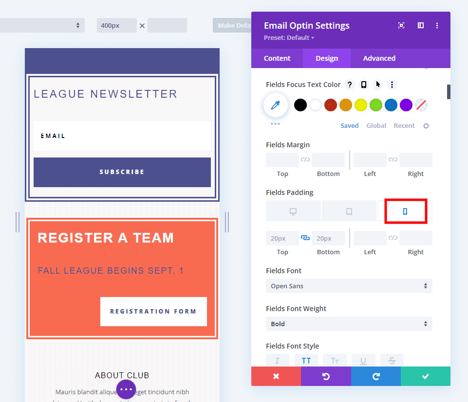
With the Divi Builder, you can tailor your Divi Footer size according to the device type. Simply select the device icon to independently adjust the desktop, tablet, and phone versions of the website. Within the theme builder, you have the flexibility to modify padding, font sizes, icon sizes, and more, for each device type.
Similarly, if you’re including a map link in your footer, consider transforming that link into a big fingertip-size button for mobile users. This way, upon tapping, the map app will launch seamlessly on their phone or tablet.
6. Don’t Underestimate the SEO Possibilities
Although search engines typically prioritize headers and the main body of a website, footers can also play a role in enhancing search engine optimization. The footer is an excellent spot to include your mission statement or vision as an opportunity to include your primary keyphrase.
Protip: Do not overdo SEO practices. Stuffing keywords and links can lead to black hat practices.
Conclusion
The footer is the last thing your visitor sees on your website, and also the last chance they seek to take action. So, as I’m winding up my 6 tips to create a user-friendly Divi footer, I want to remind you: don’t miss out on the opportunity of giving your audience a CTA while they are still on your website. Make sure to include your contact details so the user knows who you are, and how to get in touch with you.
Moreover, approach for a simpler design that incorporates the right mix of information, design elements, and functionality to make the most out of the Divi footer on your website.
Now, that you’ve reached the bottom of this page, feel free to examine the Divi Cake footer and let us know what you think, or if you have any feedback about our footer.😉


0 Comments