One thing I’ve noticed about websites built with Divi is the menu, even if it’s styled, tends to remain looking like the stock menu. There’s nothing wrong with this (Divi does have a nice menu), but Divi is a powerful platform and practically any type of design is possible. This includes creating amazing menu designs. In this article, we’ll look at 10 amazing Divi menu styles to help spark your imagination.
1. Skyfox Design
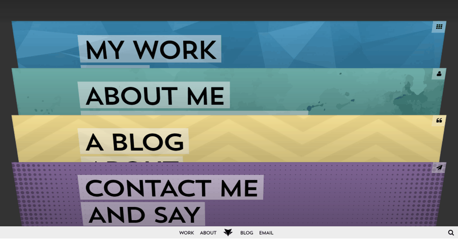
This menu is built with cards. Hover over a card and it rises slightly. Click on a card and it tilts forward until it becomes the page on the screen. A hamburger menu icon takes the place of the icon in the upper right of the card. Clicking the hamburger menu takes you back to the main screen. The location you were on the page becomes the card. A navigation menu is also found at the bottom of every page.
2. Palo Pictures
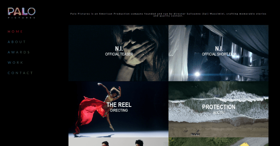
This site has a vertical menu that remains in place on the screen when you scroll. The link for the current page has a red gradient while the rest have a blue to green gradient. Both darken on hover. The font choice, spacing, and colors look great against the black background.
3. Solvid

This website builds a services navigation menu into the hero section using buttons. The buttons include icons and text. They shift and display a shadow on hover. The same navigation is added to the main menu as a mega menu. Each service is shown in the mega menu as a box with a gradient and a box shadow that disappears on hover.
4. Bjerkeng
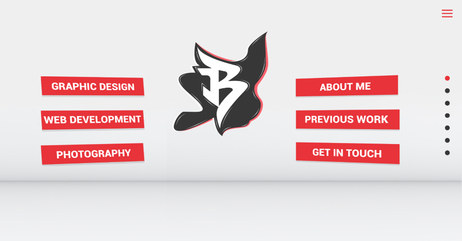
This site places the menu as the prominent feature of the hero section. Each menu item is a separate button that zooms on hover. The buttons include large white text within a bold red box and a box shadow on the bottom. What I find the most intriguing is that they’re tilted, pointing to the logo in the center. The navigation is also placed within the hamburger menu using ultra-large text. Even the dot-navigation is larger than normal and fits perfectly within the site’s design.
5. iAmChrisMunoz
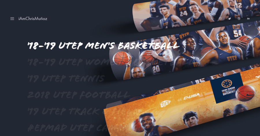
This one uses a menu as the landing page. The links to the various pages are large text that looks hand-written. Hovering over the text changes the text to white and reveals a new background image for that link. The images are posters for sporting events, except for the last image which includes a football, basketball, soccer ball, and a few other things in the background- all styled to match the site.
6. Hanging Theatres
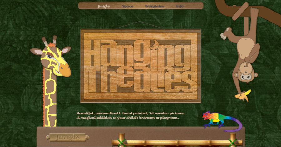
This menu is small and simple, but the styling sets it apart. A wooden board is placed in the top center of the screen. The menu items look as if they were etched into the board in a fancy font that matches the site’s branding and audience. Hovering over the text lightens it. The active page is even lighter. The menu remains in place on-scroll.
7. Global Children School

This one is more similar to a standard menu but it includes some interesting styling. Each menu item is separated by a line. All of the colors match the site’s branding. The active and hover items are orange. The background changes to green on hover. Contact info is placed above the menu. The menu moves with the page and then sticks to the top of the screen on-scroll.
8. Ane Riel
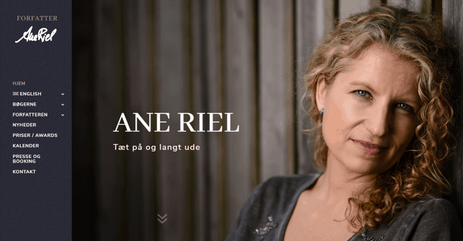
This site makes good use of the vertical menu. The menu remains in place on-scroll and it has a nice background texture. All of the dropdown items appear outside the menu and include a slightly transparent background in the same color as the main menu. A styled vertical line that matches the tan of the active page separates the menu from the submenu.
9. Olivet College

This site uses several menus for navigation. The main menu shows icons along with the text. Hovering over the text opens a mega menu with four columns of text for links and two images for specific pages. Under this are four boxes with backgrounds and overlays. Hovering over them opens a mega menu with tabs. Each tab includes text links and images over a background image with a white overlay.
10. Pearls Seafood Market
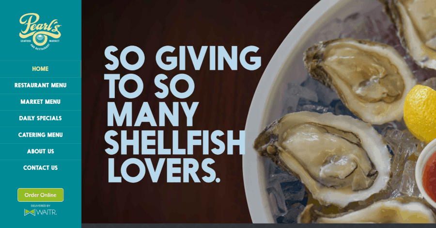
This site uses a vertical menu that remains in place. As you scroll, the text expands the line-spacing and increases in weight just enough to draw attention and stand out. The menu items are placed over a blue background and they’re separated by a line. This blue is used throughout the site. The menu also includes an embedded online ordering system.
Ending Thoughts
That’s our look at 10 amazing Divi menu styles to help spark your imagination. Divi has a lot of options for creating menus including locations, hamburger icons to open or close the menu, etc., and you can even build them using Divi modules. No matter what type of Divi menu you want to build, there’s sure to be something on this list to inspire you.
Which of these Divi menu styles are your favorites? Let us know in the comments below.


All styles are great. I like Olivet College. This site uses several menus for navigation. The main menu shows icons along with the text. A mega menu with four columns of text for links and two images for specific pages appears when you hover over the text.