Viewing your website in different screen sizes and resolutions is crucial. Visitors use desktops, tablets, and smartphones to view the website, so it needs to look great on all devices. The latest Divi update (Divi 4.7.0) adds a new preview feature, called Divi Responsive Views, to make that task much easier. In this article, we’ll take a look at Divi Responsive Views, see what it can do, and see why you need it.
But wait, isn’t Divi already responsive?
Divi is responsive, meaning that it resizes and adjusts the content to fit different screen sizes, but it isn’t enough to automatically allow it to adjust the content to fit the screen. You want the content to adjust correctly, so words don’t wrap to the next line, photos don’t stack incorrectly, etc.
This requires small adjustments to your designs, which is why it’s important to view your Divi website on different types of screens. Seeing your website in different screen sizes and shapes allows you to make adjustments so your website will always look great, no matter what screen your visitors are using.
Fortunately, Divi did already have a preview feature to see the site in desktop, tablet, and phone modes. It was helpful, but it wasn’t ideal. Looking at the preview feature that we had until this latest update will show us why this update was needed. Let’s take a look.
Original Preview Features
Originally, the preview would display the website as a desktop, tablet, or mobile phone. The resolution isn’t specified on the screen. You could select between the three different screen options in the bottom left corner of the screen by clicking the icon of the device you want to see.
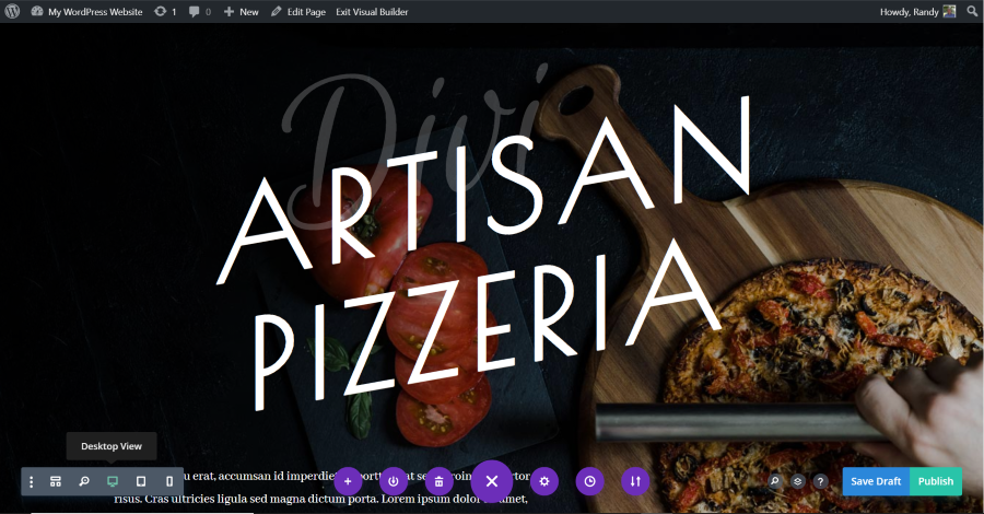
Here’s the Desktop View. This is the default view and it doesn’t change with this update, but it’s a good idea to see how it works so you’ll know what all of those buttons are. This view displays as your desktop, which might be a different size from your visitors. In my case, it’s a 15” screen with a resolution of 1920 x 1080.
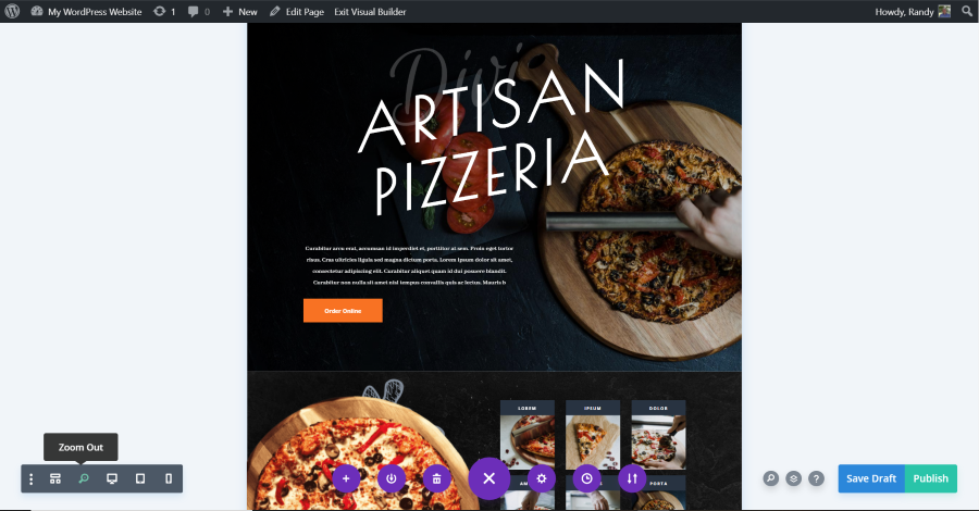
The Zoom feature allows you to see more of the desktop view. It doesn’t provide any information about the screen size, the content that will show above the fold, etc.
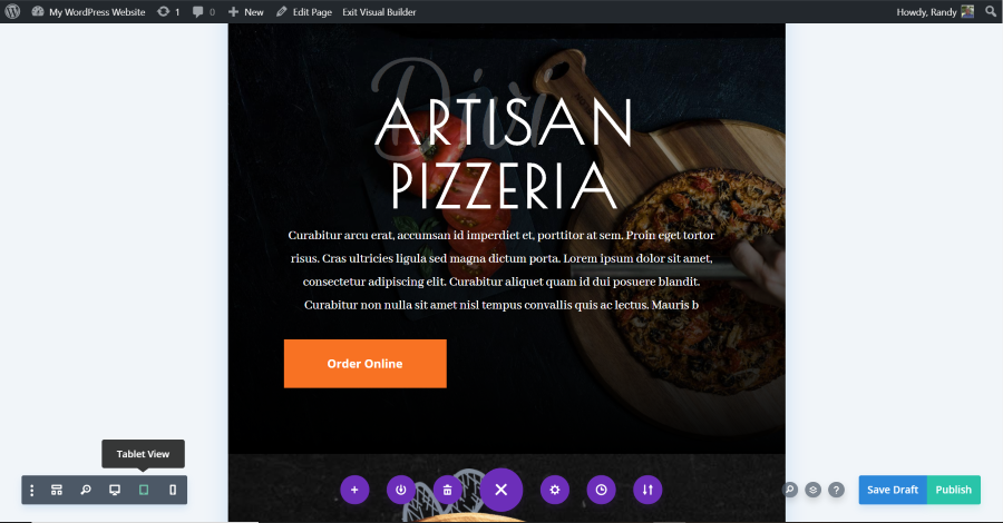
This is the Tablet View. It’s the size of a common tablet in portrait mode, but it doesn’t show a specific tablet or screen size. It doesn’t show in landscape mode and you can’t change the size (at least without using code).
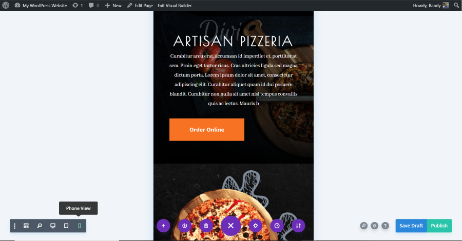
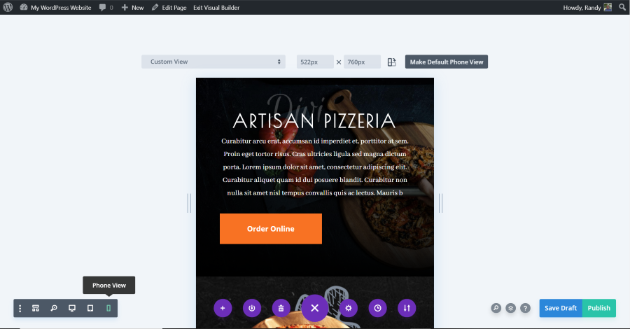
Here’s the Phone View. It shows how the website would look in portrait mode on a common smartphone. Like the tablet view, it doesn’t show the resolution, screen measurements, allow for a screen rotation, etc.
More Viewing Options with Google Chrome Tools
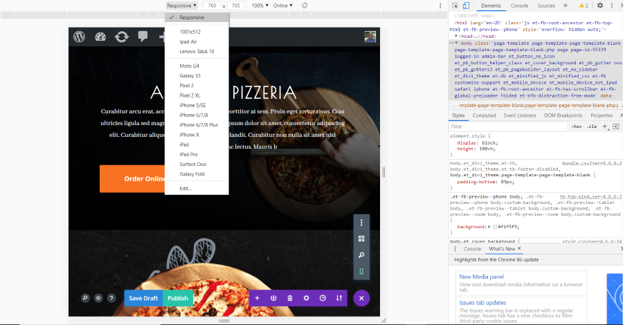
Google Chrome Tools helps by providing even more viewing options. To view Chrome Tools, hold Ctrl-Shift-J (or hit the F12 button) in Windows, and Ctrl-Option-J on Mac.
You can view the website as responsive, choose a specific device, edit devices, enter a custom screen size, drag the screen width and height, zoom to a specific level, and see the website in portrait and landscape mode. The example above shows my website in responsive mode at 760px wide.
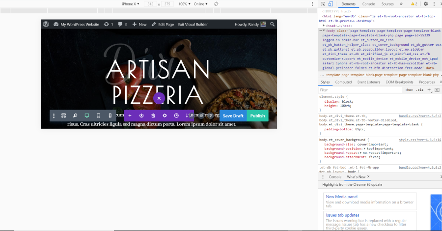
This example shows an iPhone x in landscape mode. This is a lot more useful for seeing different screens, but it’s outside of Divi. By selecting Chrome Tools, your Divi editor now fits inside the smaller screen. This is helpful, but it’s still not ideal.
The new Divi responsive tools combine the Divi views and the views from Google Chrome Tools to create an even better viewing environment.
Divi’s New Responsive Views
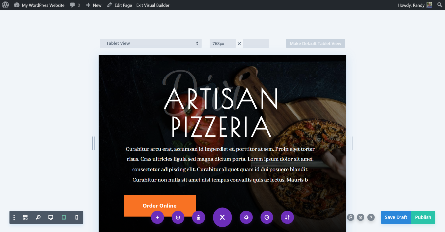
With the latest Divi update, the desktop and its zoom feature remain the same, but there are now new settings for the tablet and phone previews. It still has the standard Tablet and Phone views, but they have a lot more options.
Above the preview window are settings to choose specific devices, see the size and enter a custom size in pixels, and make the current size the default view. On the sides are anchors that you can grab to resize the device by dragging. This example shows the standard Tablet View.
Height Indicator
The height indicator is a line that identifies where the height of the screen ends for each device. This is the “fold” in newspaper lingo. It refers to the area of the screen that displays before scrolling. This allows you to see what elements will appear above the fold on each of the devices you choose so you can plan your design. Hovering over the line shows the pixel height.
Viewing Different Devices
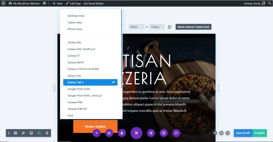
Clicking the dropdown box for the views shows specific devices that you can choose. This makes the screen the size of that device and shows the size in the fields. By default, it shows the size as width x height in portrait mode. My example shows the website as it would look on a Galaxy Tab S in portrait mode. You can’t add new devices but you can create a custom view.
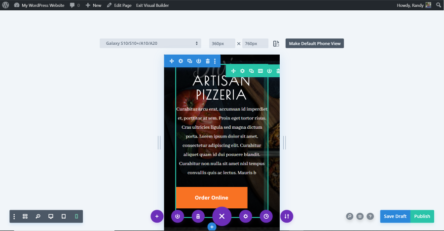
Selecting a different device automatically changes the icon in the lower-left corner to show if you’re viewing a tablet or a phone. This example shows the website as it would look on a GalaxyS10, S10+, A10, and A20 in portrait mode.
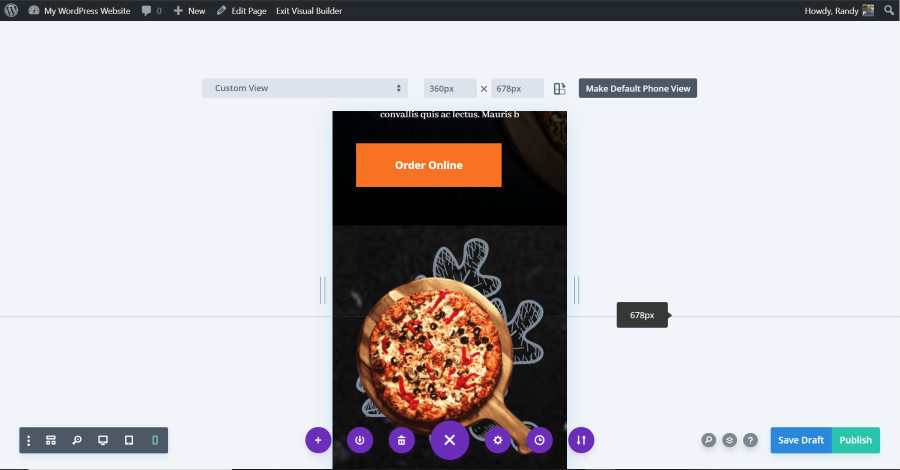
Viewing a Custom Size
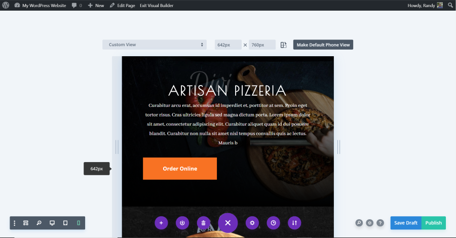
To view the website in a custom size, simply grab the edge of the viewing area (the draggable anchors) and drag it to the size you want. It shows the number of pixels in the fields above the window and on the anchor when you hover over it. This example shows the pixel width as a small popup as I’m hovering over the left anchor.
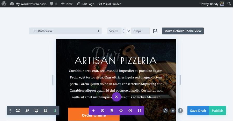
Alternatively, you can enter the number of pixels you want to see in the fields. You can also fine-tune the adjustments by clicking the arrows that appear in the fields when you hover over them.
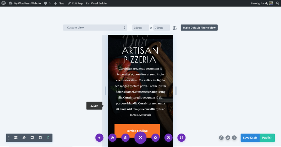
This is the smallest width. It’s 320px wide.
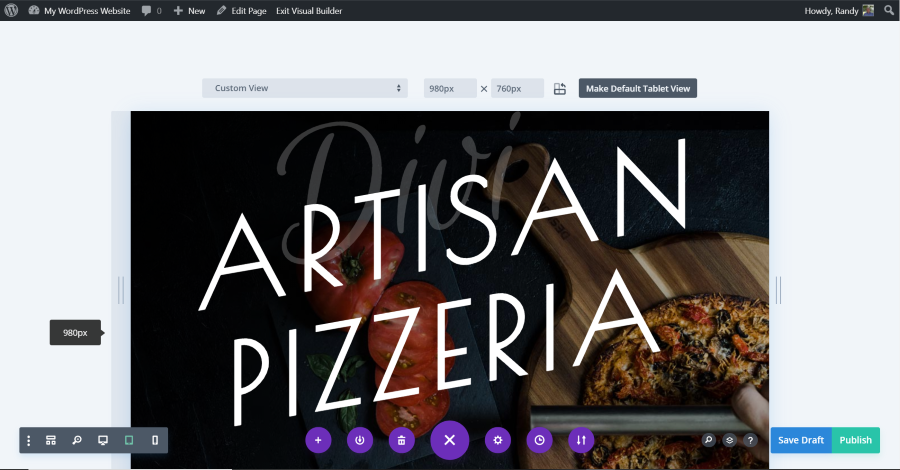
This example is 980px wide. This is the responsive breakpoint when it changes to the desktop design.
Viewing in Landscape Mode
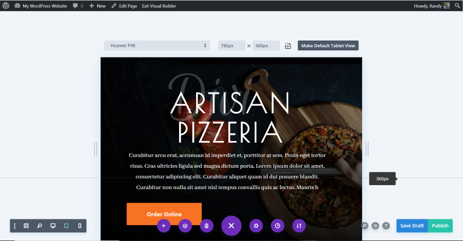
Click the icon to the right of the width and height fields to preview the website in portrait or landscape mode. The icon shows the device in both positions, but the mode that is currently viewed is darker. This example shows the icon and device in landscape mode. This example shows that the breakpoint for this device is 360px.
Making a Default View
You can make any size the default tablet or phone view. For a standard size, choose a device from the dropdown box to choose a default device. For a custom size, select the icon in the lower-left corner for the type of device you want to create a default view for. To create the custom size, drag the sides, or enter the numbers in the fields.
Click the Make Default button in the upper right corner above the website preview. Now, when you select to see the tablet or phone view, your custom size will be the one that shows. You can select another size, create a custom size, and create a new default view at any time.
Ending Thoughts
This Divi update is simple but important for designers to see their websites on various devices. You can see the website as responsive, with presets for specific devices, custom sizes, see the site above the fold, and see it in portrait and landscape modes. You can also drag to resize and create your own default sizes for both tablets and phones. Changing between the views is easy and it’s noticeably faster now.
I always recommend testing the site on real devices before publishing, but this update saves a lot of design and troubleshooting time since we no longer have to use other devices to see how the website will look during the design process.
For more information about all of the Divi updates for 2020 so far, see the articles:
- A Look at the New Divi Sticky Options
- Divi Presets Overview
- A Look at the Divi Animation Builder
- A Look at the New Divi Layers View
We want to hear from you. What do you think about Divi responsive views? Let us know in the comments.


0 Comments