Divi has lots of settings. Once you get used to them they tend to be intuitive. The problem is knowing where to start. In this article, we’ll look at the Content tab of the sections, rows, and modules to help you get started.
Where are the Settings?
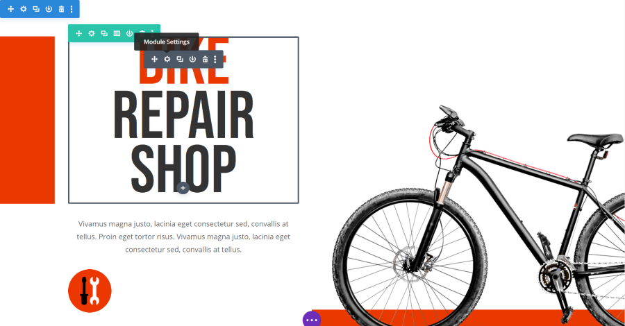
You can find the settings for sections, rows, and modules by hovering over the element in the Visual Builder and clicking on the gear in the toolbar that pops up. Regular sections are in blue, specialty sections are in orange, full-width sections are in purple, rows are in green, and modules are in dark gray.
The Content tab is the first tab within the popup. You’ll also see Design and Advanced. Each section, row, and module will have unique settings, but they’ll also have many of the same settings.
The wireframe view automatically displays the toolbar.
Content Settings for Sections
The section settings include Link, Background, and Admin Label.
Link
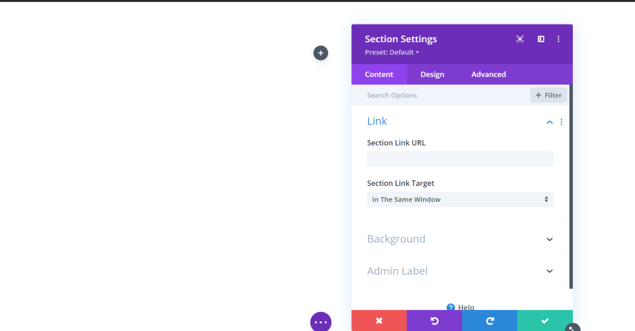
The link allows you to redirect the user to another page when they click on that element. You can set it to open in the same window or a new window.
Background
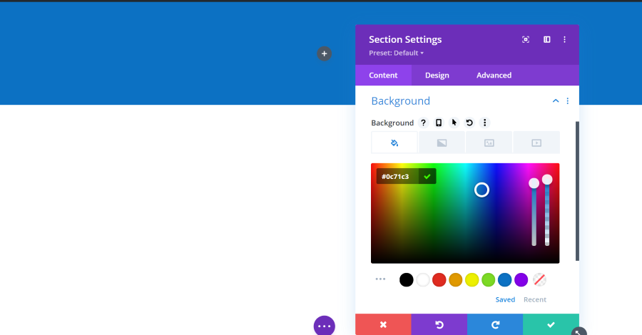
Background allows you to add color, gradient, image, or video. You can use some of them together. The color picker lets you choose the color, enter the hex code if you want, and adjust the darkness and opacity with sliders. This shows a blue background at the default size which doesn’t cover the entire screen. This is adjusted in the Design tab, but there is an easy way to adjust it from the visual editor.
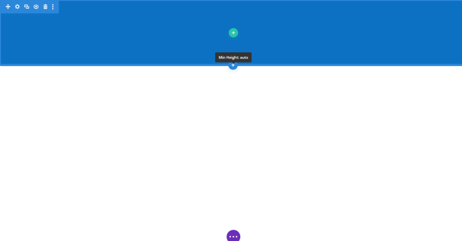
Hover over the element to see its border. It will show the minimum height.
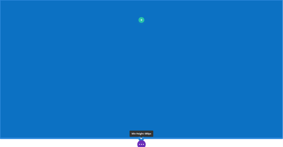
Grab the edge of the border and drag it to the size you want. My height is now set to 680px.
Background Gradient
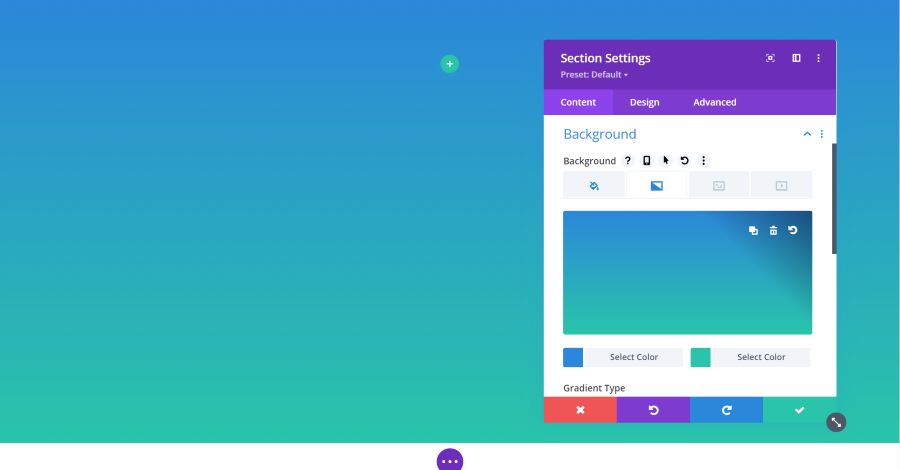
A gradient is a blend of two colors that allows the background color to gradually change from one color to the other. Gradients work the same as color, but it includes two color pickers.
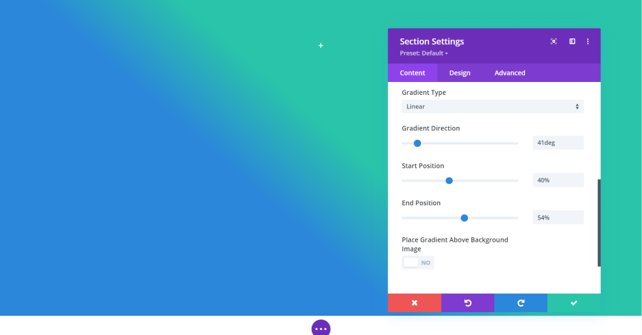
You can also choose the type (linear or radial), direction, start position, end position, and place the gradient above the background image. This gives you a lot of control over the design of the gradient.
Background Image
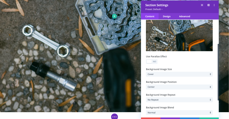
Image includes settings for parallax, which allows the image to stay in place as you scroll or to scroll at a different rate than the rest of the page. You can also choose the image size, position, repeat, and image blend. Image blend adds color to the image.
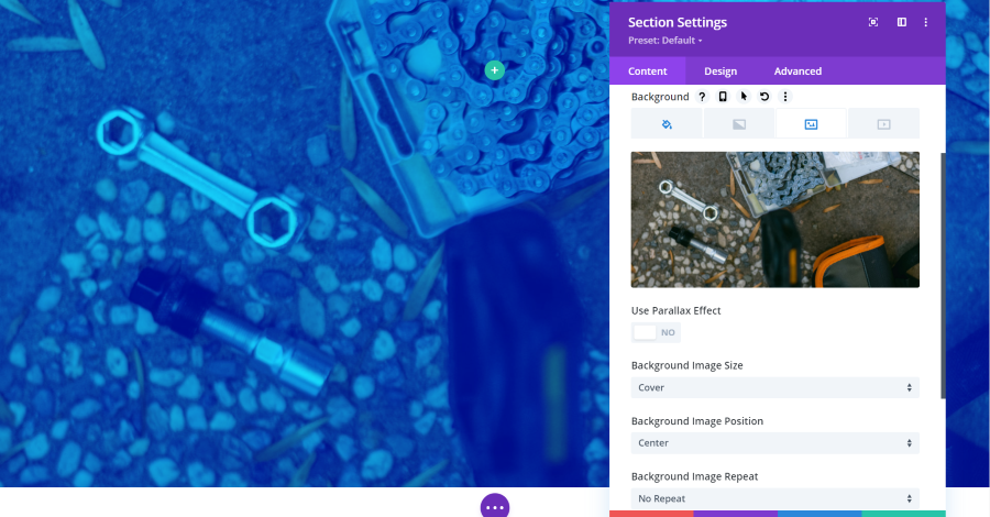
If you select Overlay for the Background Image Blend, it will show either the background color or gradient over the image. This is the blue background color as an overlay.
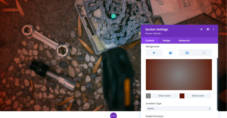
Here’s the overlay as a gradient. I’ve set this one to Radial and selected gray and dark red for the two colors.
Background Video
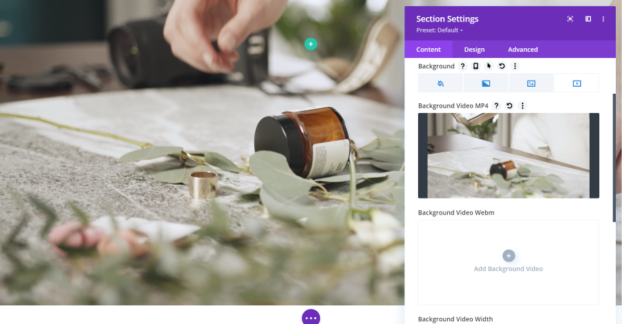
Video plays a video on a constant loop. You can upload an MP4 or Webm.
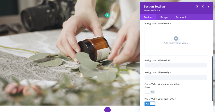
You can adjust the width and height and have the video to pause when another video plays and choose whether or not the video continues to play when it’s not in view.
Admin Label
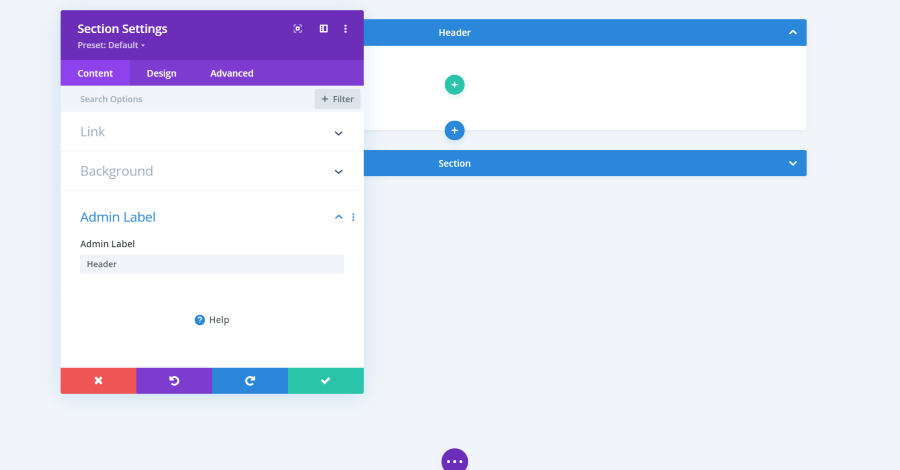
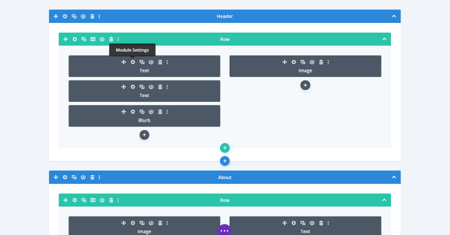
Admin Label lets you name the section, row, or module. The name you enter in the field will display in the builder for that element. In this example, I’ve named the section Header. I’ve collapsed the second section by clicking the arrow on the right of the section.
Content Settings for Rows
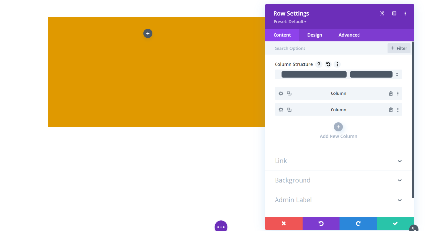
The Content tab for rows includes settings for the column structure, columns, link, background, and admin label. Rows are one of the elements that have other modules within them. This example shows a row with two columns. Each of the columns is a submodule that can be adjusted separately. All of the adjustments work the same.
In these examples, I’ve added a background color to the row so it will stand out from the background and dragged the height to make the row taller.
Column Structure
The column structure dropdown includes 20 structures to choose from. The one that’s selected is darkened in.
Columns
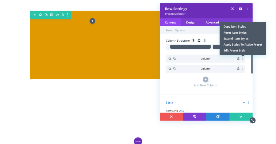
You can open the columns, clone them, delete them, right-click and see a styles menu, and drag and drop them in a different location.
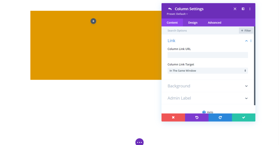
Columns include the same settings as sections.
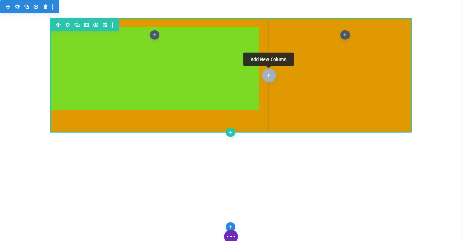
You can also add a new column by selecting the icon in the Visual Editor within the row. I’ve added a background color to the left column so it stands out from the row.
Content Settings for Divi Modules
Each of the modules includes settings that are unique to them, several that are common among many other modules, and the main settings found in sections and rows. We’ll look at some of the most popular and widely used modules.
Blurb Module Content Settings
The blurb module includes settings for text, image and icon, link, background, and admin label.
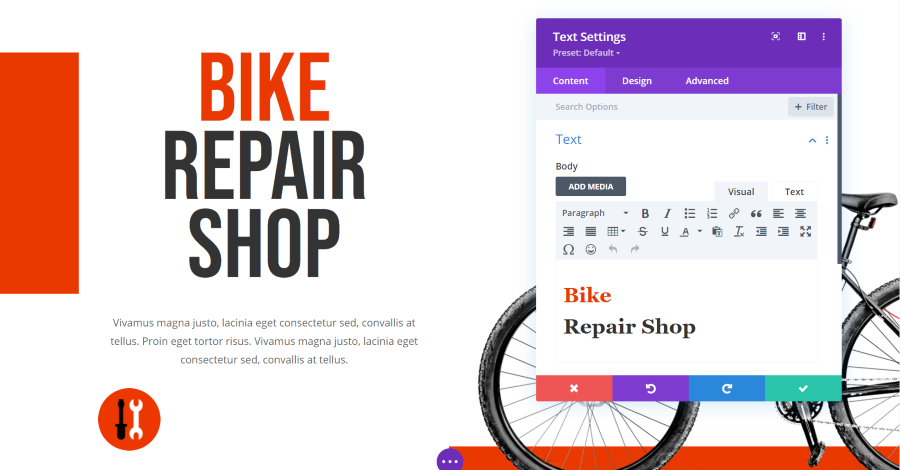
Blurb Module Text Settings
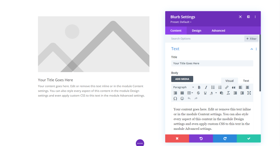
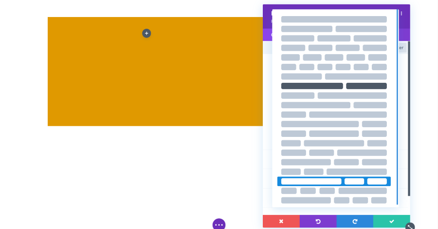
The text settings include a title and an editor for the body content. The body is a standard classic editor complete with visual and text tabs and you can add media.
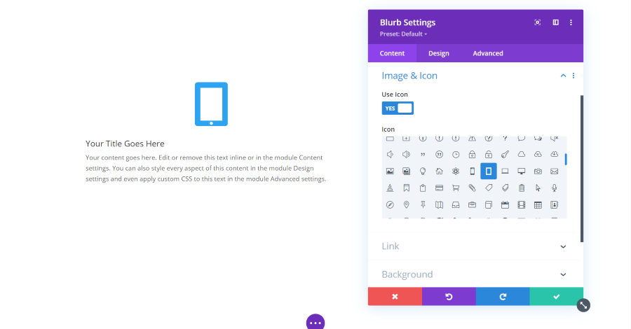
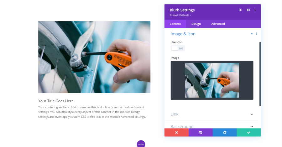
Blurb Module Image and Icon Settings
Image and icon settings allow you to choose between displaying an image or an icon. Selecting the icon option opens a list of icons that you can use.
Image lets you choose an image from your library.
Blog Module Content Settings
The blog module includes settings for the content and elements. It also includes link, background, and admin label settings.
Blog Module Content Settings
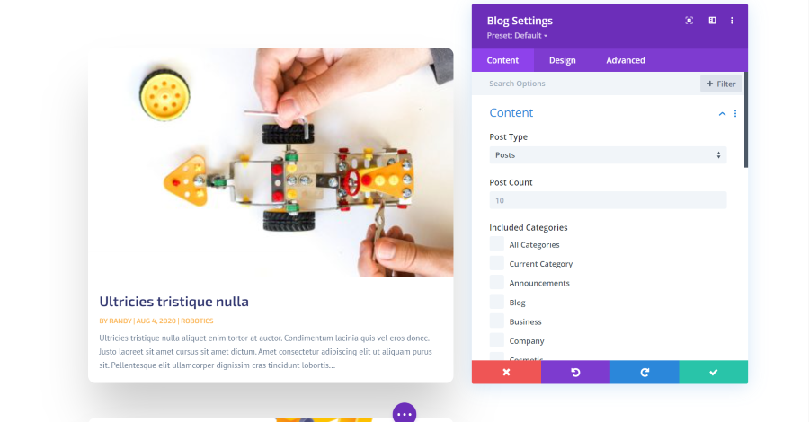
The content settings let you choose the post type, post count, categories, date format, content length, excerpts and length, and the post offset number. The post type can be posts, pages, media, projects, or other post types that you have installed. The post count limits the number of posts that the module displays at a time.
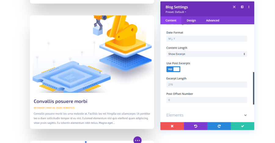
The date format determines how the date is displayed for the posts. For the content length, you can show a portion or all of the content. If you show an excerpt of the content, you have control over the number of characters it will display.
The post offset is one of the most useful features. It determines the number of posts it ignores beginning with the most recent. This is useful if you’re already showing certain posts somewhere else on the page and you don’t want to show them twice. For example, if you have an offset of 1, it will start with the second most recent post. The latest post can be shown in another blog module or as a featured post.
Blog Module Elements Settings
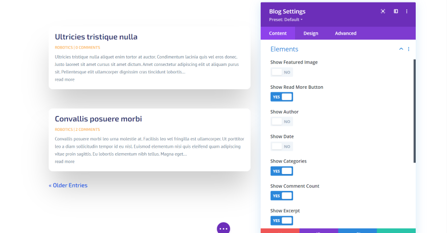
Elements allows you to choose which features display. This includes the featured image, a read more button, author’s name, date, categories, number of comments, excerpt, and pagination. The read more button is added to the bottom of the excerpt. Pagination is added to the bottom of the module. It provides navigation to the next or previous posts. In this example, I’ve disabled the featured image, author, and date. I’ve added a read more button and pagination.
Contact Form Module Content Settings
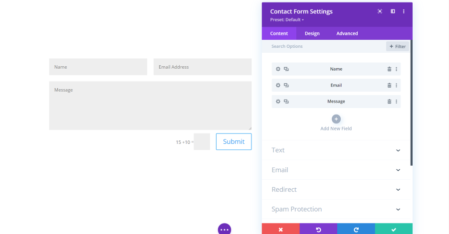
The contact form module includes submodules for the fields. You can add as many as you want, rearrange them, delete them, etc. It also includes settings for text, email, redirect, spam protection, link, background, and admin label.
Contact Form Module Text Settings
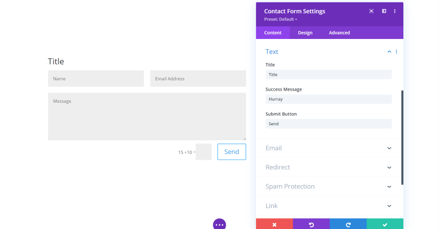
The text settings include a title, a success message that will show once the form is submitted, and the text for the submit button.
Contact Form Module Email Settings
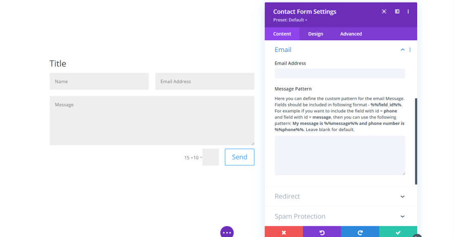
Email includes the address where the content of the form will be sent and the message pattern. This allows you to create a custom pattern so it will show you the content of the fields the way you want to see it.
Contact Form Module Redirect Settings
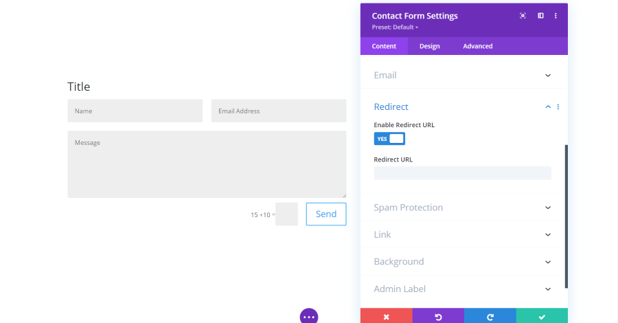
Redirect gives you the option to send the user to a different page once they submit the form. You can add the URL of where they’ll be redirected.
Contact Form Module Spam Protection Settings
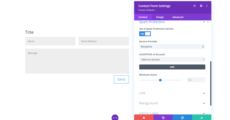
Spam protection allows you to use the built-in math equation (as seen in the previous sections), or add a protection service.
Email Optin Module Content Settings
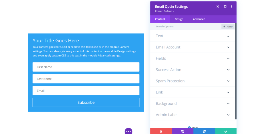
The email optin module includes settings for text, the email account to connect to, fields, success action, spam protection, link, background, and admin label.
Email Optin Module Text Settings
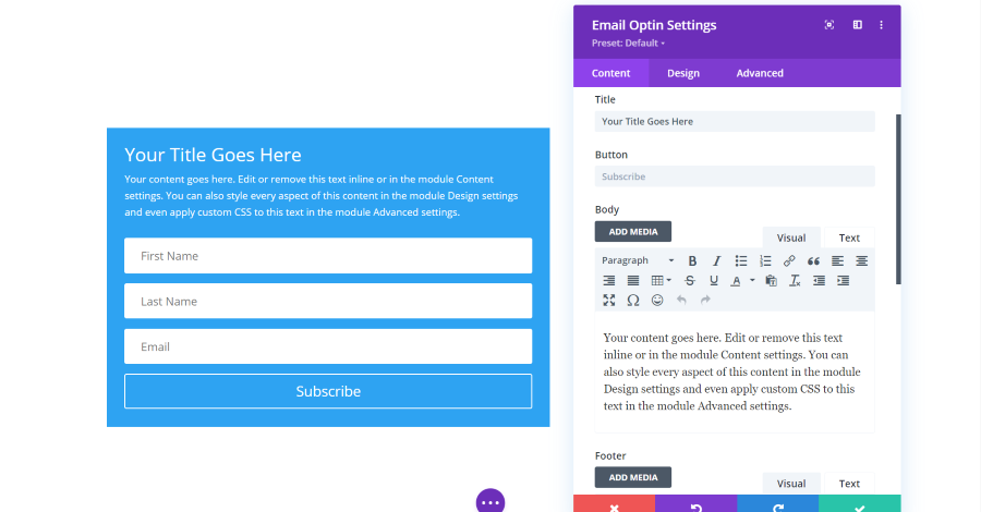
Text settings add title, button, body text, and footer text.
Email Optin Module Account Settings
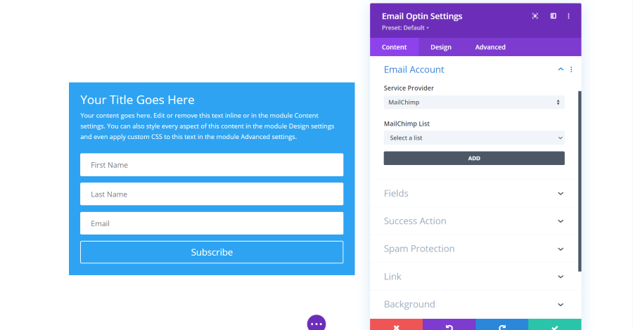
Account settings connect your form to your email newsletter provider.
Email Optin Module Fields Settings
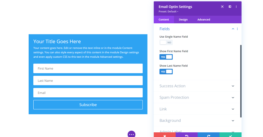
Fields allow you to choose which fields display. Choose a single name or first and last names.
Email Optin Module Success Action Settings
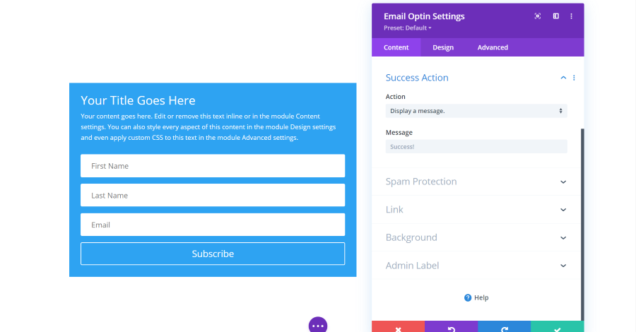
Success Action determines what happens after the user clicks the subscribe button. You can have it display a message or redirect them to a specific URL.
Ending Thoughts
That’s our look at the basic settings in the Content tab of Divi’s sections, rows, and modules. We only looked at a few of the module’s settings, but many of them are similar. Once you play around with a few of them, you’ll get a better idea of how to use all of them.
For more information about getting started with Divi, see the previous article in this series:
Getting Started with Divi: Using Divi Layouts
We want to hear from you. What are your favorite adjustments in Divi modules? Let us know in the comments.


0 Comments