The latest Divi update adds sticky options to any element in the Divi Builder. Divi Sticky Options allow you to stick any element to the top or bottom to the browser’s viewport (the boundaries of the screen). The element can work as normal within the layout, but when it touches the top, bottom, or an element such as a row, it reacts according to the sticky options that you’ve set for it. In this article, we’ll take a look at Divi Sticky Options, see what it can do, and see how easy it is to use.
Sticky Options User Interface
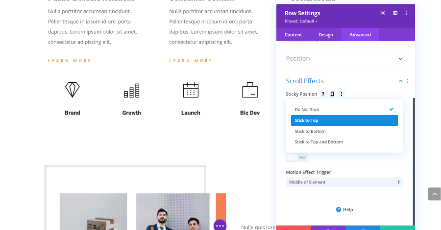
A new option is added to the Scroll Effects in the Advanced tab of every section, row, column, and module. The sticky options work in the standard builder and the theme builder. This gives you a lot of control over what can be sticky including modules for custom post types. The example above shows the sticky options for the row of icons used in my Divi layout.
Also, you’re not limited to just one element. You can make multiple elements in the layout sticky. Since the option is added to elements in the Divi Builder, only an element made with the Divi Builder can be sticky. Widgets in standard sidebars can’t be made sticky, but the sidebar module can be.
The sticky options include sticking to the top, bottom, or top and bottom. You can control the sticky feature based on the direction the user is scrolling. If a sticky element touches another sticky element, they’ll stick together in a stack.

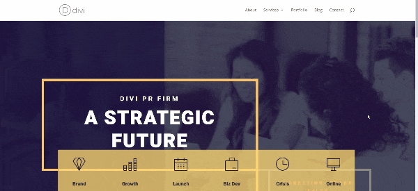
In this example, I’ve set the row to stick to the top. This is great for creating a menu. We can also style it so it works better with the rest of the layout. We’ll see this later.
Sticky Offset
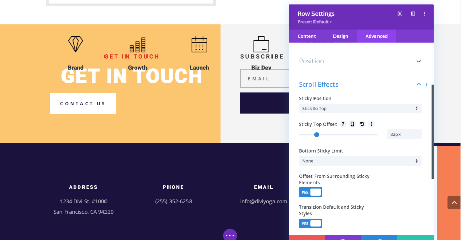
Sticky Offset lets you determine where the element sticks vertically on the page by adding an offset number of pixels. This means the element doesn’t have to stick to the actual top or bottom. You can have it float in a specific location. This example shows the top offset set to 82px, making the row of icons sit just under the top of the screen.
You can also set a bottom sticky offset. This example uses Stick to Top and Bottom and adds a bottom sticky limit of 75px. This gives you a lot of control of where it can display based on the direction the user is scrolling.
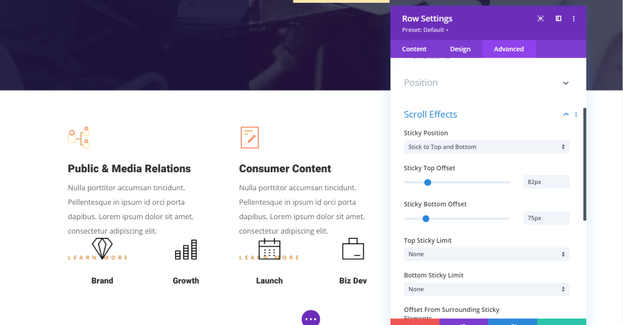
Sticky Limit
You can also set limits for when the elements are sticky. It gives you several options based on the element: None, Body, Section, Row, and Column.
None means the element will not be sticky if the user scrolls in the opposite direction.
Body is the entire website minus the header and footer made with the theme builder.
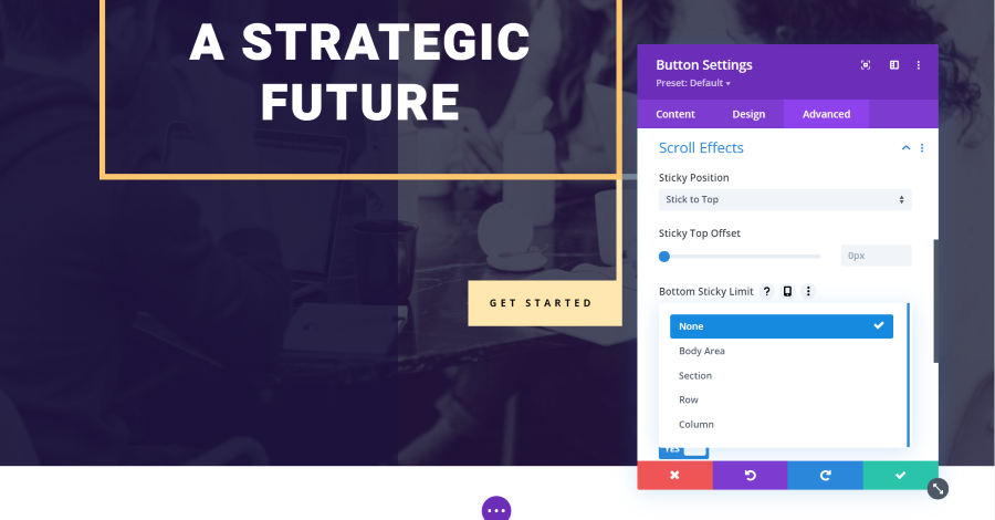
Section, Row, and Column limit the element to be sticky for that section, row, or column only. Once the user has scrolled past the area, the sticky element unsticks and scrolls away. This is a great way to provide a CTA, button, image, menu, etc. that only applies to a certain section.
Offset From Surrounding Sticky Elements
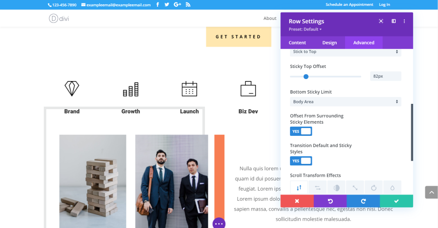
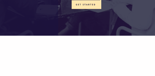
This allows it to offset from other sticky elements. In the example above, I’ve set the Get Started button to stick to the top. I’ve enabled the offset from surrounding sticky elements for the sticky row with the icons. Now, when I scroll far enough that the row touches the pixel limit for the offset, it offsets from the button rather than the menu. This keeps them from overlapping.
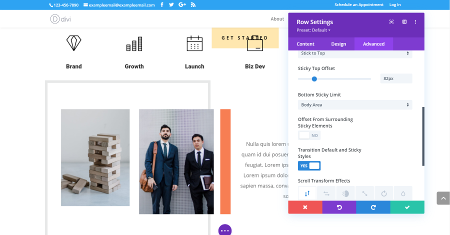
With the feature disabled, the second element ignores the first element and uses the menu as its offset. This causes the two elements to overlap. Having them overlap could create some interesting visual effects, so it makes sense that it’s an option. The feature is enabled by default.
Transition Default and Sticky Styles

You can have a different default style for sticky elements. The element will have the style you set for it, but then when you make the element sticky it will take on the sticky style. This featured is enabled by default and adds a new option to many of the style settings. The sticky styles are identified by a pin icon. Clicking this icon lets you select the styles that this element will display if it’s set as sticky. It opens a set of tabs that includes the desktop view and the sticky view. You’ll also need to select the pin tab within these styling options or you’ll adjust the desktop options.
At first, having to select the pin twice does seem like an extra step that isn’t needed but this allows you to set a style for before and after the element is sticky. This gives you a lot more styling options for the ‘before’ state of the elements.
Divi Sticky Options Examples
Here’s the example of the sticky options in motion. I’ve set the button to be sticky when it touches the top. I’ve set the row of icons to be sticky from the start. This row sticks to the bottom. I’ve also set the row to have different styling for when it’s sticky.
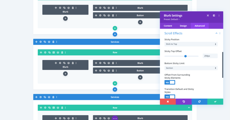
For the next example, I moved the blurbs around to create two columns. The blurbs on the left have sticky options enabled. I’ve set them to stick to the top, have an offset of 250px, and set the bottom sticky limit to the row. The Offset From Surrounding Sticky Elements and Transition Default and Sticky Styles are enabled. I’ve also added padding to the rows to create lots of space between them.
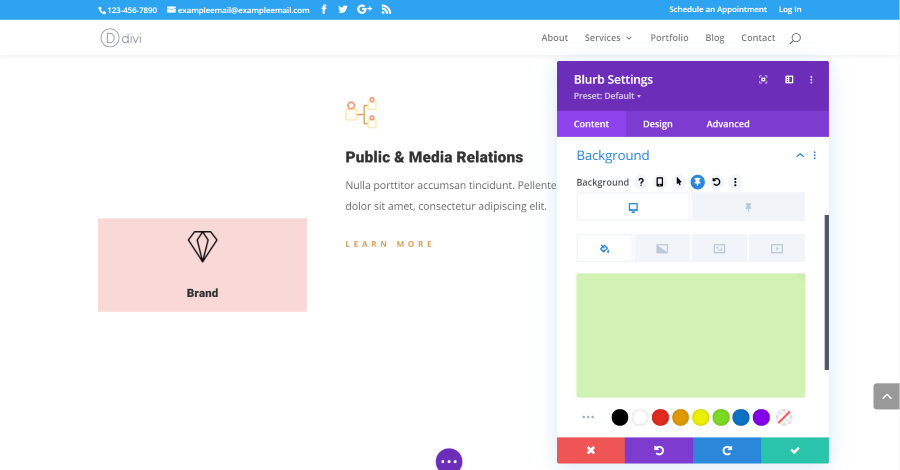
For the blurb’s background, I’ve set a different background color for the non-sticky and sticky state. I’ve adjusted each blurb independently. This example shows a green background for the blurb before it becomes sticky and shows the blurb in its sticky state, which has a red background.
The result shows the blurbs in the same row scrolling together until the blurb in the left column hits the sticky point. It then changes its background color and waits until the next row meets it. Once the next row arrives, the blurb continues scrolling.
Ending Thoughts
Divi Sticky Elements is a welcome addition to the Divi Builder. Having an element sticky seems like a small thing, but this update provides a lot of design possibilities for Divi layouts. They’re great for holding a call to action, such as an offer, signup form, ad, etc., in place to get more screen-time. I also like this for navigation, titles or descriptions for sections, visual designs for images, visual effects, etc.
The UI is easy to follow and use. I especially like that it’s added to sections, rows, columns, and modules. I’m looking forward to seeing the designs and creative ways to use Divi Sticky Options that the Divi community comes up with for their Divi websites, layouts, and child themes.
We want to hear from you. How do you plan to use Divi Sticky Options? Let us know in the comments below.


It’s fantastic. This effect is amazing and different! Had made a sticky side bar but due to a bug in DIVI my template was destroyed in a DIVI crash so now I am trying to re-establish my sticky side bar.