It’s no secret that one of the lucrative ways of keeping your visitors engaged is through sliders – also known as carousels. But let’s be honest. Not many slider modules in the market cater to enough features and functionality needed to create captivating sliders with fast loading speeds and responsive design.
If you’re familiar with Divi Themes, you know they work tirelessly to offer maximum functionality within their single product package. The Divi Slider Module is no different. The slider module is a built-in module in the Visual Builder, widely used to create interactive slideshows or carousels with rapid load time. You can place it anywhere on your webpage, allowing customized settings for each slide separately.
In this article, I’ll walk you through all the functionalities the Divi slider offers, so you know every possible feature within the Divi Slider Module to build interactive sliders.
Setting Up a Page to Launch Your Slider
To build the Divi slider module, you’ve to first install the Divi theme, a popular WordPress theme by Elegant Themes, on your WordPress website. You can follow these easy steps to install yours. Once you’ve downloaded and activated the Divi theme, adding sliders to your webpage is not a tough nut to crack.
To start building your slider from scratch, create a new page from your WordPress Dashboard. Add a title, then select the option Use Divi Builder. This action will take you to the front end of the page.
Before the page opens up, you need to select your preference from one of the three options: “Build From Scratch”, “Choose a Premade Layout”, and “Clone an Existing Page”, each with its own defined purpose.
For now, let’s go with the “Build From Scratch” option. This choice loads a blank page granting you freedom over the look and feel of your page.
Once the page is loaded, you’re ready to get to the next step.
Adding the Divi Slider Module
When the page is loaded, Divi automatically adds a section by default. To add a row, click on the green “+” icon. A dialog box will appear with various rows and column options. To delve deeper into the settings of sections, rows, and columns, check out here. For instance, I’ll select a single row. Now that the sections, rows, and columns are set up, click again on the “+” icon – this time appearing in grey. This will bring up the comprehensive Divi Module Library, showcasing every feature available within the Divi Theme.
Type “slider” in the top search bar to access the slider module. Here you’ll find four distinct slider options. “Post slider”, “Slider”, “Video Slider” and “DC Product Slider”. Alternatively, you can scroll through the module library to locate these options.
In this article, we’ll take an in-depth look at the setup of the simple Slider. So, click on the “Slider” option. By understanding this thoroughly, you can easily work with the rest of the sliders.
If you’re looking to compare before and after pictures in the same space, get Before After Slider for a smooth transition.
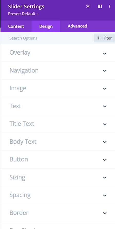
Slider Module Setting Options
Now that you’ve selected the Slider module, the Slider Settings will automatically appear on your page. Here, you’ll see three different tabs, each serving its purpose: Content, Design, and Advanced.
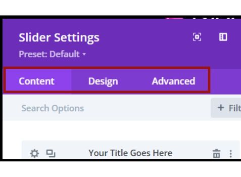
Divi Slider Settings Interface
All configurations in the Slider Settings are global. Any changes made here will be implemented on every slide in the Divi Slider module, allowing you to create engaging sections with less fatigue.
However, this doesn’t mean you can’t make changes to specific slides. The Divi Slider Module guarantees full control over each aspect of your slides, making it a feature-rich module. We’ll discuss how to customize individual slides later in this article.
For now, follow along to explore the settings in each tab.
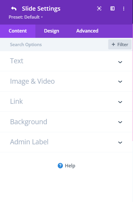
Content Settings
The Content settings encompass all the primary components of the Divi slider, including individual slides, links, navigation, background, and admin label. Let’s see how each option works and what it offers.
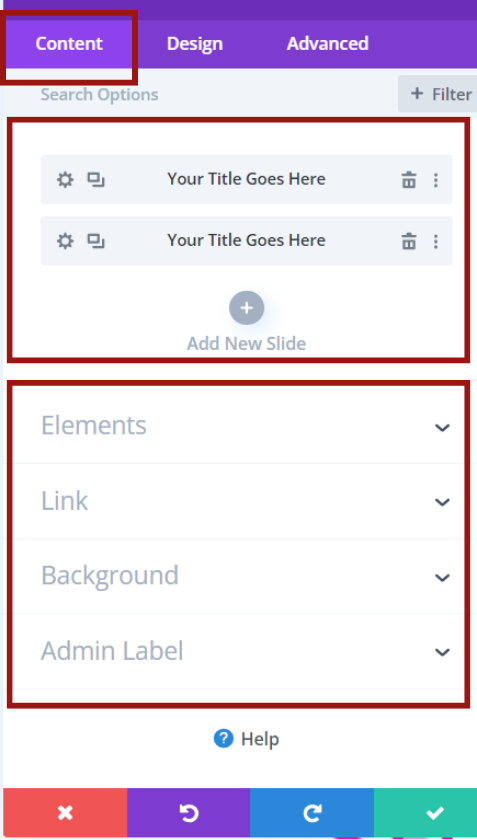
Divi Slider: Content Settings Breakdown
Managing Divi Slider: Adding & Deleting Slides
By default, The Divi slider comes with two slides and each slide has its distinct settings. To add more slides, you can either duplicate an existing slide or click on ‘Add New Slide’. Additionally, by clicking on the three dots on the far right of each slide bar, you can copy item styles, reset item styles, or even extend item styles to other elements.
If you want to delete any slides, including the pre-made ones, simply click the delete button next to the three dots.
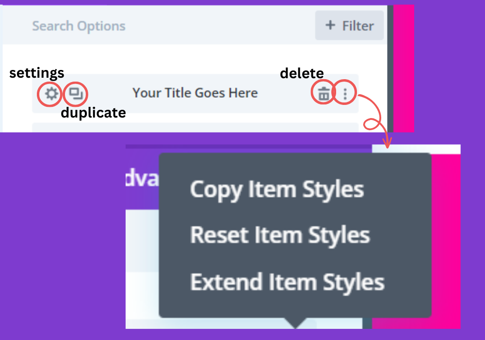
Navigating Divi Slider: Add, Duplicate, Remove
Once you select the settings, you’ll go into the configuration settings for the selected slide. Each slide has its own content and design options, so you get a fully customized experience. But before we dive into it, let’s discuss the global content settings.
Read More: Explore testimonial sliders to display your testimonials
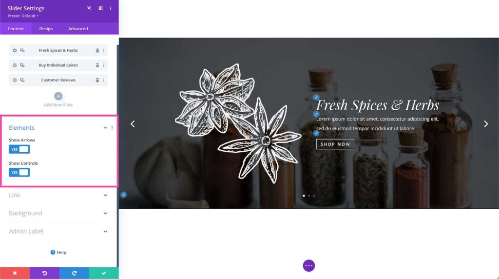
Elements
In the elements section, the Divi slider module gives you the option to manage the arrow and control elements of your slider.
- Show Arrow – Use this toggle to display or hide the navigational arrows on your slider.
- Show Controls – Toggle to show or hide the controls on your slider.
Arrow and Control Element in Divi Slider
Insert Link
If every slide in your slider modules shares the same link, you can simplify the process. Instead of adding a link to each slide separately, Divi lets you apply a global link to the entire module.
- Module Link URL – Place your URL for all the slides here. This action makes the entire module clickable.
- Module Link Target – Decide where the link will direct your visitors. Select “In a new tab” if you want the link to open in a new tab, or “In the same window” if you prefer your visitors to stay in the current window.
Adding Global Background to Your Slides
Using a consistent background for each slide improves user experience. It not only maintains the cohesiveness of the slides but also makes your website look more appealing and organized. That’s where Divi Slider’s global background serves the purpose. You can add a solid color, gradient, image, pattern, or even a video as the background. For a deeper understanding of how to set the content’s background, explore more about the content’s background settings.
Moreover, you can toggle the parallax effect, adjust the background position, choose the gradient type, and much more.
Global and Individual Design settings
Your homepage accounts for 50% of your website traffic. And guess what? It takes less than 1 second for visitors to make up their mind about your website. So approaching for a sleek and minimal design is always a win-win. Luckily, the Divi slider module provides you with deep control over the style settings, allowing you to tailor the module to your preferences.
Divi Slider’s Design Tab
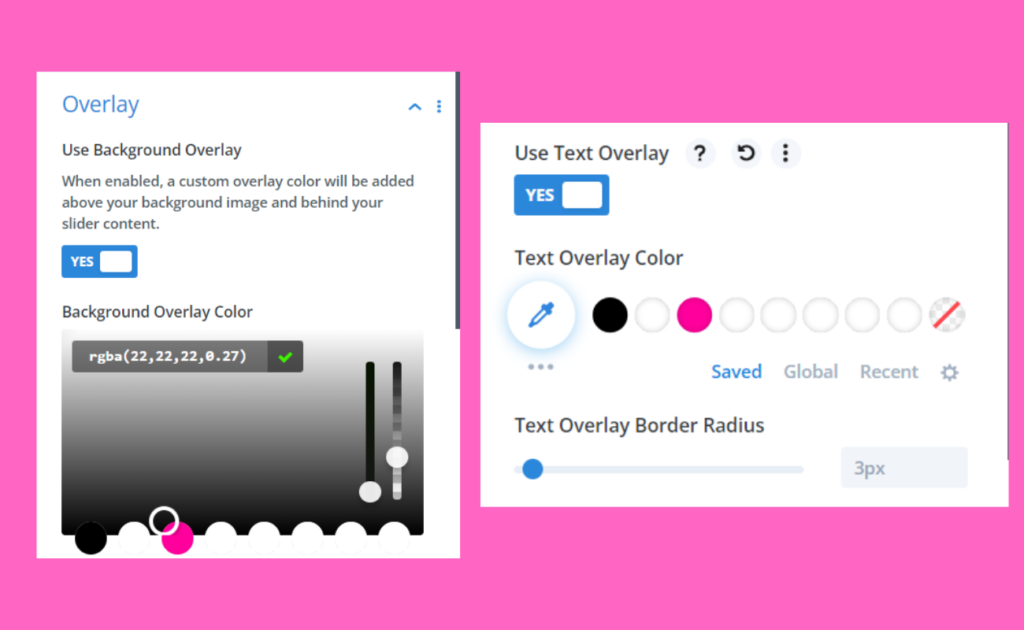
Overlay
Starting with the overlay, it lets you apply a global color to all slides, ensuring a uniform look and feel, especially when the color palette across slides varies significantly. If you’re a beginner, you can you can build simple overlays using the Divi Visual Builder. The Divi Slider Module provides two overlay options.
- Use Background Overlay – Toggle “yes” to enable the background overlay color, which adds a layer over the content’s background. Choose a color from the overlay palette or use the dropper icon. Additionally, adjust the transparency with the bar on the right for a more controlled look.
- Use Text Overlay – toggle “yes” for the text overlay color. This provides a background for your text content, such as headlines, descriptions, or CTAs. Using overlays ensures that the text remains visible against its background.
Overlay Settings: Text and Background Settings
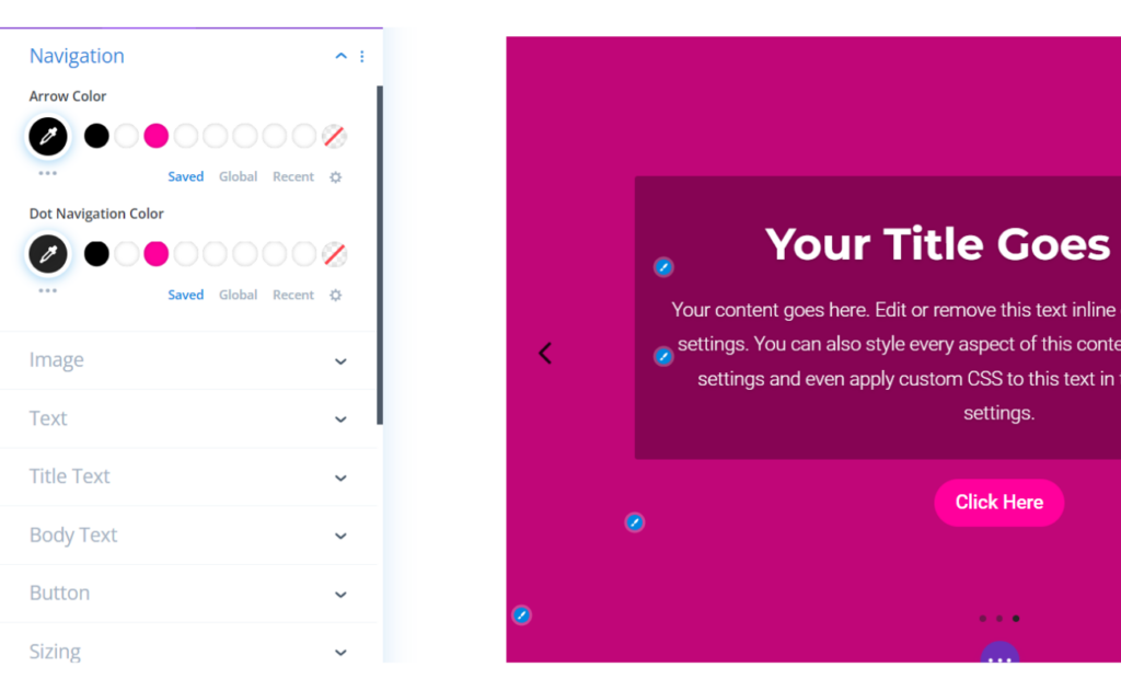
Setting Divi Slider Navigation Colors
Here, you can set the colors for the arrow and dot navigation that appear at the bottom of the slider — provided you’ve enabled the control elements. You can select a color from your site’s palette or use the eyedropper tool to pick your desired color.
Color Options for Divi’s Arrow and Dot Navigation
Read More: Learn how to pick the right color for your website
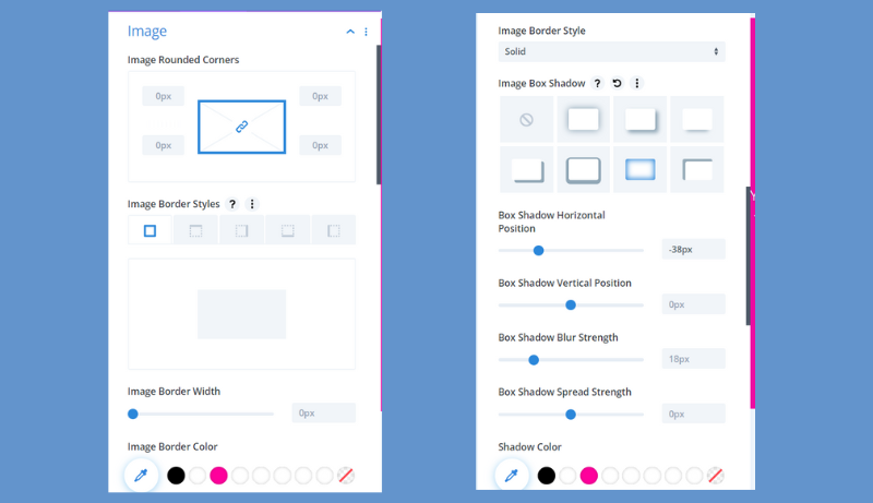
Image
If your background is an image, you can adjust all image styling aspects in this section.
- Image Rounded Corners – This option allows you to have rounded corners of the image for more softer and modern aesthetics. Enter a numerical value in the provided box to adjust the corner rounding. By default, all four boxes are linked, meaning that a change to one will affect all. However, if you wish to assign distinct values to each corner, simply click the blue chain link icon to unlink the values.
- Image Border Styles – From here, you can add a border to your image. Whether you want a border on all four sides or just specific sides, the Divi slider module allows you to customize image border slides as you wish.
- Image Border Width – Here, you decide the thickness of your border. A larger number results in a thicker border
- Image Border Color – While adjusting other border settings, you can also choose the color. Select a border color that aligns with your site’s aesthetics, and you’re good to go.
- Image Box Shadow – Divi themes offer several shadow styles to choose from. Select a shadow style from the provided options for a refined appearance. Additionally, you can adjust the box shadow’s horizontal position, vertical position, blur strength, and spread strength.
Divi’s Guide to Image Styling Features
Read More: Tips and Tricks for a Elevating Web Design Experience
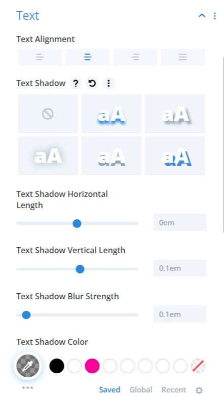
Text
With this option, you can adjust your text’s alignment to control how your text looks within the module. Furthermore, in addition to images, the Text Shadow option allows you to add shadows to your text content. Once activated, you can enhance your text with effects like colors, horizontal length, vertical length, and blur strength.
Overview of Text Settings in the Divi Slider Module
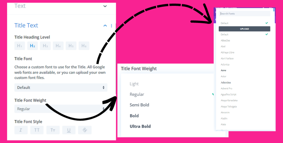
Text Title
The Text Title section provides settings specifically tailored for the title. The Divi theme offers a plethora of options. Let’s explore some of the key ones.
- Title Heading Level – Here, you can select the hierarchy of your heading. From H1 to H6, you can choose a heading level based on your preference. While H1 represents the main title, the importance of the headings decreases as you go from H2 to H6.
- Title Font: Choose a font from a list that includes hundreds of options. This list features all of Google’s web fonts, but you can also add your custom font. Additionally, you can adjust the Title Font Weight and Title Font Style.
Pro tip: Limit yourself to using three or four font styles throughout your website. Using too many font styles can slow down your website’s loading time, as each font needs to be loaded separately. This can impact your site’s speed.
Divi’s Text Title Settings Uncovered
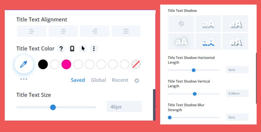
- Title Text – In this section, you can adjust various aspects of the title text:
- Title Text Alignment: Choose from left, right, center, or justified.
- Title Text Color: Select your desired color or use the eye dropper tool.
- Title Text Size: Adjust the font size either by dragging the slider or inputting a specific numerical value.
- Title Text Shadow: Once enabled, you’ll have the option to further tweak its settings.
Make sure to choose settings that best fit your design preferences and the overall aesthetics of your website.
Slider module: Tailoring your Title Text
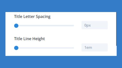
- Line Height and Letter Spacing – Line height and letter spacing enable you to enhance readability by adding space between lines and individual letters. You can add height and spacing by dragging the range slider or by typing in a numerical value.
Adjusting Title Letter Spacing and Title Line Height
Body Text
The Body Text provides styling options similar to those in the Title Text but focuses on the content’s body. You can customize the Body Font, adjust its weight and style, align the text, choose its color, size, and adjust the spacing. Essentially, you have the flexibility to make a variety of changes.
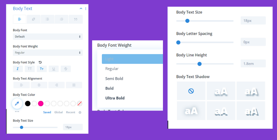
Refining Body Text Styling with Slider Module
Buttons
To apply custom settings to the button, toggle the “Use Custom Styles For Button” option. Once activated, you’ll have access to a wide range of customization possibilities using the Divi Theme Builder.
- Button Text – Select the button size, color, and background based on your website’s needs and preferences. Navigate through the tabs to add a solid color, gradient, or even an image as the button background. The gradient and image backgrounds will display their respective options, which we’ve previously discussed.
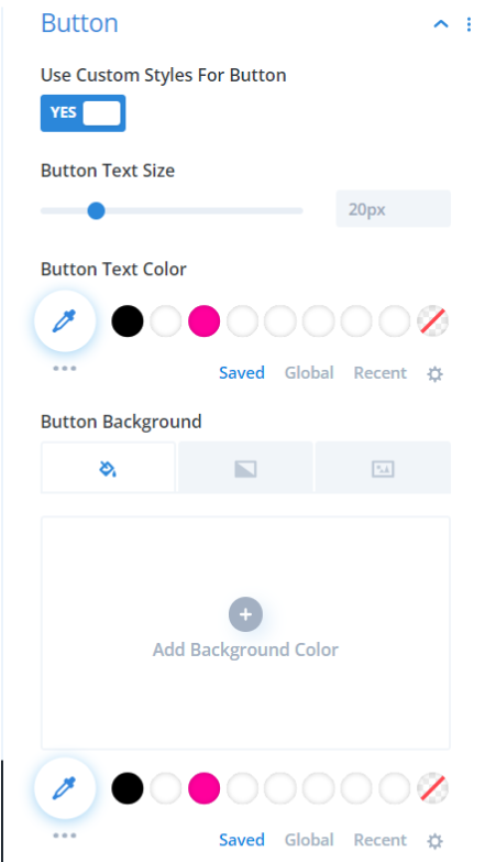
Unpacking Divi Button Customization Tools
- Button Border – In this section, you can set the width, color, and radius of your button. If you prefer a button without rounded corners, set the radius to zero. Similarly, adjust the width to define the thickness of your button border.
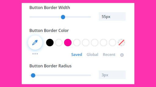
Button Border Customization
- Button Font – Choose a font for your button that complements the text above. Use the dropdown for Font Weight to select the desired boldness of your button text. Additionally, you can select the button font style: whether italicized, capitalized, in small capitals, underlined, or struck through.
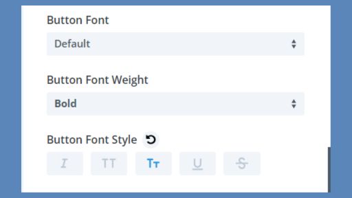
Selecting Button Typography in the Slider Module
- Show Button Icon – If you wish to display an icon on your button, toggle “Show Button Icon” to yes. By default, the ‘>’ icon will be displayed, but you can choose from a variety of other icons listed in the box. You can also change the icon’s color and place it to the left or right of the text. Additionally, if you’d like the icon to appear only upon hovering, enable the “Only Show Icon On Hover For Button” option. This feature enhances the aesthetic appeal of your button.
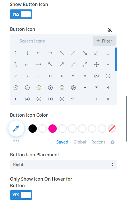
Slider Module’s button Icon Choices
- Margin and Padding – Use the button margin and button padding options to adjust outer and inner spacing, respectively. The margin controls the space outside the button, while padding influences the space inside it. If you desire consistent margin or padding on all sides, click the chain link to link them together.
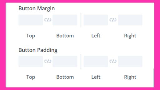
Adjust the Button’s Margin and Padding in the Slider Module
Read More: Learn 6 call-to-actions to increase conversion
Sizing and Spacing
In this section, you can determine the dimensions of your slider module. Adjust the Width, Max Width, and Max Height to specify the module’s size. You have the option to regulate both the content width and height. Additionally, you can align the module to the left, right, or center using the provided arrows.
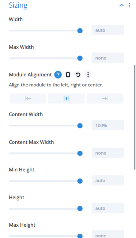
Adjusting Slider Module Sizing
The spacing feature lets you add margin and padding to your module. To create outer space between multiple modules or sections, use margins. Conversely, if you wish to increase spacing within the module itself, apply padding.
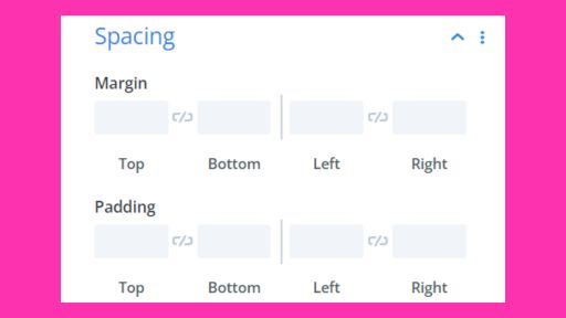
Adjusting Slider Module Spacing
Filters
Divi goes above and beyond to enhance website design possibilities. You can apply various filters such as brightness, saturation, contrast, and hue to your slider module. Additionally, you can adjust opacity, add blurring effects, and even incorporate invert filters to your module.
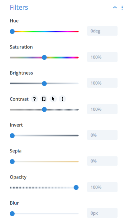
Slider Module’s Advanced Filter Options
Transform
Achieve advanced design effects using the transform controls: scale, translate, rotate, and skew. You can also set origin points for this module. Drag to resize the box or circle, or enter the desired value directly into the box to configure each feature.
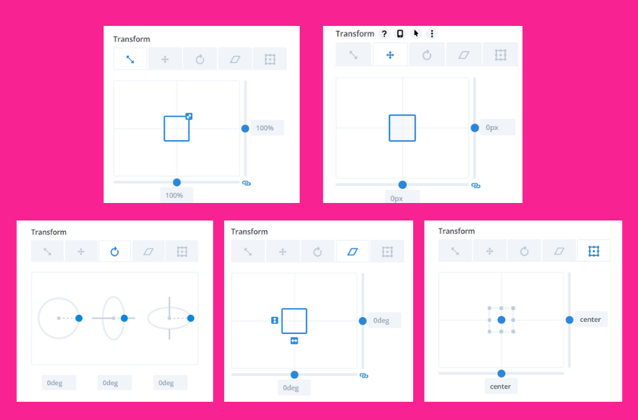
Mastering Transform Controls: Skew, Scale, Shift
Animation
You can choose from seven different animation styles. After enabling an animation, you can adjust its duration, delay, opacity, and speed. To turn off animations, simply select “none.”
Moreover, if you want your slides to cycle automatically, toggle “Automatic Animation” on. For continuous rotation of slides, set the Animation Repeat to “loop.” Additionally, you can determine the speed at which the slider transitions between slides by enabling “Automatic Animation.”
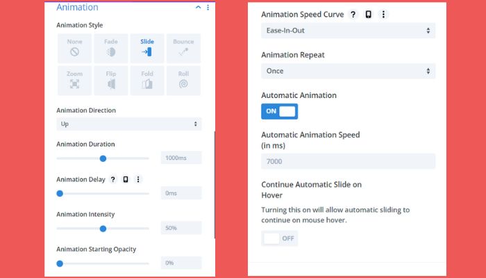
Fine-tuning Automatic Slider Movements
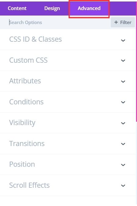
Advanced
There’s an entire section dedicated to Advanced settings, and I’m going to guide you through all these intricate customization options. This way, you can be among the 1% who go the extra mile to elevate their website game.
Divi’s Advanced Feature Settings Interface
CSS ID & Classes
You can assign a unique CSS ID or class to this module for custom styling or to add additional functionality. The CSS ID can be used to apply custom CSS styles from your child theme‘s stylesheet. You can add multiple CSS classes, separated by commas.
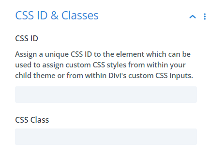
Slider Module’s CSS ID & Classes Options
Custom CSS
In this section, you can input specific CSS code directly. There are multiple sections available for adding CSS to specific elements within the module.
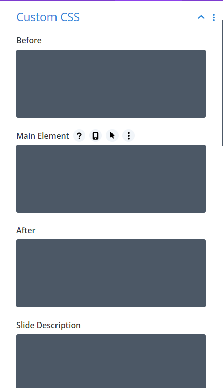
Tailored CSS Codes for Divi Elements
Attributes
The attributes section defines the nature of the relationship between the source you’re linking to and the page from which you’re linking. This assists search engines in better understanding your page.
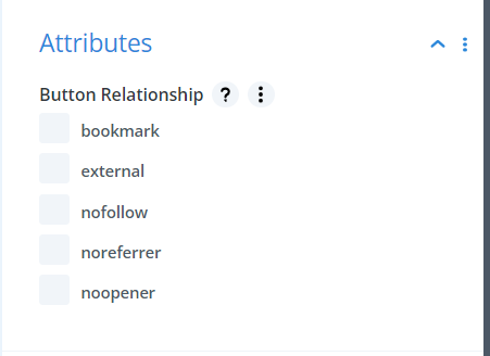
Slider Module’s Link Attributes Settings
Conditions
This tab enables you to determine when users can view this module. Depending on certain conditions, you can set this module’s visibility. For instance, if a visitor has previously purchased from your site, then this module can be made visible to them. Additionally, you have the flexibility to activate this module based on conditions such as time zone, browser, modal, and several other criteria.
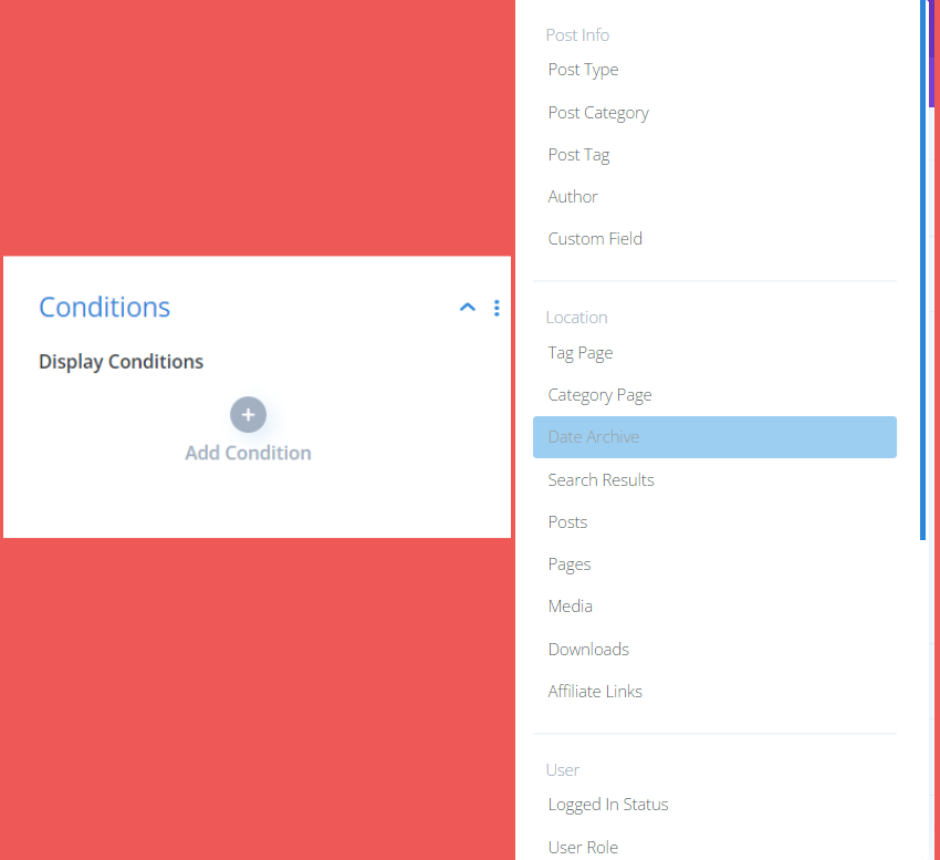
Slider Module: Setting Visibility Conditions
Visibility
In this section, you determine your module’s visibility. If activated, the module will not display on the selected device, whether it’s mobile, tablet, or desktop. Additionally, you have the option to decide the amount of content from this module to be visible on mobiles. If you wish to display content on phones, toggle the option to ‘yes’.
Similarly, to ensure CTAs are visible on the phone, enable that setting. You also have the choice to decide whether to display or hide images/videos on phones.
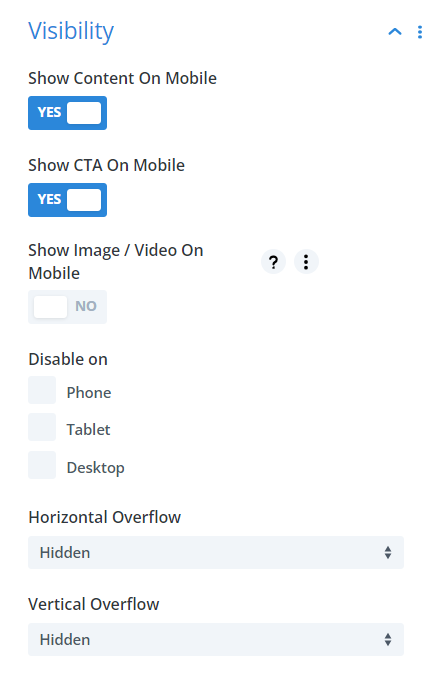
Configure Phone Image/Video Settings for Your Slider
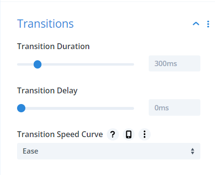
Transitions
This feature lets you adjust the duration of the hover animation, set the transition speed curve, and determine any delay.
Adjusting Hover Animation Duration
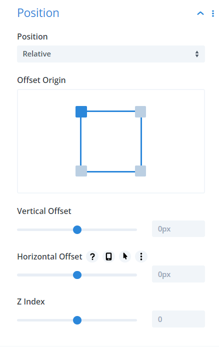
Position
Here, you can set the module’s position type, offset origin, vertical and horizontal offsets, and its z-index. You have the options of default, relative, absolute, and fixed positions. Elements set to absolute positioning float within their containing elements, while those set to fixed positioning float within the browser viewport. The z-index specifies the stack order, with elements having higher values overlaying those with lower values.
Setting Slide Module’s Element Positions
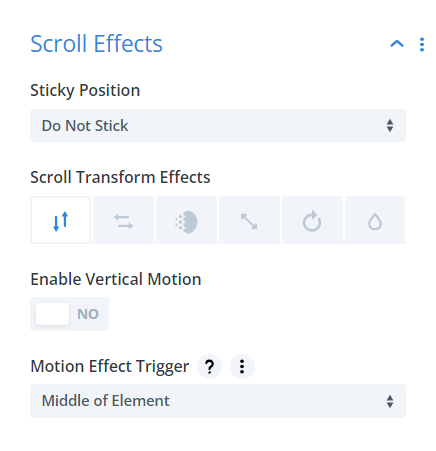
Scroll Effects
In this section, you can control the module’s scrolling behavior. You have the option to set the module to stick to the top, bottom, or both, and allow it to transform as users scroll. The vertical motion setting lets the element scroll at a different pace than the surrounding content. Furthermore, the Motion Trigger Effect determines when the scroll effect starts, based on the element’s position in the viewport. The element can also maintain a consistent distance from the browser’s edges while scrolling, and its animation transitions respond to user scroll behavior.
User-Responsive Scroll Effects in Slider
Customizing Individual Slides
As mentioned earlier, the Divi Slider Module allows you to apply custom styles to each slide individually. If you style a particular slide, it will override the general style set for the entire module. To maintain consistency across all slides, make your style adjustments in the primary module settings.
To customize the appearance of individual slides, navigate to the module settings and click on the gear icon adjacent to the slide you wish to edit. From Content to Design to Advanced, every setting can be adjusted to fit your preferences. The Design and Advanced tabs have the same options as the global settings, but the Content settings vary slightly. Let’s delve into the Content settings.
Accessing Individual Slide Setting
Text
In the Text section for the selected slide, you can modify the title, button, and body text. If you wish for any of these to match the global settings, simply leave the corresponding field empty.
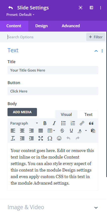
Editing Slide Text in Slider Module
Image & Video
With this option, you can upload an image or video to add visualization to your content. The image or video will display to the left of the content. If you prefer a text-only slider, simply leave this field empty.
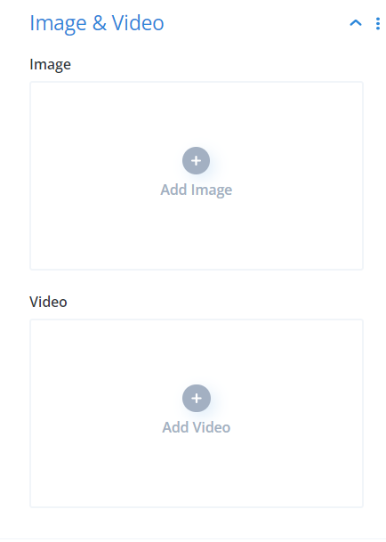
Enhancing Slides with Visuals in Slider Module
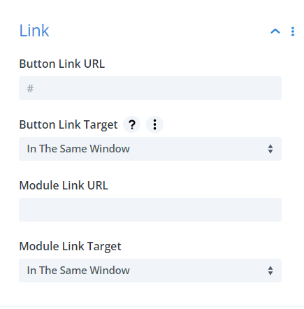
Link
Link the button to the URL you’d like your visitors to go to.
- Button Link URL – Enter the URL for the slide button. Upon clicking, users will be redirected to the specified page.
- Button Link Target – Decide if you want the URL to ‘open in the same window’ or ‘in a new tab’.
- Module Link URL – This link pertains to the entire module. Clicking anywhere on this module will navigate visitors to the given URL.
- Module Link Target – Your choice here determines whether the clicked link opens in the current window or a new tab. Choose “In The Same Window” for the existing window and “In The New Tab” for a separate tab.
Configuring Slider Module’s Button Link
Background
Similar to the module’s global settings, you can set a solid color, gradient, image, video, or pattern as the background of your slide.
Slider Module Background Settings
Moreover, you can also download effective pre-made slider designs available in the Divi Marketplace. Incorporate the sliders into your website and make the necessary changes using slider settings to match the aesthetics of your web design.
Explore the Divi Slider Options to Create Your Magic
Now that we’ve extensively gone through each step of the settings, design your first slider using your creativity. You can draw inspiration from other creatively-pleasing websites as well. Explore options, play around, and unlock the power of attractive sliders.
Don’t forget to tell me in the comments what options you explored and how this blog helped you.
Conclusion
The Divi’s Slider is a great choice for those who want to use the module to showcase different products or services, each with its custom layout and description. It is also a remarkable feature to create a slideshow of events or milestones, with each slide representing a different point in time.
The best thing about Divi’s sliders is its emphasis on extensive styling features and position adjustments without compromising the speed of the website and thus standing out among all the other slider plugins.
And because the module is part of the Divi Visual Builder, you can rest assured that it’s built to work seamlessly with other modules. So what are you waiting for? Get your Divi’s Elegant Theme Membership today to design your slides with Divi’s slider module and add engaging sliders on your webpage to increase engagement.
If you need any help regarding Divi Slider, feel free to contact us here.


0 Comments