Divi Advanced settings give you more control over the look and feel of your Divi website. They provide an easy way to target elements with CSS, control which elements are visible on which devices, adjust the position of elements, add scroll effects, and more. Even though this is the Advanced settings, most are easy to learn and use. In this article, we’ll look at the Advanced tab of your sections, rows, columns, and modules and see how to use them.
Where to Find the Settings
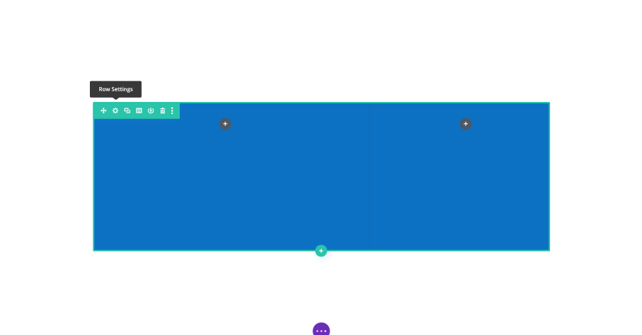
In the Visual Editor, hover over the element (section, row, column, or module) you want to adjust. You’ll see a set of icons. Click on the gear for the section, row, column, or modules to open the settings.
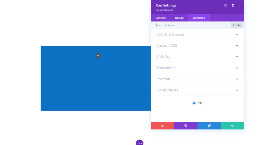
Select the Advanced tab in the settings screen. Here, you’ll see settings for CSS ID & Classes, Custom CSS, Visibility, Transitions, Position, and Scroll Effects. The options for sections, rows, and columns are the same with a few minor variations.
CSS ID & Classes
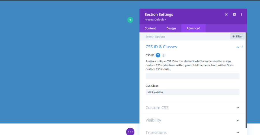
CSS is beyond the scope of this tutorial, but if you’re using CSS you can assign the CSS ID in the first field and add CSS classes to the second field. Separate the CSS classes by spaces. The CSS itself can be placed into multiple locations within your Divi website. For more information, see our tutorial How to Add Custom CSS to Divi.
How to Adjust the Settings
Most of the controls for the adjustments work the same as the Design settings. However, there is a new sliding tool to be aware of. It shows the Viewport for the top and bottom on the sides and a mid-offset in the center.
The Viewport is the area of the screen that you can see. The website continues below the screen, but the edge of the screen is the bottom Viewport. The sliders simply provide a way for you to adjust how close the element can get to the top or bottom of the screen. The mid-offset is where the element starts.
The best way to get the feel of what these adjustments can do is to use the sliders, enter numbers in the fields, etc., to see what effect they have on the element. Also, when you hover over the name of the setting, you’ll see a small menu appear. One of these menu items is a question mark. Click this to get a brief description of what the setting is for.
Custom CSS
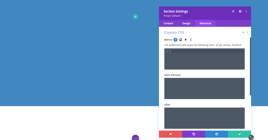
Custom CSS includes fields where you can place your CSS to target specific elements. The Section fields include Before, Main Element, and After. The fields will match the element, so if a module has text you’ll see fields for text.
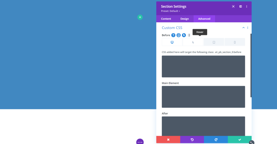
Icons appear when you hover next to the field’s title. Clicking on the desktop icon reveals tabs for the different screen types and clicking the arrow shows a field for hover, allowing you to add CSS to the different screen sizes and hover separately.
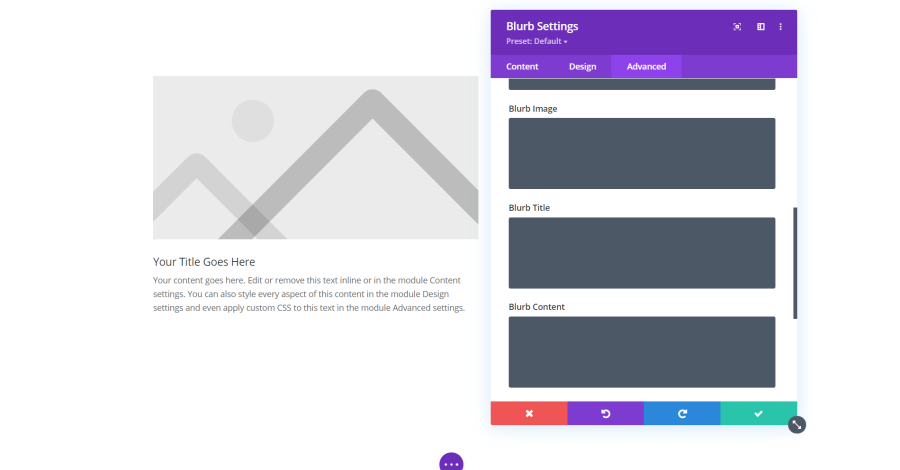
Most of the modules add more fields for Custom CSS. Here are the extra fields for the blurb module. Since it has an image, title, and content, each of those elements have their own Custom CSS fields.
Attributes
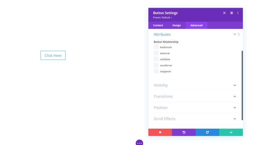
Most of the modules also add Attributes. The options change based on the features of the module. Blurb Attributes allow you to enter alt text for the image. Here are the Attributes for the button. It allows you to define the button relationship. Choose between bookmark, external, nofollow, noreferrer, and noopener.
Visibility
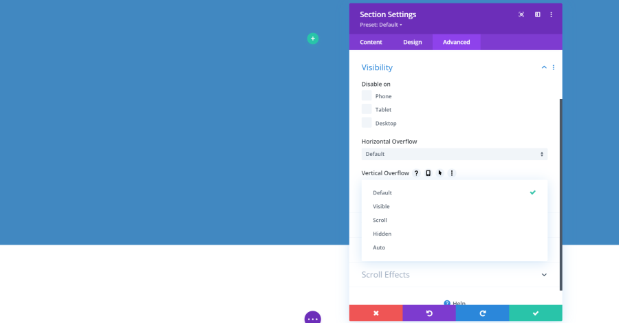
Visibility includes options to hide the section, row, column, or module on specific screen sizes. This allows you to create a specific design that will show on the desktop, another that will show on tablets, and another that will show on phones.
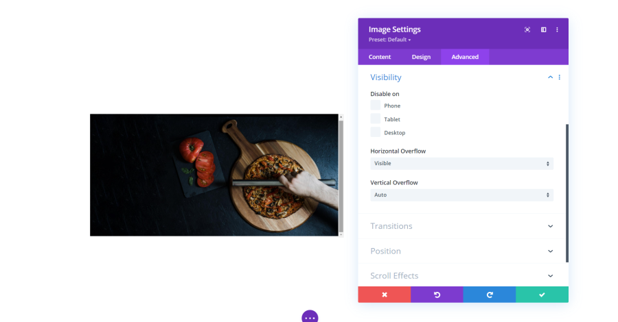
You’ll also see settings for Horizontal Overflow and Vertical Overflow with options for default, visible, scroll, hidden, and auto. These control the overflow of the x and y-axis of the element. This example shows an image module with an image the overflows its window. In other words, it’s taller than the space allowed for it. When this happens, you can choose how Divi will handle it. In this example, I have the window to display a scroll bar. I’ve set this one to auto, which shows the scroll bar if the image needs it.
Transitions
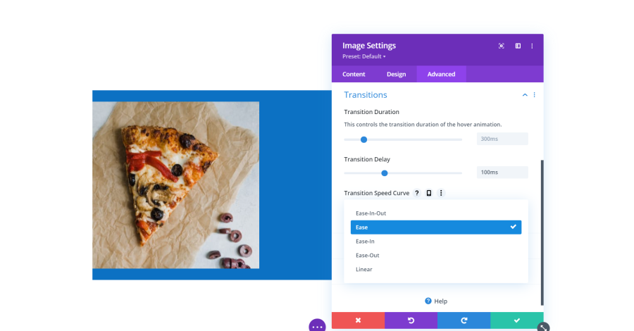
Transitions control the speed, delay, and curve of the hover animation. For the speed curve, choose between ease-in-out, ease, ease-in, ease-out, and linear.
Position
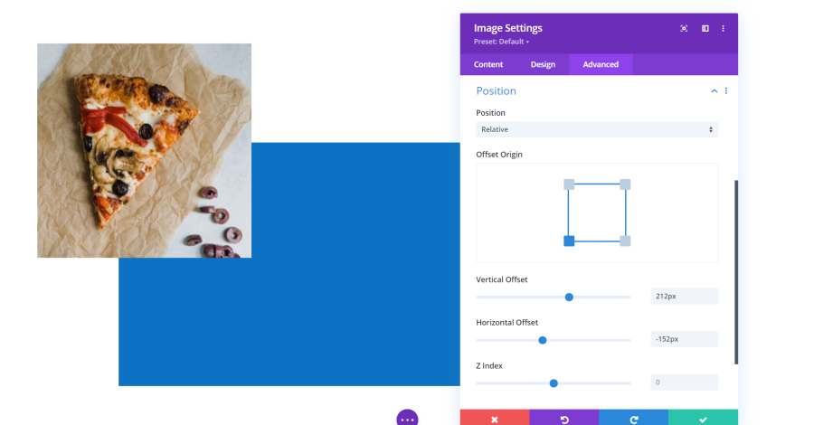
Position controls the position type, which allows you to specify where the element sits on the screen in relation to its container. Normally, an element is displayed within the container. For example, a module is displayed within a column, which is displayed within a row, which is displayed within a section. With Position, you have control over that placement. You can even place it outside of its container.
The position can be relative (offset without disturbing the elements around it), absolute (float within the parent elements), or fixed (float within the visible area of the browser). You can adjust the offset origin and the vertical offset, horizontal offset, and Z index. The square in the center lets you choose the corner the offset is from.
The example above shows an image with the position adjusted to make it start outside of the upper left corner of its row. I’ve given the row a blue background to make it easier to see.
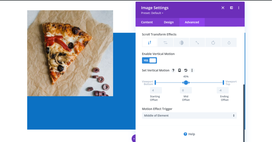
Scroll Effects
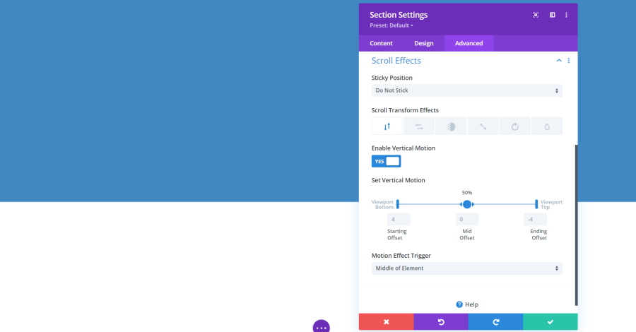
Scroll Effects are some of the most interesting features of Divi. They can make your elements stand out as the user scrolls up or down your website. Settings include the sticky position, transform effects, vertical motion, and the motion effect trigger (choose from the top, middle, or bottom of the element). Transform effects include vertical motion, horizontal motion, fade in and out, scaling up and down, rotating, and blur. The settings can work together or independently. Let’s look at a few of them.
This is Vertical Motion. The image moves separately in a vertical position from the background. I’ve left all the settings at default. You can fine-tune its position with the Set Vertical Motion sliders.
This Horizontal Motion. The image moves horizontally as you scroll. It still moves with the page, so it also has a vertical movement.
This is Fade In and Out. The image is faded when it starts to scroll and un-fades when it reaches the center.
This is Scaling Up and Down. The image starts smaller and scales up to the correct size.
This is Rotate. The image starts in a rotated position and then rotates into place as the user scrolls.
This is Blur. The image starts blurry and then sharpens as the user scrolls.
This example uses all of them combined. You can use them in any combination and with other Divi settings.
Ending Thoughts
That’s our look at Divi Advanced Settings tab. These settings allow you to target elements with CSS and give you control over the element’s visibility, position, and scrolling animations. The scrolling effects are an especially good way to make your site stand out without having to learn advanced programming. The adjustments are standardized between sections, rows, columns, and modules, so if you learn to use one you have an idea of how to use them all.
For more information about Divi settings, see our previous article: Getting Started with Divi: Design Settings.
We want to hear from you. Do you use Divi’s Advanced settings? Let us know about your experience in the comments.


0 Comments