The Divi Builder is a state-of-the-art, no-code visual website building tool exclusively crafted for WordPress users. With the Divi Builder, individuals can effortlessly construct visually stunning websites from scratch, all without the need to delve into intricate lines of code—unless they opt to do so. This advanced tool harnesses the power of web development and introduces the Divi Visual Builder, enabling users to design bespoke websites with ease, while witnessing real-time changes during the creative process.
So far in this series, we’ve covered the most prominent settings in the Divi Builder. There are lots of settings that help speed up your design process and improve your website. In this article, we’ll look at those “hidden” settings to help you get the most out of the Divi Builder.
Divi Preset
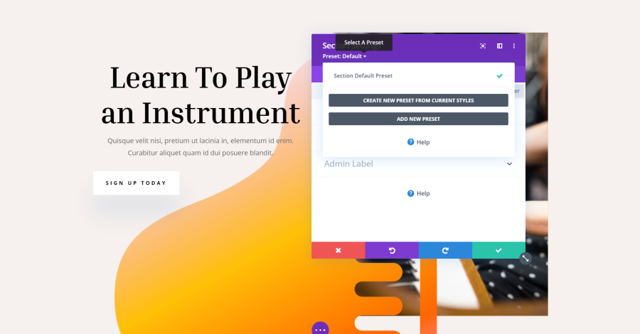
Title: Divi Preset
At the top of the Settings window for sections, rows, columns, and modules is an option called Preset. Presets are settings that you can reuse. Clicking this allows you to select a preset, create a preset from your current styles, and add a new preset. For detailed information, see our article Divi Presets Overview.
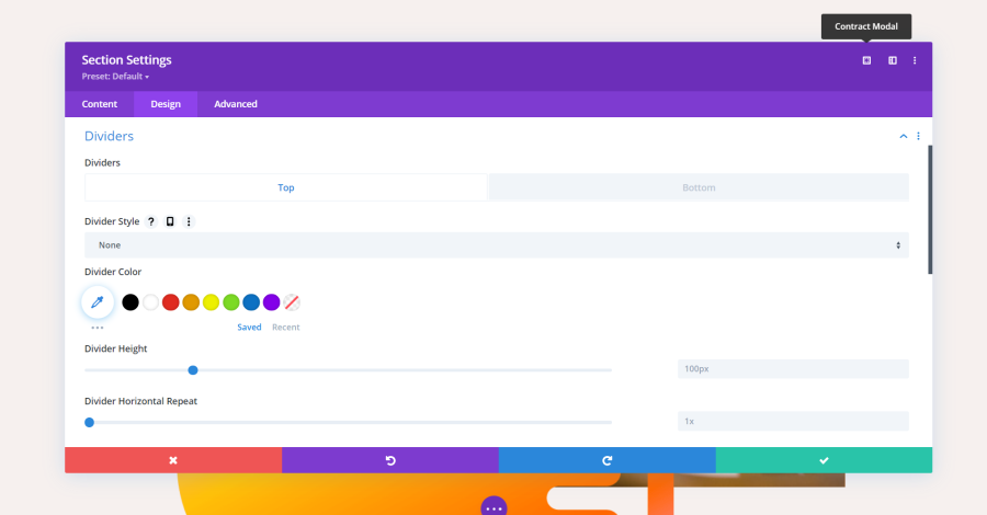
Modal Settings
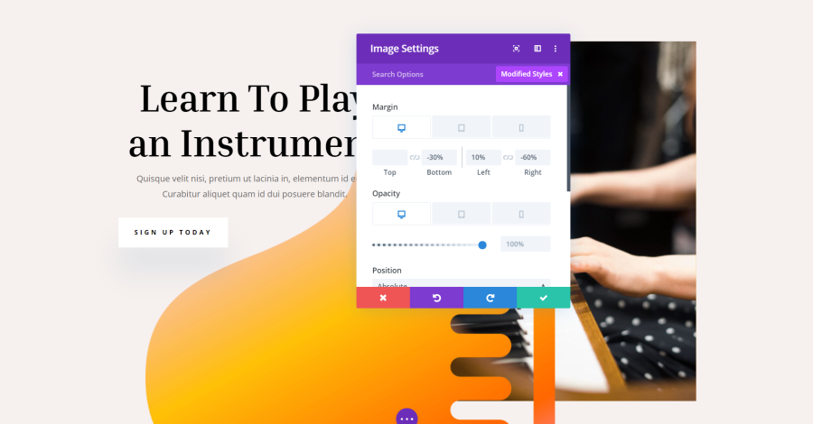
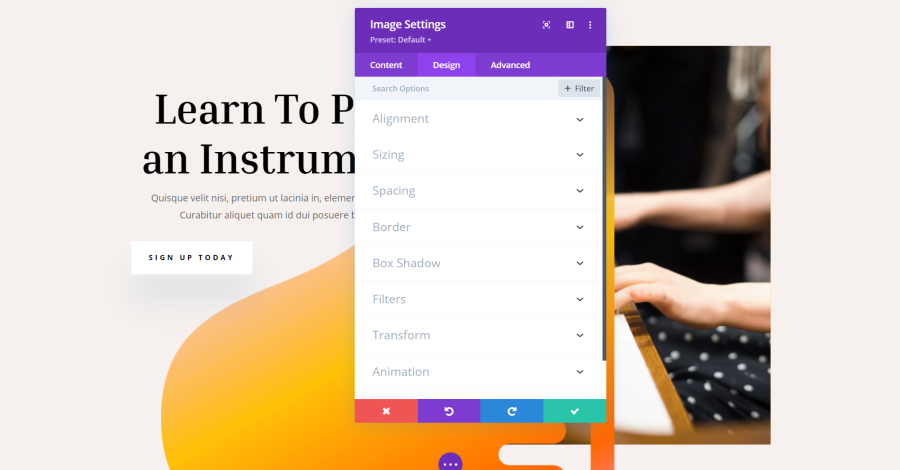
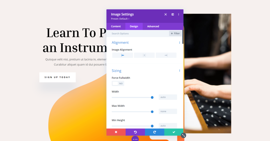
The modal is the box that contains the settings that open when you click the gear icon on sections, rows, columns, and modules. Across the top on the right of the modal are three icons.
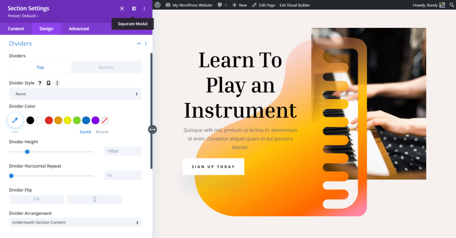
Expand Modal

Title: Expand Modal
The first option is Expand Modal.
Title: Expanding the Modal
Selecting it makes the modal wider. The icon now says Contract Modal, so you can make it smaller.
Snap to Left
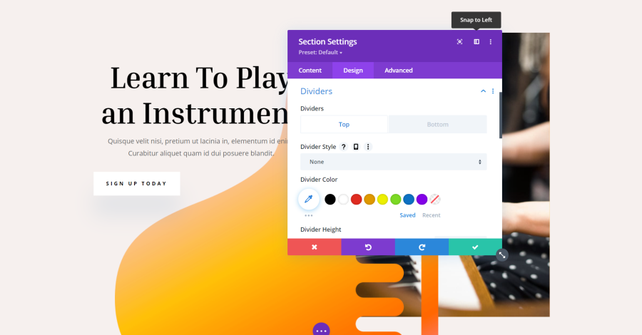
Title: Snap to Left
The second icon is Snap to Left. Normally, the modal is floating and can be moved anywhere with drag-and-drop. The problem is you can’t see the content behind the modal.
Read More: How to Boost Visibility for Travel Agencies
Title: Snap to Left
This places the modal to the left side of the screen and pushes the content over so it’s all visible. An arrow is added to the right side of the modal. Grabbing this arrow lets you change the width of the modal. The layout adjusts to match.
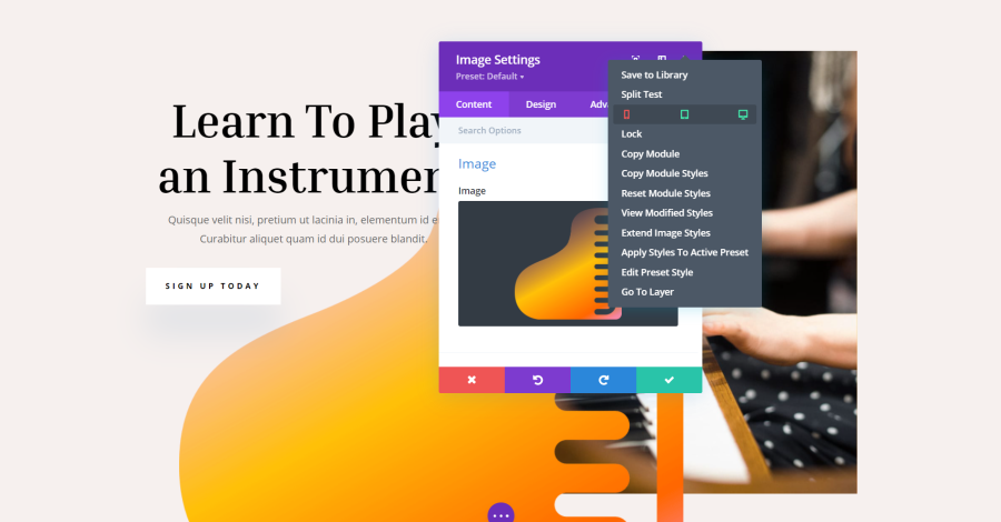
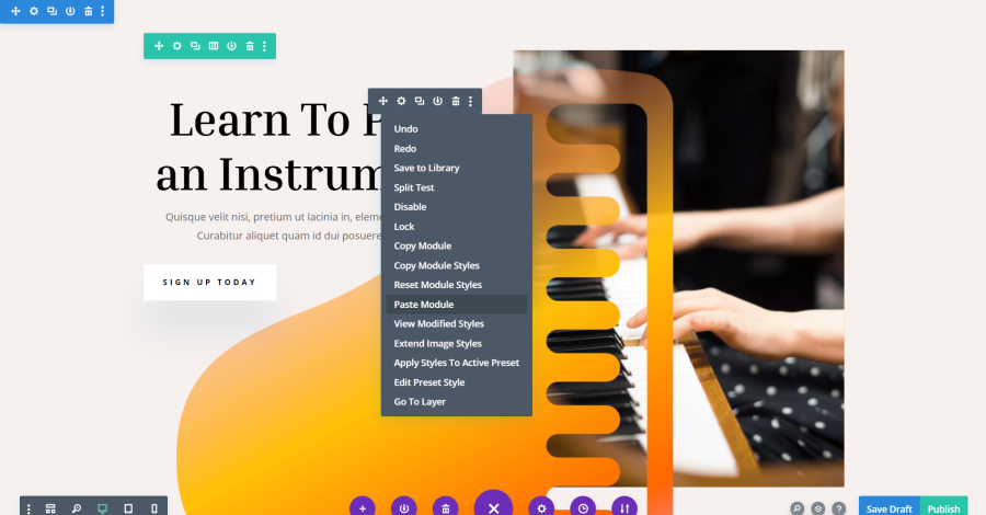
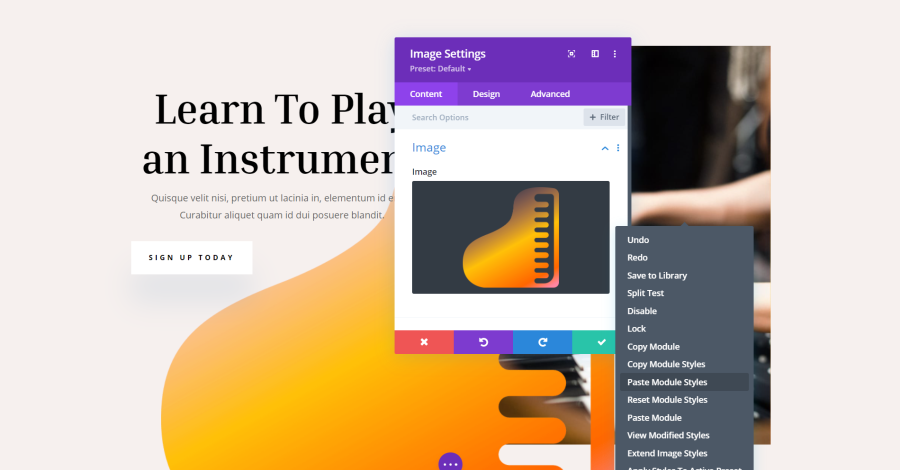
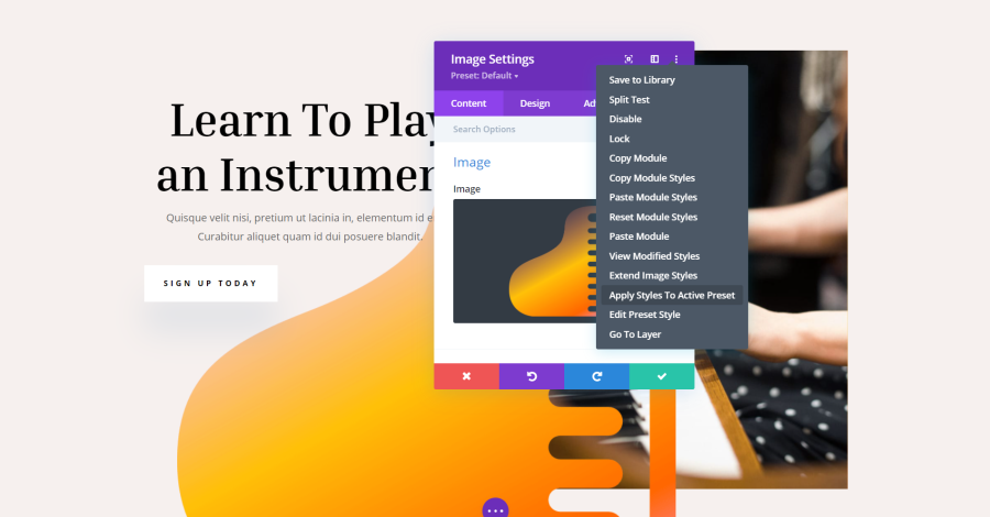
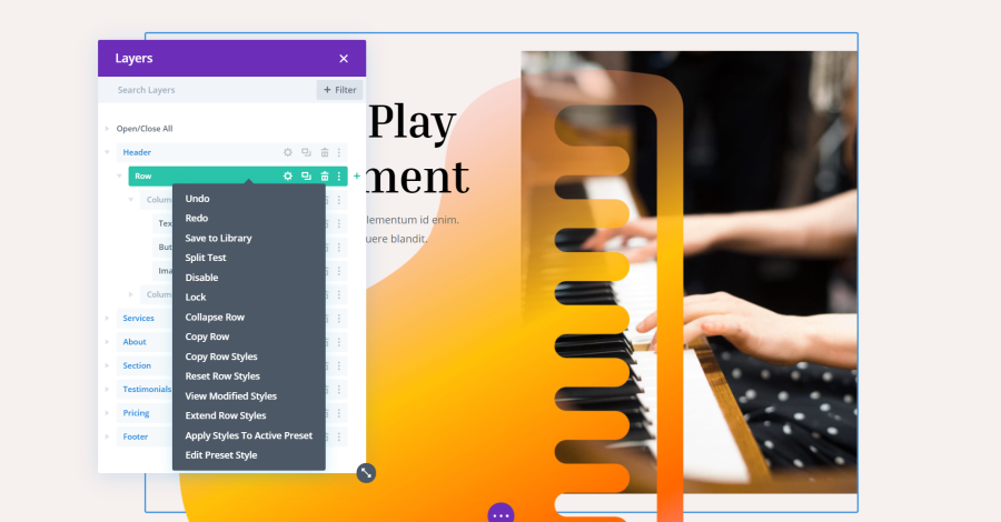
Other Settings
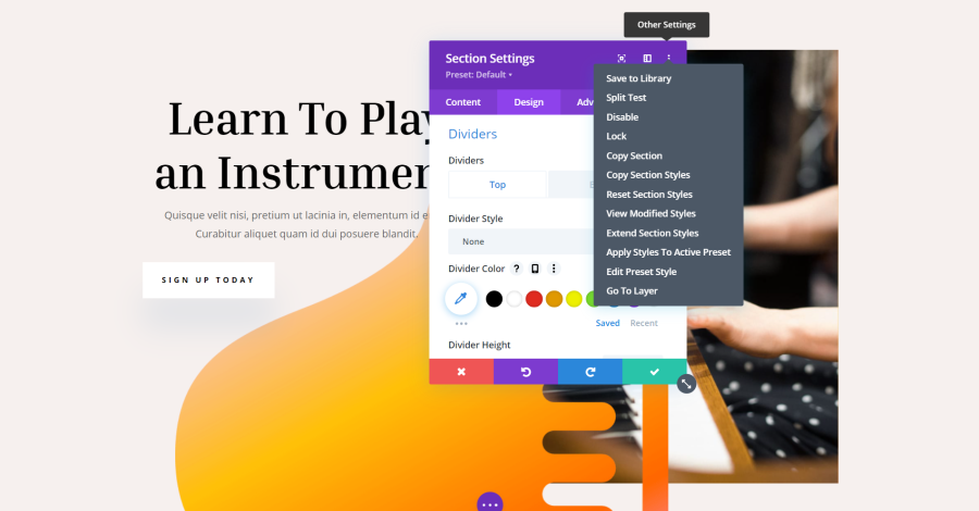
Title: Other Settings of Modal
The three dots on the far right of the modal is called Other Settings. These settings allow you to save to the library, perform a split test, disable, lock, copy the element, copy the styles, reset the styles, view styles, extend styles, apply the styles to the active preset, edit the preset style, and go to the layer.
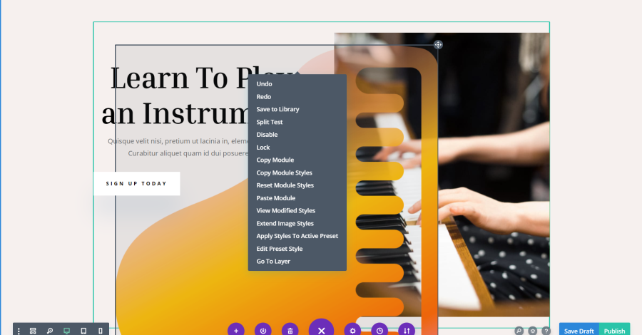
Title: Other Settings of Modal
You’ll see similar options by right-clicking on the element. We’ll look at a few of the settings in more detail.
Read More: 7 Best Accordion Layouts for Divi to Enhance Your Website’s Visual Appeal in 2024
Save to Library
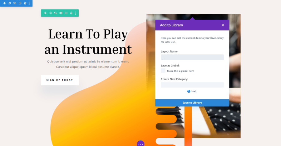
Title: Save to Library
Select Save to Library to keep a copy of your element. This allows you to reuse it as many times as you want. If you select Save as Global, any changes you make to the global element will be reflected on every page that uses that global element. This is great for creating banners, messages, ads, etc. since you can change the information once and it’s automatically changed across your website.
Split Test
Title: Split Test
Selecting Split Test lets you create a second version of an element. Half of your audience will see the first version and the other half will see the second version. Divi keeps track of the statistics so you can choose which design had the best results. This is a great way to improve your website based on real-world testing. We’ll cover split testing in greater detail in a future article.
Read More: 8 Best Divi Child Themes and Landing Pages for Social Media Agencies
Disable
Title: Disable Elements
Disable allows you to easily choose which screen types you want to disable the element for.
Lock
Title: Lock Element
Lock keeps anyone from seeing the settings and making changes to the element.
Copy
Title: Copy Module
This allows you to paste a duplicate of the element into any Divi layout on your website.
Copy Styles
Title: Copy Module Styles
Copying the styles lets you reflect those styles to similar elements within the layout. This is great if you’ve created a design for a module and you want other modules in your layout to have those settings. Instead of opening each of the modules and manually making the adjustment, simply paste the styles into the specific modules you want.
View Modified Styles
Title: View Modified Styles
This shows you the settings for that element that have been changed.
Extend Styles
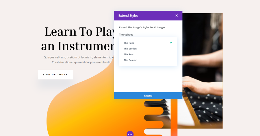
Title: Extend Styles
Extend Styles lets you reflect your changes to every element of the same type without having to paste them individually. You can choose to extend the styles to the entire page or just the current section, row, or column.
Apply Styles to Active Preset
Title: Apply Styles to Active Preset
This allows you to update the current preset using the styles of the element you’ve selected.
Edit Preset Style
Title: Edit Preset Style
This lets you edit the current present style. The modal will spin around to show you the style’s settings. An arrow icon is added to the right of the modal. Clicking this takes you back to the regular settings.
Read More: How to Make Your Custom Footer in Divi: Step-by-Step Guide
Go To Layer
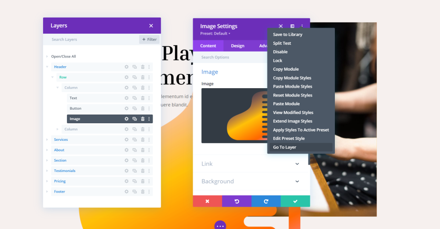
Title: Go To Layer
Go To Layer opens another modal that shows you the structure of your page in a layer view. It highlights the current element, so you can see it within the hierarchy of the layout.
Title: Go To Layer
Within the Layers view, you can perform the same functions as the wireframe and visual views. Layers makes it easier to work with large layouts, making it an excellent tool for saving time. For more information about Layers, see our article A Look at the New Divi Layers View.
Revealed Settings
Title: Revealed Settings
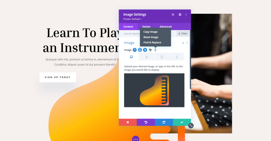
More options are revealed when you hover over the options in the modals. The options vary based on the type of elements they are, but most include a set of icons that open more options. They include from left to right:
Question mark – shows a short description of what this setting does.
Device – opens tabs where you can view the layout for each device.
Arrow – shows the hover state of the element.
Circled arrow – lets you undo the setting and resets it to default.
Three dots – opens a small menu where you can copy, reset, and find and replace settings.
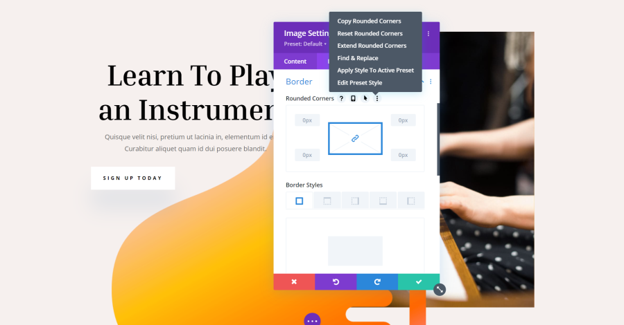
Title: Adding Rounded Corner
The menu will vary depending on the setting. This one for borders adds corners and styles.
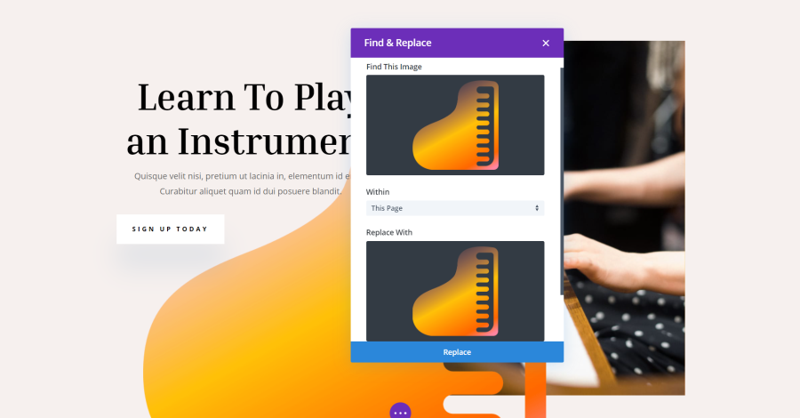
Title: Find & Replace
The Find & Replace option lets you specify where to search for the element or settings and allows you to replace just the specific element or all elements.
Read More: 8 Best Divi Child Themes & Layouts for SEO Agencies in 2024
Builder Settings
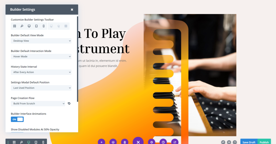
Title: Builder Settings
Builder Settings are found under the three dots. For the Classic Builder, this is placed on the right at the top of the builder. For the Visual Builder, this is found on the far left when the settings are opened (open the settings by clicking the large purple icon).
Customize Builder Settings Toolbar
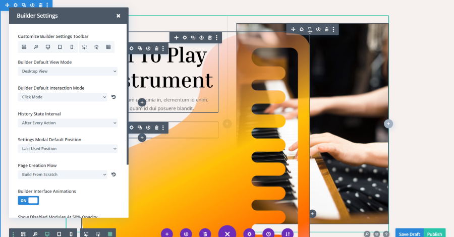
Title: Customize Builder Settings Toolbar
Choose which options show on the toolbar by default. Options include wireframe, zoom, desktop, tablet, phone, hover mode, click mode, and grid mode. The last three choose how the icons for the settings appear. Hover shows the options on hover, click requires you to click on the element first, and grid shows all of them for every element by default. I’ve enabled all three icons and selected grid mode in the example above.
Builder Default View Mode
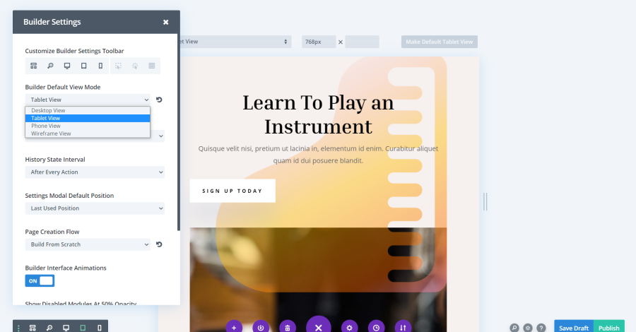
Title: Builder Default View Mode
Choose which view mode shows as the default between wireframe, desktop, tablet, and phone. This example shows the tablet view.
Builder Default Interaction Mode
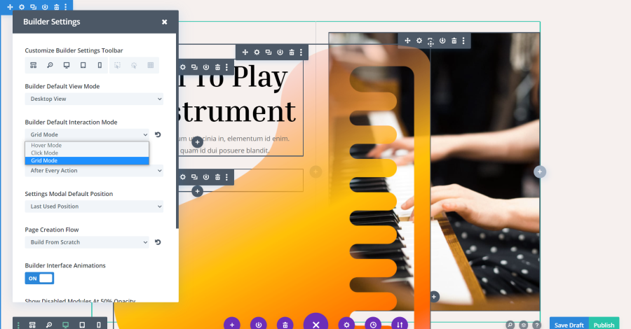
Title: Builder Default Interaction Mode
Choose which interaction mode is the default between hover, click, and grid mode. This example shows the grid mode.
Read More: Divi WordPress Theme Review
History State Interval
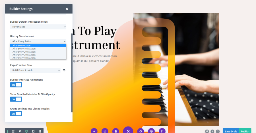
Title: History State Interval
This determines how often Divi saves a version of your page. It’s determined by the number of actions. Choose between every, 10, 20, 30, or 40 actions.
Settings Modal Default Position

Title: Settings Modal Default Position
This allows you to set the default position of the settings modal. Choose from the last used position, floating minimal size, fullscreen, fixed to the left, fixed to the right, or fixed to the bottom.
Title: Settings Modal Default Position
In this example, I’ve set the modal to appear at the bottom of the page.
Page Creation Flow

Title: Page Creation Flow
This determines what Divi shows you when you create a new page. It can provide a modal where you can select to choose the type of page you want to create (build from the library, from scratch, or clone a page), or automatically build from scratch, use a premade layout, or clone an existing page.
Builder Interface Animations
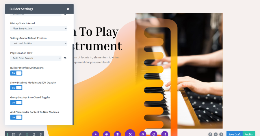
Title: Builder Interface Animations
Enable or disable the animations that appear when you click on something in the Divi Builder.
Show Disabled Modules at 50% Opacity
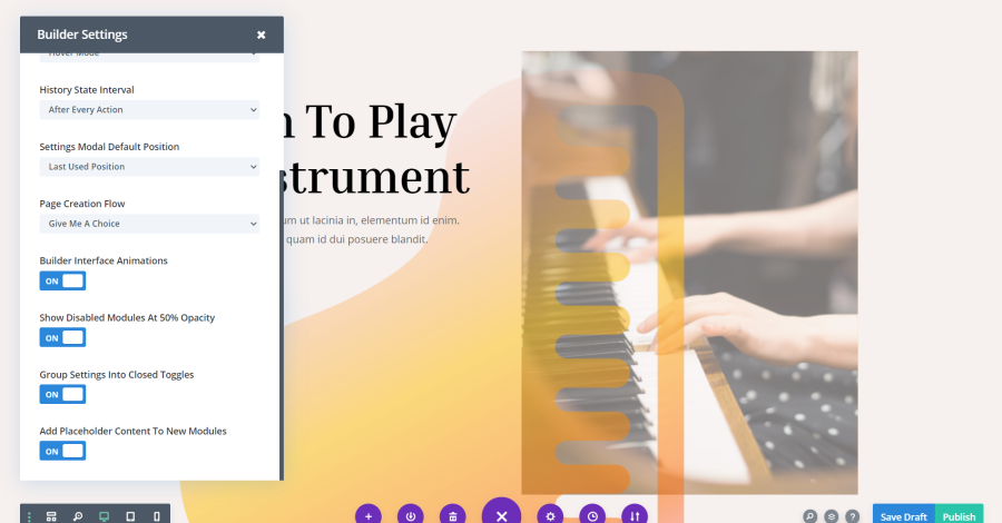
Title: Show Disabled Modules Opacity
This allows you to still see all the elements even if they’re disabled, but they appear less opaque than normal. In this example, I’ve disabled the two images, so they show at 50% opacity.
Read More: 23 WordPress Plugins for Divi Website in 2024
Group Settings Into Closed Toggles
Title: Group Settings Into Closed Toggles
This one keeps the toggles closed when you open the settings modal. You’ll have to open the settings you want. This makes the modal easier to use.
Title: Settings
If this setting is disabled, all the settings are opened by default, as seen in this example.
Add Placeholder Content To New Modules
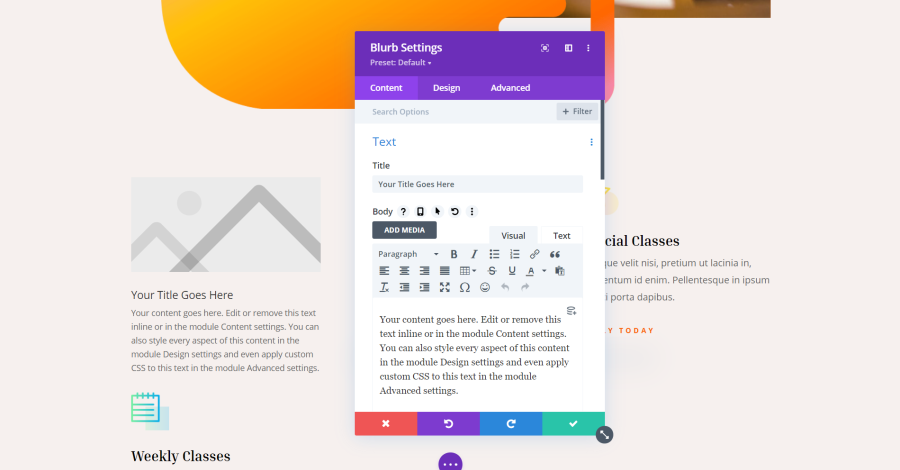
Title: Placeholder Content
This adds placeholder content so you can see how the element would look within your layout. This example shows a blurb, which includes a placeholder image and body text.
Divi Menu
Title: Divi Menu
The big purple icon can be moved to any side you want by dragging and dropping it to the location on the screen. This setting lets you determine which is its default position. In this example, I’ve dragged the menu to the left sidebar.
Divi Page Settings
Here’s a look at Divi’s page settings.
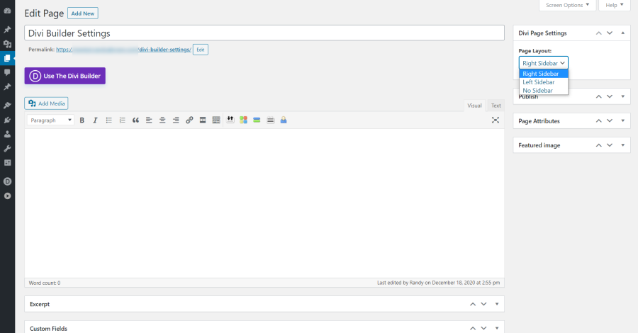
Title: Page Settings
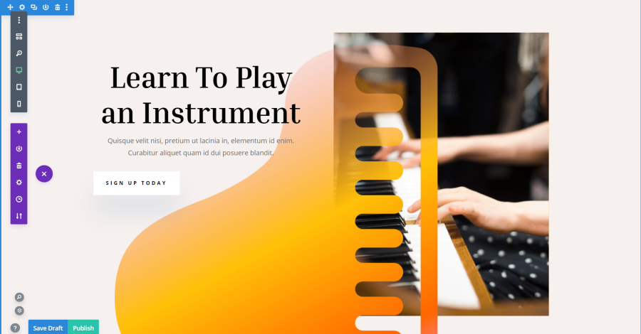
Divi includes different page settings depending on if you’re using the Divi Builder. Without the Divi Builder, you’ll have the option to place the WordPress sidebar on the right, left, or not include the sidebar.
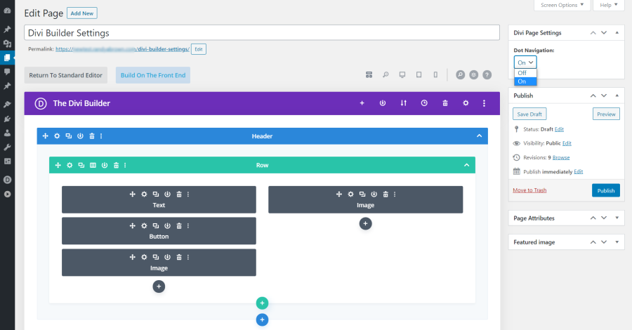
Title: Page Settings Dot Navigation
With the Divi Builder enabled, you have the option to use Dot Navigation for this specific page. Dot navigation is off by default. When enabled, dot navigation typically appears as a series of dots, each representing a specific section or part of the page. Users can click on these dots to quickly scroll to the corresponding section, enhancing the overall user experience by providing a convenient and intuitive way to navigate through the content.
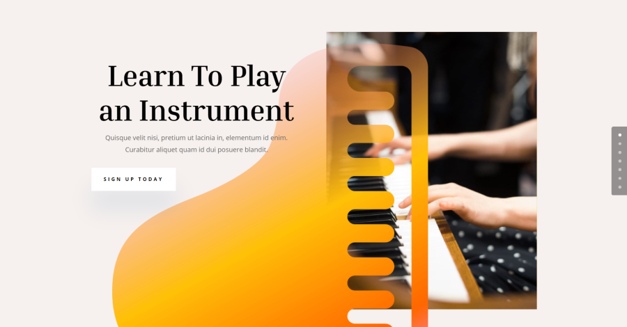
Title: Dot Navigation
When it’s enabled, you’ll see dots on the right of the screen that takes the user to each section when clicked.
Read More: 8 Best Divi WooCommerce Themes for E-commerce Sites
Page Template
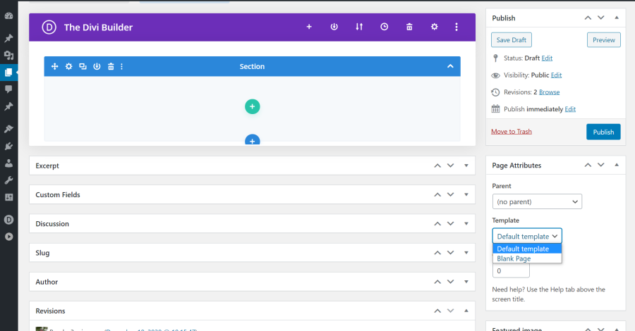
Title: Page Template
Page Attributes includes standard WordPress settings. One of those settings includes templates that are added by the theme. Divi lets you choose between two templates. The default template includes the header and footer. The blank template is completely blank, so you can create navigation with the Divi Builder.
Ending Thoughts
That’s our look at the Divi Builder and page settings that are not as prominent as most settings. These settings give you control over how the builder works and provides lots of shortcuts to make working with Divi as easy as possible. The split test is especially a good tool to help make your website the best it can be.
For more information about Divi settings, see our previous article: Getting Started with Divi: Advanced Settings.
We want to hear from you. Have you tried any of these Divi settings? Let us know about your experience in the comments.


0 Comments