The Divi Theme opens up a world of possibilities for everyone – be it a freelancer, a small business owner, or even a company CEO. With Elegant Theme’s renowned Divi Theme, the sky’s the limit.
In this blog, we’ll be exploring three main topics: incorporating the Divi menu in the footer, creating a full-width menu, and configuring a responsive slide-in menu. To make things organized and easy to follow, we’ve divided our discussion into three sections. First, we’ll walk you through adding the menu to the footer. Then, we’ll delve into the full-width menu option, and finally, we’ll guide you on setting up a responsive slide-in menu. Let’s dive in and explore these exciting features together!
Add Menus to Your Divi Footer
To kick things off, let’s add a menu to the Footer Menus Area in WordPress. First, head over to Appearance -> Menus -> Create A New Menu.
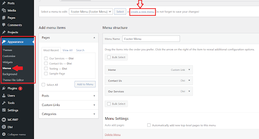
Creating a new menu
After you create the menu, you can click “save”. Next, you can add the pages you want from the options given. Afterward, arrange the pages in the order you wish to display them. When you’re ready, click Save Menu.
Read More: Create and Style a Divi Menu: Add Icons and Images To The Divi Menu
Add The Footer Widgets
Now, let’s integrate the menus you’ve made into your footer widgets. Navigate to Appearance -> Widgets in your WordPress dashboard. Choose an unused Footer Area among the six options provided by Divi. If you need an additional widget area, there’s a tool at the bottom to create a new one.
Inside the chosen Footer Area, click the plus symbol to reveal the list of blocks and search for “menu.” Select the Navigation Menu from the list of your choices.
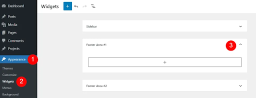
Add The Footer Widgets
Once you’ve completed the above mentioned steps, your menu will be incorporated into the footer, just like the image displayed below:
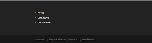
Menu at the footer
2nd Method of adding the menu to the footer
Similar to the initial step of creating a menu, click on the footer option this time and save the menu once it’s set up. As shown in the image below:
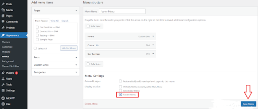
2nd Method of adding menu to the footer
Following these steps, your menu will be seamlessly added to the footer, just like the example shown in the picture below:

Integrating the menu at the footer of the website
Moving on to the next part, let’s discuss how you can replace the Primary Menu Bar with Divi’s Fullwidth Menu Module.
Read More: Best Security Measures for Divi: Hardening Your Website Against Threats
Replace the Primary Menu Bar with Divi’s Full width Menu Module
The primary menu bar ensures visitors can easily navigate your site. In addition to the standard WordPress primary menu bar, you might have noticed Divi’s Fullwidth Menu Module. Typically, this module is utilized to showcase different menus on your website, distinct from the primary menu found at the top of each page.
Alternatively, you can effortlessly replace your primary menu bar with the Fullwidth Menu Module. This grants you the flexibility to position the menu anywhere on the page without having a duplicate menu at the top. Moreover, Divi’s built-in customization options empower you to style the menu according to your preferences. You can achieve impressive designs by utilizing features like borders and dividers.
Now, let’s explore the process of replacing your primary menu bar with the Divi Fullwidth Menu Module.
Disabling Fixed Navigation Bar
First, let’s start by disabling the fixed navigation setting in Divi’s theme options. This will help us remove the main menu area at the top of our page. To do this, head over to WordPress Dashboard > Divi > Theme Options.
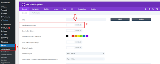
Disabling Fixed Navigation Bar
Read More: How To Write a Blog Post With Divi AI
Creating Primary Menu
The next thing we’re going to do is create our primary menu. We’ll use this primary menu for both the default Primary Menu Bar at the top and the Fullwidth Menu Module. To add your menu, go to your WordPress Dashboard > Appearance > Menus.
Adding Pages to Save the Menu
Finally, make sure to include all your pages in the menu and save it. Don’t forget this last step—it’s crucial! Save your menu so all your pages are accessible.
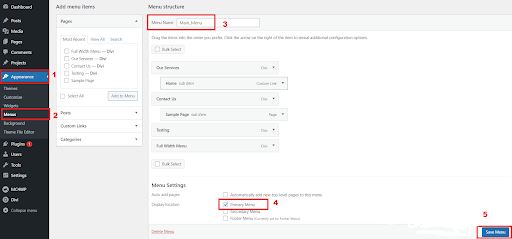
Adding Pages to the Menu
Hiding the Primary Menu Bar
To hide the primary menu bar on our pages, we’ll use a bit of CSS code. Make sure to turn off the Fixed Navigation Bar option before doing this, or else you’ll end up with a white space instead of completely getting rid of the menu bar. Open the page settings next by clicking on the following icon at the bottom of your page, switch over to the Advanced tab and add the following CSS code to the Custom CSS box:
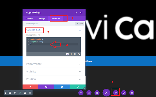
Hiding the Primary Menu Bar
#main-header {
        display: none;
        }
Styling the Full width Menu Module
Decide whether you want to keep or hide the main menu bar on all pages. If you’re thinking of using it on certain pages, you should first customize the default Primary Menu Bar. If you plan to get rid of the Primary Menu Bar entirely, you can skip this part. You can apply whatever style you like by heading towards settings of the full-width menu module.
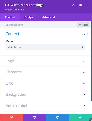
Styling the Full width Menu Module
Read More: Creating an Eye-Catching Hover Reveal Effect for the Divi Blurb Module
Final Look of the Full width Menu Module
We’ve demonstrated how to replace the main menu bar at the top of your pages with the Fullwidth Menu Module. By doing this, you have the flexibility to position your menu wherever you prefer on your page. The cool part is, you can also use Divi’s built-in features to customize its appearance.

Final Look of the Full width Menu Module
Continuing to the next section, let’s delve into the process of substituting the Primary Menu Bar with Divi’s Slide In Menu. This section will cover the creation of a Slide-in Menu. Without further ado, let’s dive right in and get started.
How to Make a Slide-in Menu for Divi
Slide-in menus, also referred to as off-canvas or mobile-style menus, play a crucial role in optimizing space and providing your website with a sleek, modern appearance. Divi offers convenient built-in settings that allow you to easily configure your navigation bar for a slide-in effect. In most situations, the default configurations work well, but it’s worth noting that the styling choices are somewhat restricted.
Create a Slide-in Menu with the Default Divi Settings
Making a Slide-in menu with Divi is easy. Here’s how: Go to the theme customizer, click on Header & Navigation, then choose Header Format. Finally, pick Slide In from the Header Style options in the dropdown box, as shown in the image below:
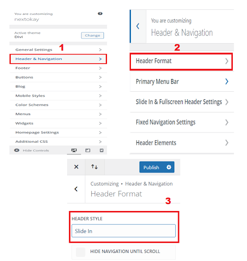
Creating a Slide-in Menu with the Default Divi Settings
When you click the hamburger icon, the page smoothly shifts to the left, creating space on the right for the menu. The icon, which looks like a hamburger, turns into an X. Click the X, and the menu neatly closes while the page slides back into its original position.
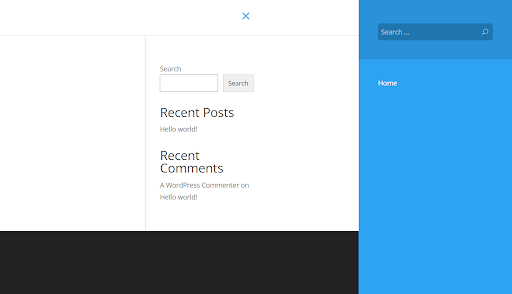
Slide In Menu
Notice that because the page has been pushed to the left, the site’s logo is no longer showing on the screen.
Read More: 9 Best Contact Form Plugins for Divi and WordPress
Conclusion
In conclusion, this blog post has explored advanced Divi menu integration techniques, covering footer integration, full-width menu customization, and the implementation of a responsive slide-in menu. Divi’s versatility caters to various user needs, from freelancers to business owners and CEOs, offering limitless possibilities.
We began by guiding you through the process of adding menus to your Divi footer, ensuring a seamless integration that enhances your website’s navigation. The incorporation of footer widgets and step-by-step instructions provided a clear roadmap for this customization.
Moving on, we delved into replacing the Primary Menu Bar with Divi’s Fullwidth Menu Module. By disabling the fixed navigation bar, creating a primary menu, and hiding the original menu bar using CSS, we demonstrated how to achieve a customized and visually appealing full-width menu.
The journey continued by exploring the transition from the Primary Menu Bar to Divi’s Slide In Menu. We highlighted the significance of slide-in menus for optimizing space and achieving a modern website aesthetic. The default settings for creating a slide-in menu were explained, showcasing the smooth transition and interactive features such as the hamburger icon transforming into an X.
In essence, this blog post has equipped you with the knowledge to elevate your Divi theme experience. Whether you’re looking to enhance footer navigation, create a stylish full-width menu, or implement a sleek slide-in menu, Divi’s features empower you to customize your website to meet your unique preferences. Let the creative possibilities with Divi continue to unfold as you explore and implement these advanced menu integration techniques.
Read More: Fixing Divi Bugs: Effective Solutions and Troubleshooting


0 Comments