In this step-by-step Divi guide, we’ll walk you through the process of making your Divi mobile menu uniquely yours by utilizing CSS within the Menu module. By following this tutorial, you’ll gain the skills to personalize and style various elements of the Divi Theme Builder mobile menu. Dive into customizing the image, hamburger menu icon, dropdown appearance, menu items, and submenu items effortlessly. We’ll cover everything from tweaking colors and borders to adjusting spacing, adding hover effects, and more!
With this easy-to-follow tutorial, you’ll have the know-how to make your mobile menu stand out, creating a seamless and visually appealing experience for your website visitors.
Understanding The Structure of Divi Mobile Menu
To get started, let’s break down the structure of the Divi mobile menu. This way, we can focus on specific elements one by one to craft a design that suits your style. While there are many components, we’ll concentrate on the most crucial and practical ones in this discussion. The structure of the Divi Mobile Menu consists of:
- The Header
- Logo Image
- Hamburger Icon
- The Dropdown Menu
- Menu Items & Links
- Submenu Items & Links
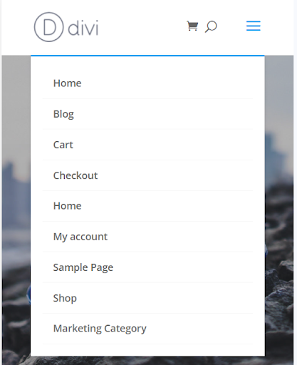
How the Divi Menu module appears by default when viewed on a mobile device:

Default Divi Mobile Menu
Alright, let’s dive in! This tutorial is broken down into sections, each focusing on a specific aspect of the mobile menu. In simple terms, each section covers a different part of how the menu works on your phone. So, we’ll take it step by step to make it easy to follow and understand.
Read More: Create and Style a Divi Menu: Add Icons and Images To The Divi Menu
Mobile Menu Header by Default: Exploring the Basics
Now, let’s dive into the menu header—the section that houses your logo and the handy hamburger menu. Divi provides a basic set of options, but if you wish to tweak the color or spacing, you’ll need to apply some CSS. This step becomes necessary whenever you want to personalize these elements.

Default Mobile Menu Header
Where to Place the CSS Code
Paste this code in your Divi>Theme Options>Custom CSS code box.
Let’s Edit the Default Menu Header
/*edit the default Divi mobile menu header*/
#main-header {
    YOUR CSS HERE
    }
Unique Styling Concepts: Crafting Your Own Distinctive Style
Here are some suggestions for customizing the look of your submenu. You can apply these changes by inserting the provided code snippets into the specified selector. Feel free to pick and choose the ideas that best suit your preferences.
Adjust The Spacing and Background Color
padding: 0!important;
background: #000000!important;
Adjusting the Divi Mobile Menu Logo Image
There are a few tweaks you can make to the logo image. To make it look just right, you might need to play around with the spacing and size a bit.
Divi Menu Logo Image
Read More:Divi Logo Guide: Resize, Reset, and Style Like a Pro
CSS Selector for editing the Divi Default Mobile Menu Logo Image:
/*edit the Divi default mobile menu logo image*/
#logo {
    YOUR CSS HERE
    }
CSS Selector for editing the Divi Mobile Menu Module Logo Image
/*edit the Divi mobile menu logo image*/
.et_pb_menu__logo img {
    YOUR CSS HERE
    }
Styling Concepts for Crafting Your Own Distinctive Style for Mobile Menu Module Logo Image
Here are a few cool ways you can personalize the look of the Divi mobile logo image. You can easily do this by adding in the code bits provided into the selector indicated above.
Adjust the Padding, the Width, Max Width, and Adding A Box Shadow
padding: 30px;
width: 80%;
max-width: 200px;
box-shadow: 0 2px 5px rgba(0, 0, 0, 0.1);
Read More: How To Write a Blog Post With Divi AI
How to edit the Divi Mobile Menu Hamburger Icon
If you wish to adjust the appearance of the mobile menu’s hamburger icon, you can tweak its settings using CSS. Keep in mind that the Menu module offers options such as size and color, but the default menu doesn’t provide specific settings for these aspects.
CSS Selector for Editing the Divi Mobile Menu Hamburger Icon
/*edit the Divi mobile hamburger icon*/
.mobile_menu_bar:before {
    YOUR CSS HERE
    }
Styling Concepts for Crafting Your Own Divi Mobile Menu Hamburger Icon
The following is a list of some ideas for things you might want to do to style the Divi menu hamburger icon. You can choose to do this by placing the snippets into the selector shown above.
Setting the Color, Background Color, Size, Icon, Border, Border Radius
color: #000000;
background: #ff0000;
font-size: 48px;
border: 2px solid #ff0000;
border-radius: 100px;
Edit the Divi Mobile Menu Dropdown
When you’re setting up your mobile menu, there are a few tweaks you might consider. You might want to get rid of that chunky blue line right at the top of the dropdown menu—it’s not the prettiest thing, is it? Or perhaps you’re thinking about reducing some of that extra space around the edges, making it a bit wider, changing up the background color, or playing around with the shadow effect. All these adjustments can help you fine-tune the look and feel to match your style better.
Read More: Is Divi Good for SEO: Myths, Realities, and Best Practices
Divi Mobile Dropdown Menu
CSS Selector for Editing the Divi Mobile Menu Dropdown
/*edit the Divi mobile menu dropdown*/
.et_mobile_menu {
    YOUR CSS HERE
    }
Styling Concepts for Crafting Your Own Divi Mobile Menu Dropdown
Here are some suggestions for customizing the Divi mobile menu dropdown. You can implement these changes by inserting the provided code snippets into the designated selector mentioned earlier. Feel free to pick and choose the options that suit your preferences.
Setting the Top Border, Adjust The Spacing, Add Or Adjust The Shadow, Make It Wider,
border-top: 0px;
padding: 0px!important;
box-shadow: 0 2px 5px rgba(0, 0, 0, 0.1);
width: 112%;
margin-left: -6%;
Read More: Fixing Divi Bugs: Effective Solutions and Troubleshooting
Editing the Divi Mobile Menu Parent Links
Let’s dive into customizing your menu item links. There’s a bunch you can tweak here – play around with colors, adjust spacing, change the background, tweak opacity, and you can even ditch that small bottom border if it’s not your style. It’s your menu, so make it look and feel just how you want it!
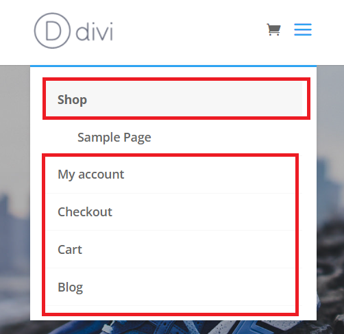
Divi Mobile Menu Parent Links
CSS Selector for editing the Divi Mobile Menu Parent Links
/*Divi mobile menu parent links*/
.et_mobile_menu li a {
    YOUR CSS HERE
    }
Styling Concepts for Crafting Your Own Divi Mobile Menu Parent Links
Following are some styling concepts for customizing the appearance of your Divi mobile menu parent links. You have the option to apply these changes either by default or when hovering over the links. Simply insert the provided code snippets into the designated selector as shown above to achieve the desired effect.
Adjusting The Spacing, Changing The Opacity (On Hover), Background Color (On Hover), Font Size, Link Color, Adding Letter Spacing, Adjusting The Border
padding: 10px 20px;
opacity: 1;
background: #ffffff;
font-size: 20px!important;
color: #2cba6c;
letter-spacing: 2px;
border-bottom: 2px solid #000000!important;
Read More: Common Divi Contact Form Issues & How to Fix Them?
Editing the Divi Mobile Menu Submenu Child Links
You can also tweak the submenu items, which usually show up with a slight indent on the left by default. When it comes to styling, the tips for these items should align with what we discussed earlier for the main links. Keep the look consistent to create a seamless design for both parent and submenu links.
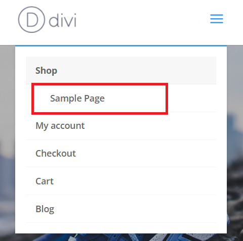
Divi Mobile Menu Submenu Child Links
CSS Selector for editing the Mobile Menu Child Links
/*Divi mobile menu submenu links*/
.et_mobile_menu .menu-item-has-children li a {
    YOUR CSS HERE
    }
Styling Concepts for Divi Mobile Menu Submenu Child Links
Check out these suggestions for customizing the appearance of Divi’s mobile menu submenu links. You can apply these changes either as the default setting or activate them upon hovering. Simply insert the provided code snippets into the specified selector mentioned above. Feel free to personalize your mobile menu experience with these tweaks.
Adjusting The Spacing, Changing The Opacity (On Hover), Changing The Background Color (On Hover), Changing The Font Size, Changing The Link Color, Adding Letter Spacing, Adjusting The Border
padding: 10px 20px;
opacity: 1;
background: #ffffff;
font-size: 20px!important;
color: #2cba6c;
letter-spacing: 2px;
border-bottom: 2px solid #000000!important;
Conclusion:
In conclusion, this step-by-step guide empowers you to transform your Divi mobile menu into a unique and personalized masterpiece. By delving into the intricacies of CSS within the Menu module, you’ve gained the skills to redefine various elements, from the header and logo image to the dropdown menu, menu items, and submenu items.
Through this tutorial, you’ve learned to adjust colors, spacing, borders, and other stylistic elements, enabling you to create a mobile menu that not only aligns with your website’s aesthetics but also provides a seamless and visually appealing experience for your visitors.
Remember, each section of this guide breaks down a specific aspect of the mobile menu, making it easy for you to follow and understand. Whether you’re fine-tuning the header, adjusting the logo image, customizing the hamburger icon, or refining the dropdown menu, the power to craft a distinctive style is now in your hands.
So, go ahead, experiment with the provided CSS snippets, and let your creativity shine. Your Divi mobile menu is not just functional—it’s an extension of your brand, designed to leave a lasting impression on your audience. Happy styling!


0 Comments