Too often the blog is an overlooked element of a website’s design. We sometimes see beautiful homepages, about pages, portfolios, etc., but the blog is just the standard, out-of-the-box, blog. The standard Divi blog does look nice, but within a styled website it can look out of place. In this article we’ll take a look at a list of beautiful Divi blog examples for design inspiration.
These beautiful Divi blog page examples are in no particular order. Hang around until the end and you’ll see a bonus blog that shows what a touch of branded color can do.
1. Haris Cizmic
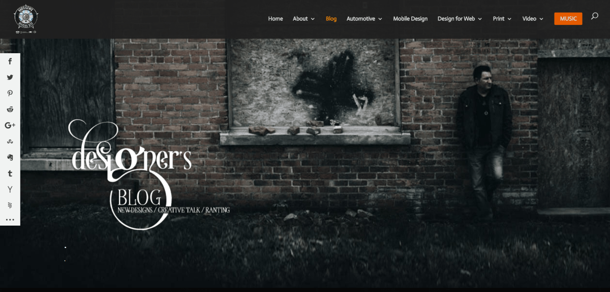
Haris Cizmic uses a full-screen image with a logo in an overlay in parallax. Scrolling reveals the blog in a three column layout. It uses a standard design for the posts but with no meta, and a read more link. The title and read more link are in orange. Rather than limiting the number of posts and using navigation, it displays them all (118 posts). The posts display over a black background.
2. Toula Boula
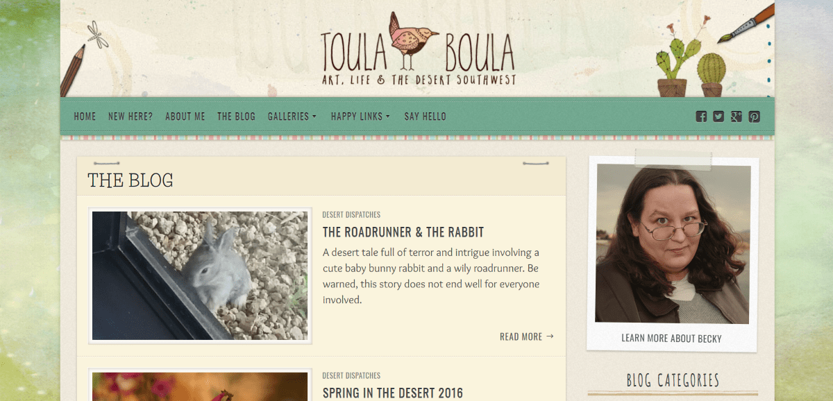
Toula Boula displays the posts horizontally in a single column layout with the image to one side and text on the other, placed within elements that look like paper stapled or taped to the background. None of this distracts from the content. The website background is watercolor. All of the colors match and blend perfectly.
3. Road to Quiet
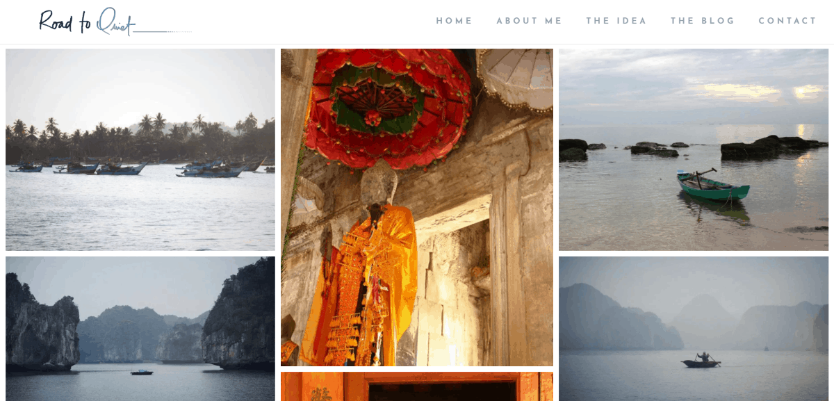
Road to Quiet displays an image mosaic as the blog’s header. Following this is a quote that leads into the blog section. Posts are displayed in a single column with large images. The post titles are centered at the bottom of the image with extra letter spacing followed by the post date. The hover overlays are white and light gray background is soothing.
4. Beyond Construction
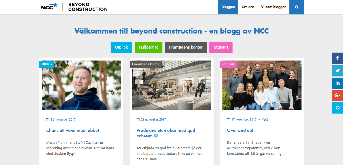
Beyond Construction uses a filtered blog with each category having its own color. The categories are placed at the top of each image. A green line separates the title from the excerpt. A green read more button with hover animation sits at the bottom of the blog card which blends with the color-branding of the website.
5. Live the Adventure
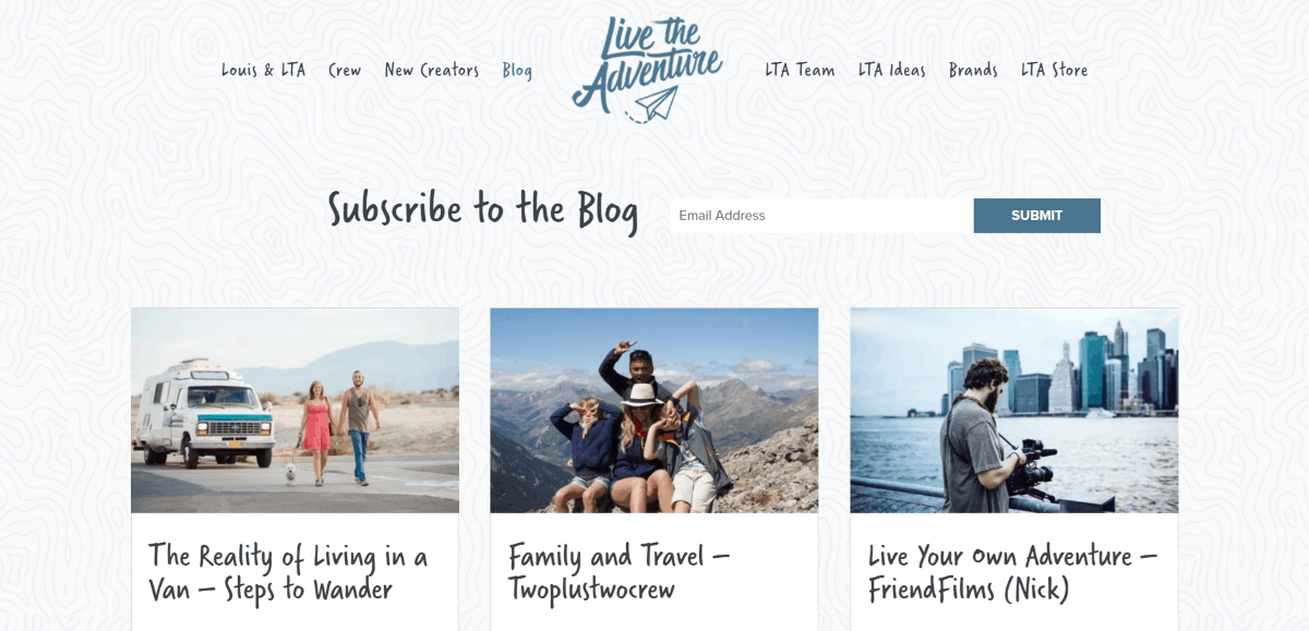
Live the Adventure displays a subscription form followed by the blog posts in three columns. The posts use standard styling, but with only the date for meta and a stylized font for the title. The posts are placed over a patterned background that’s used throughout the site.
6. Cat Townsend
Cat Townsend uses a full-screen header with tagline. Scrolling reveals large blocks with category titles in styled fonts followed by blog posts in a single column. The posts use large images, extra-large titles in a styled font, the post excerpt, and a read more link with the same color as the title. The blog section is placed over a light gray background. All of the images are in black and white and have a dark overlay.
7. The Girls Mean Business
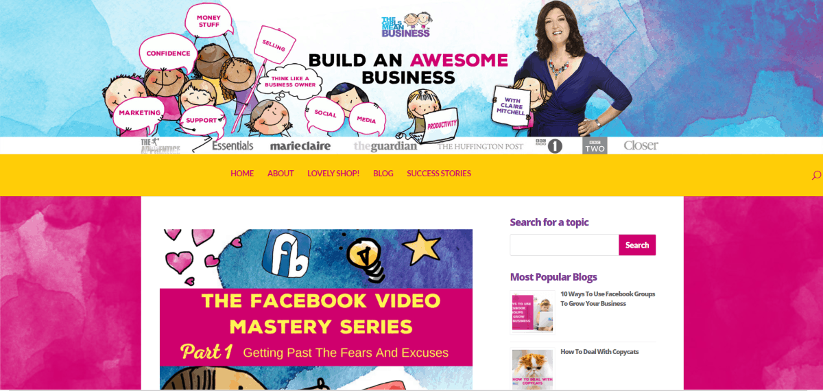
The Girls Mean Business is a blog that isn’t afraid of color. The header artwork and colors are designed perfectly to attract the target audience. The blog section uses a wide background with a bold watercolor pattern. Posts are displayed in a single column with a sidebar which includes a search box and the most popular posts. Post images use artwork that matches the site’s branding. Titles use the same color branding as the menu. The posts are divided by a dotted line.
8. Aforo Limitado
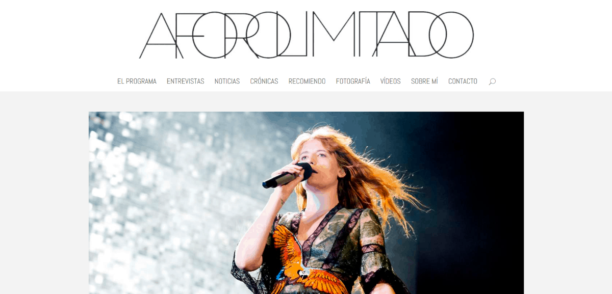
Aforo Limitado uses a post slider followed by social buttons and a post section in three columns with nine posts. The posts show the image and an area under the image with the title only, which is printed in red. It’s a minimal design that’s sharp and clean.
9. Phil Simon
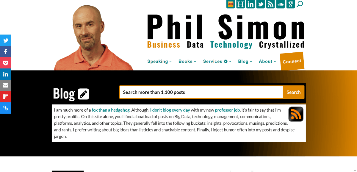
Phil Simon uses the website’s header, a search box, and a short blog description for the blog header. Posts are displayed in a single column with sidebar. The posts use a thumbnail image to the left side with text taking up most of the space. Large post titles are styled with dark green that matches the rest of the website. Navigation is styled to match. The sidebar displays a CTA and video along with recent posts, categories, etc., all against a white background.
Bonus: Divi Cake Blog
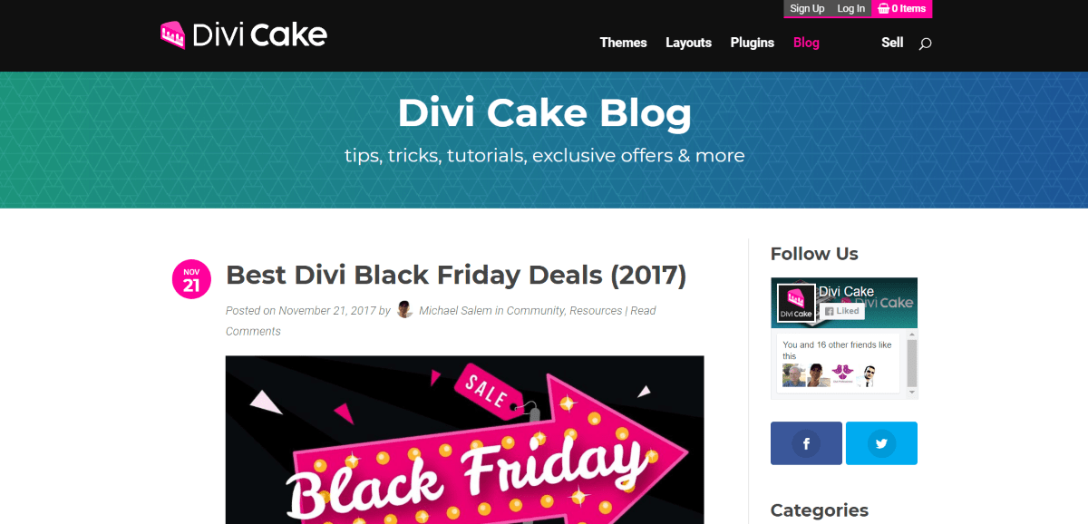
I included the Divi Cake blog because it’s a good example of using color branding and makes great use of sidebars. The header displays a gradient over a pattern. The posts are shown in single column with a sidebar. It displays the publish date in a medium-sized circle and has a large read more button – both in branded colors.
Ending Thoughts
These beautiful Divi blog examples (plus a bonus) are excellent examples of the types of designs that keep me coming back. They don’t clutter the text with flashy buttons, but they do give the blog some ‘pretty’ that makes them interesting or useful. I’m sure there’s enough in these blogs to provide some inspiration for your next Divi blog design.
We want to hear from you. Which of these 9 beautiful Divi blog examples is you favorite? Let us know in the comments.

0 Comments