Since Divi can be used to create practically any type of website, there are loads of examples of websites built with Divi to spark your imagination. In this article, we take a look at the 37 best Divi theme examples and websites created with the popular Divi theme. No matter the type of site you want to build, there is sure to be something in this list to help.
37 Best Divi Theme Examples (Updated 2019)
Below is a list of the 37 best Divi theme examples we were able to find from around the web. These websites had to stand out from the crowd, take Divi to the next level, and ultimately show off what you’re able to achieve with the Divi theme. If you’ve built a website with Divi and want us to consider adding it to this list of Divi them examples, let us know in the comments below.
1. RadAmBhf
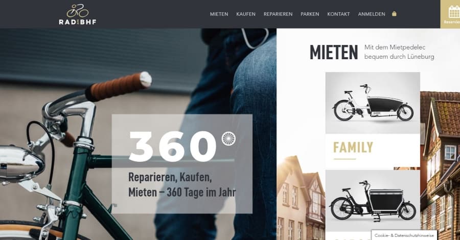
RadAmBhf adds a reservation CTA in the menu. The hero section includes a two-column split-screen with background images and products within overlays. The products show more information on hover. Services are shown as overlays within images and include elegant gold highlights that change on hover. Each of the following sections uses the gold highlights for titles and to indicate boxes that are mixed within the overlapping images. The gold looks great over both the white and the black backgrounds.
2. Bank Southern
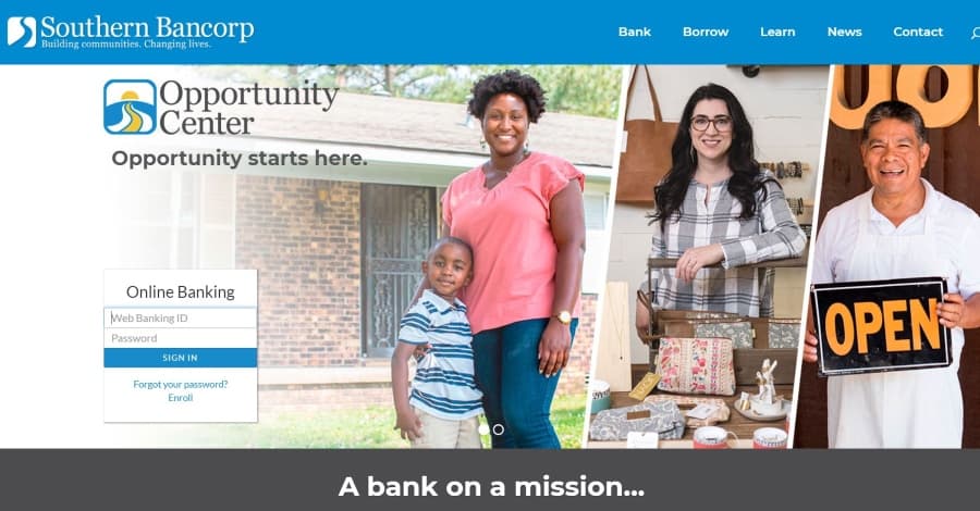
Bank Southern, one of the only Divi theme examples we were able to find of a bank, displays a full-width image slider with a tagline, CTA, and login. Information is presented within two columns at full-width and includes an image, buttons, text, and video. The menu displays links in three columns with one column standing apart with a border. The banking pages use images and toggles in two columns. Account comparisons are displayed in tables with hover animation. This is one of the only banks we’ve seen built with Divi, and it sure is a good one!
3. Ane Riel
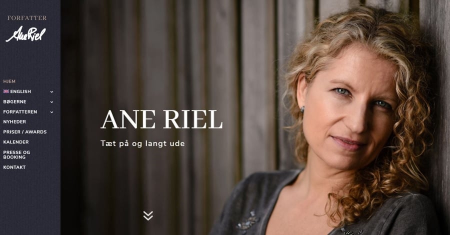
Ane Riel is an author’s website that focuses on books. The site includes a vertical menu that remains in place on scroll. The header includes a full-screen photo of the author with a title and down arrow. Scrolling reveals a couple of book sections in full-screen with the book cover, information, and button to purchase. An About section introduces the author. Following this is another book CTA, a blog section, and a three-column testimonial section. This site is a great example of displaying books for purchase.
4. In-Joy
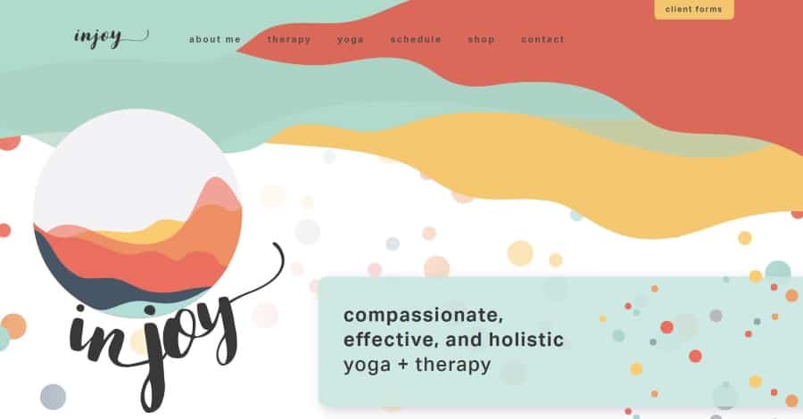
In-Joy is a great example of color-gone-wild in a good way. The color palette isn’t too flashy and doesn’t clash, but the patterns are eye-catching. Transparent blocks with gradients and titles serve as links to services. The large typography, fancy title fonts, images, and styled social icons fit well with the site’s design. The client forms button attached above the menu is a nice touch. If you’re interested in an example of using color patterns it will be difficult to find a better example than this one.
5. Doers
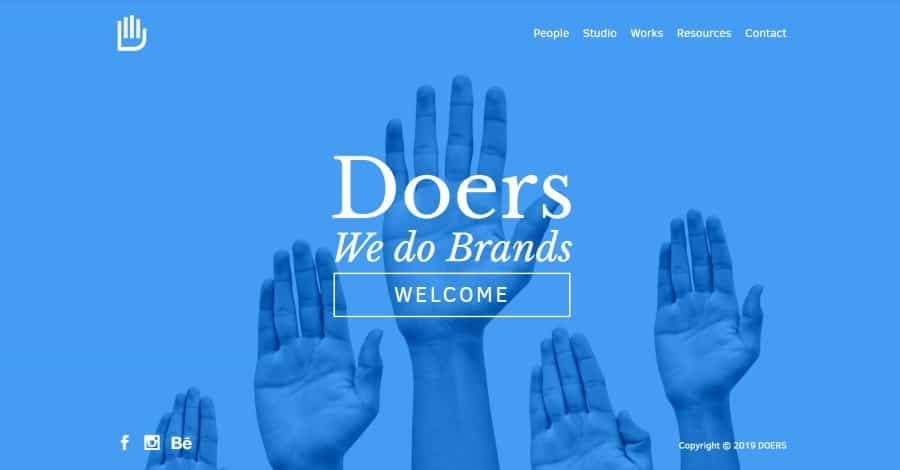
Doers uses a full-screen image with an overlay as the homepage. The overlay displays the name with a tagline and a button. The website uses a minimal design with animated icons that look like hand-drawn graphics and animated text. The blue color branding is used throughout the website. If you’re looking for a web studio built with Divi, this is an excellent Divi theme example.
6. Root of Life
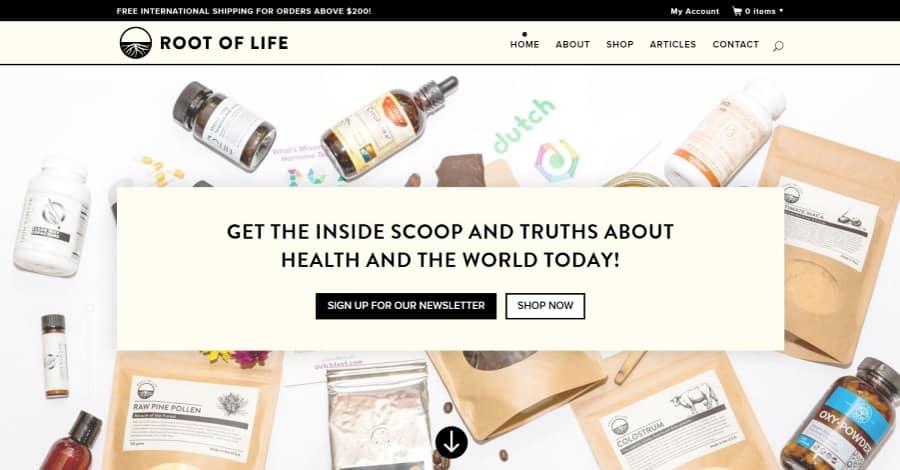
Root of Life uses a white background with cream highlights throughout the site. The header background image displays products and a CTA provides buttons to sign up for the newsletter and see the shop. The blog section is styled to match. The menu displays a dot over the link on hover. The shop uses a load more feature. The blog is filterable by category. Not many other Divi websites can compete with Root of Life when it comes to e-commerce websites built with Divi.
7. SM Graphics
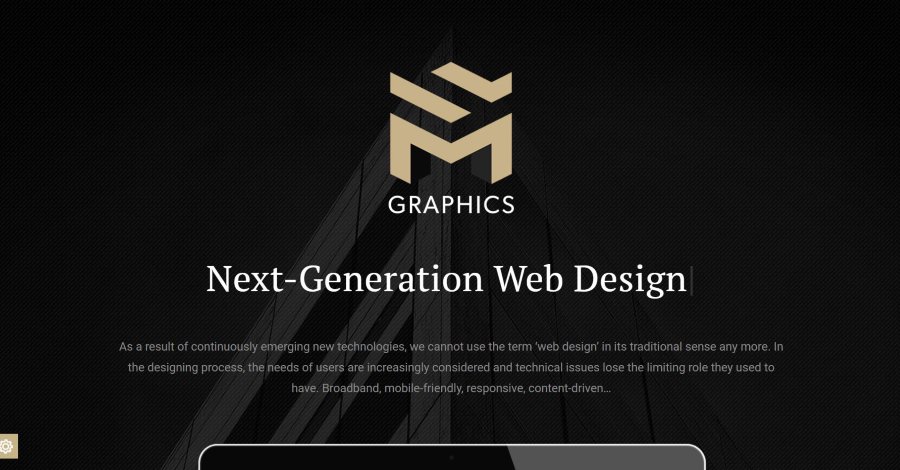
SM Graphics uses an elegant color palette of black, white, and gold. Gold is used for several section titles and icons. Work is displayed in a multi-column layout with hover animation and custom icons. Information is shown in an alternating pattern. The site has a clean layout and is an excellent example of parallax. If you’re looking for a design studio built with Divi, you’ll be hard pressed to find a better example.
8. Saint Benevolence
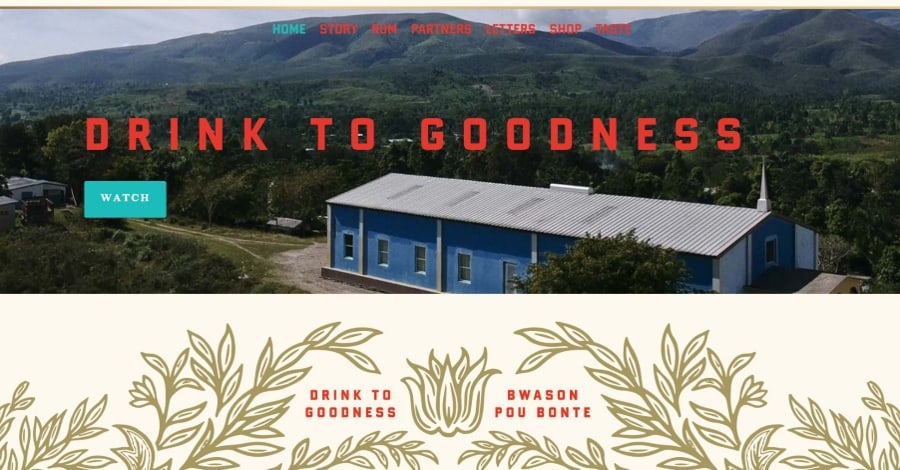
Saint Benevolence uses lots of tan backgrounds with large red fonts and gold floral patterns, all boxed in with a gold outline. Even the menu uses this color palette and pattern (the pattern is revealed on scroll). Scrolling reveals several sections with photos of the Caribbean with large blocks of text and CTA’s and a section with a photo of the product in parallax. This website is an excellent example of a simple design with only a few colors working well together.
9. Better Health by Heather
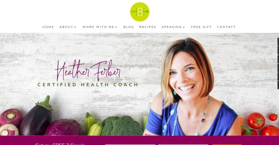
Better Health by Heather is a food blog with excellent photography and great use of color. The hero section includes a full-width image with a newsletter CTA in bold colors. An information section shows a CTA with the mission of the site. A services section shows images with a colored bar to one side and it’s separated from the previous section with a divider that shows the site’s logo. I like the testimonial section that includes a slider with the site’s branded bold colors. I also like the blog section that follows the same styling as the other images.
10. Woodyfule
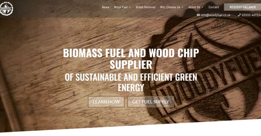
Woodyfuel uses a full-screen background video with section styling and buttons with hover animation which displays icons on opposite sides of the buttons. On scroll and CTA bar falls from one side from a vertical position to its horizontal position and then remains on the screen. Information boxes include hover animation. The color and fonts match the branding perfectly. The site includes a unique menu layout with CTA. Woodyfuel has a modern rustic feel that makes it stand out from the crowd.
11. Vet Plus
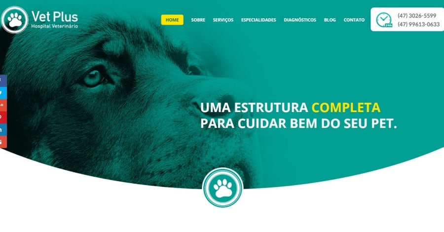
Vet Plus uses a unique layout with rounded section separators and overlapping icons. Background images use green overlays to match the branding. The menu highlights the current page in yellow and includes two phone numbers. The green and yellow branding are used throughout the site. This Divi site is a great example of how a veterinarian website should look.
12. Volume
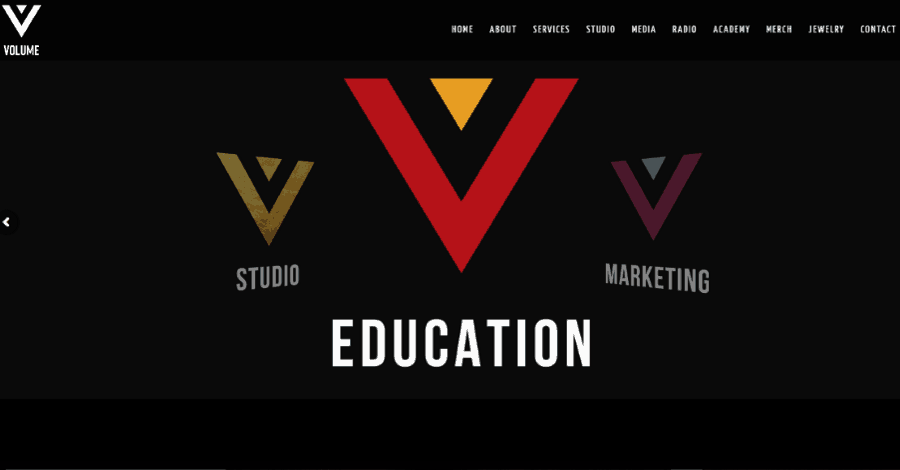
Volume has a unique header that rotates services. Scrolling reveals a full-screen information section with video and audio to highlight examples of services. Logos for awards are displayed in gold. Photos of singers are displayed within a full-width grid and include boxed styling and hover animation. If you’re looking for a unique website made in Divi, you just found it.
13. Andrew Kingslow
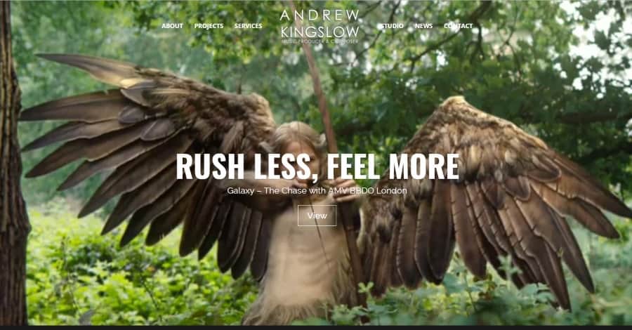
Andrew Kingslow uses a full-screen header that displays images with the Ken Burns effect, and video with a tagline and CTA. Blurbs overlap sections. Work is displayed in a three-column grid with hover animation. Loading icons display in 3D. The site makes excellent use of color. As far as Divi sites go, this is an excellent example with plenty of customizations.
14. BD’s Mongolian Grill
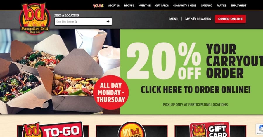
BD’s Mongolian Grill makes elegant use of large typography and a brown and red color palette. It includes lots of images to draw visitors into their call to action. It does have a lot of information within the menus, but it finds a way to present it so that it’s easy to follow. They even have a food menu for each location with a reservation system. This is one of the best restaurant designs that I’ve seen with Divi.
15. Vin Walker
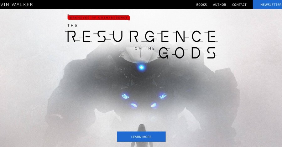
Vin Walker provides excellent proof that Divi is a great theme for authors. The slim menu provides a CTA that stands out while at the same time getting out of the way of the hero section which displays an almost full-screen CTA. Large single column sections show the novels, information about the author, and social follow links. If you’re looking for a good example of an author’s website made with Divi, look no further than this website.
16. Funk Engine Music
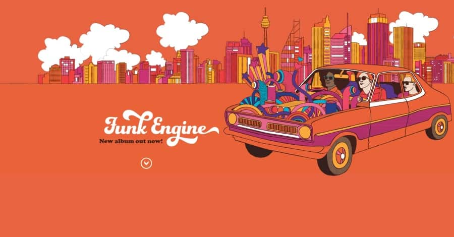
Funk Engine Music is a great example of how to make a one-page website to sell music. Styled images show the band members next to a write-up of their history along with a small testimonial slider. Styled audio players provide samples from the albums. Upcoming gigs are displayed within a table and include links to purchase tickets. The site makes great use of parallax and backgrounds with images from the studio. It’s hard to find a better one-page band website than this one.
17. Cruise Travel Outlet
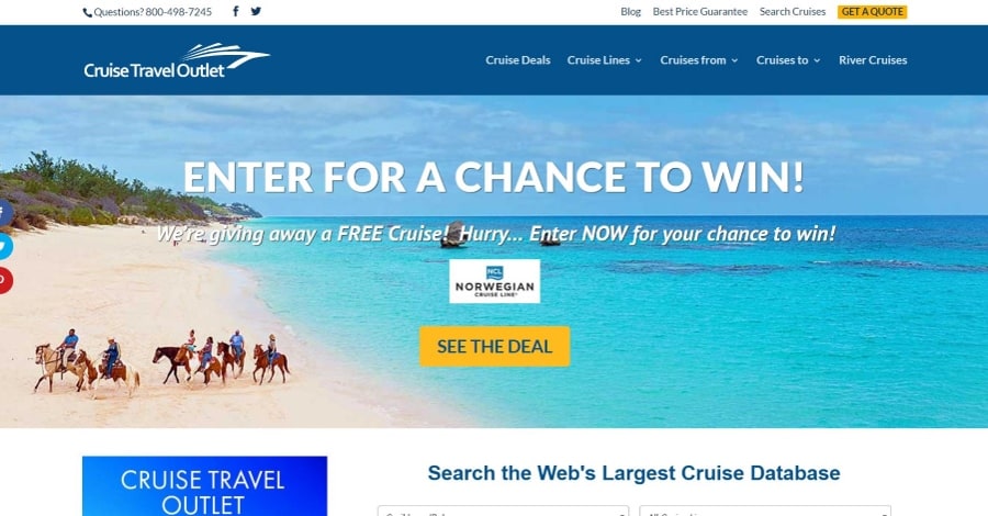
Cruise Travel Outlet makes elegant use of a gradient within the header. The header also includes tagline and CTA. A small slider shows featured deals. The secondary menu includes a CTA. The header overlay perfectly matches the yellow and blue branding that’s used throughout the site. This is a great example of a travel website built with Divi.
18. Colorstone
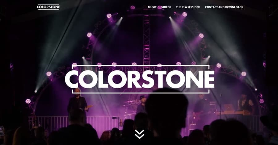
Colorstone is a great example of a multi-page band website. It displays a full-screen video of the band followed by three large blocks of color with extra-large social follow icons. Each band member is displayed within a full-width section with a solid color background, large typography, and a large image with shadow effects. The YLA Sessions page includes audio players with images. Embedded videos use shadow effects and look amazing over the orange backgrounds. This site makes great use of color and is easily one of the best band websites on the net.
19. Real Coaching Co
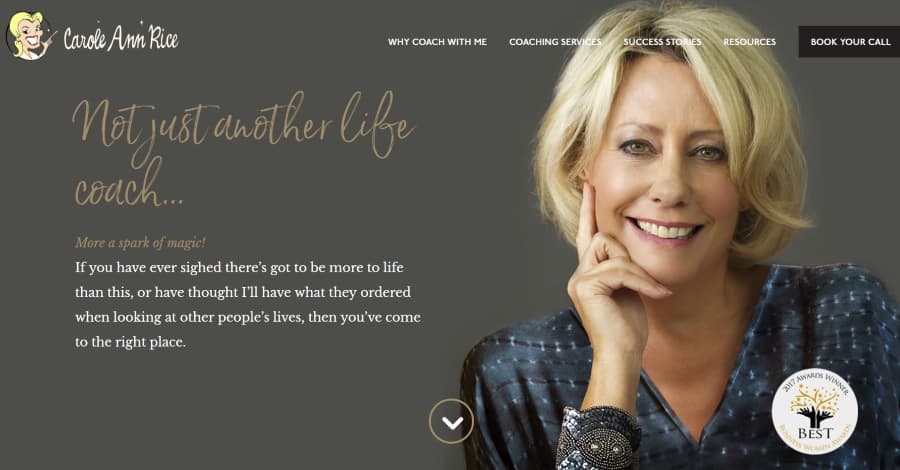
Real Coaching Co is an excellent example of how to use large hand-written fonts with elegant color backgrounds. A hero section shows the title in a gold scripted font, tagline, and a sentence of description next to a large image over a brownish-gray background. Sections alternate between solid white backgrounds and images with dark overlays and the gold fonts look great with each of them. The mega menu uses white and gold fonts against a black background. Services are displayed with styled blurbs. If you’re looking for a great example of a coaching website you’ve found it.
20. CODECRATER

CODECRATER makes elegant use of gradient overlays. Information is displayed in five columns on the home page. The CTA’s are in the form of large blue buttons, which stand out throughout the home page and within the secondary menu. The website also uses a unique dot navigation styling. The “What We Do” page uses elegantly styled toggles to display their services. The portfolio page displays work in two columns with an image, description, and link. This is a great example of a small web agency created with the Divi theme.
21. Cura Brazil

Cura Brazil uses flat design with lots of bright colors. Scrolling past the hero section reveals a video background with wavy section separations followed by an interesting section with the sun and text in parallax over skyscrapers in a flat design. Even the bar counters use the bold colors found throughout the website. A simple CTA displays four blocks of color with angled sides. A donate bar remains at the bottom of the screen with a button that slowly changes color. This website is an excellent example of flat design and bold colors.
22. Hailey Sault
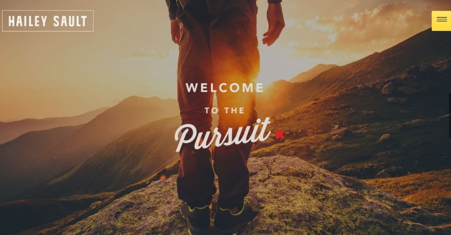
Hailey Sault displays a full-screen video background with messages. The hero section remains in place as the next section scrolls over it to reveal a large CTA in parallax over a background image. The next section is my favorite though – it’s a blog section in two columns with large images and no space between them. A large yellow CTA stands out while matching the highlights of the website. Extra-large social icons are displayed wall-to-wall in three columns. This site’s an excellent example of color and layout design.
23. On the Agenda
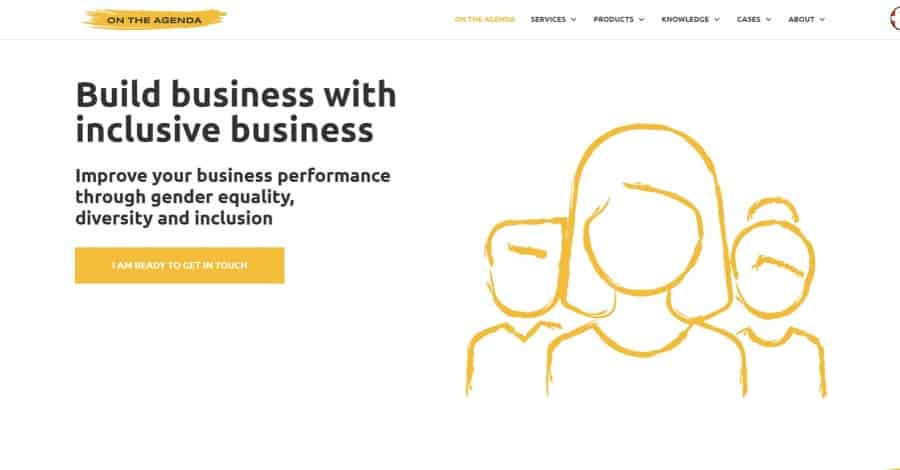
On the Agenda uses a lot of white space and simple graphics in bold yellow over white backgrounds, or in black over yellow or gray backgrounds. The graphics and sections look like they were hand painted with a brush. The yellow and gray sections were painted over the white and still has white showing through or separating them. All of the sections use a two-column layout and most have simple CTAs to learn more or get in touch. The site makes elegant use of color.
24. The Blog Creative
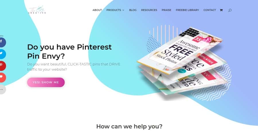
The Blog Creative has some interesting animated backgrounds behind the header and several of the sections throughout the site. The backgrounds are bubbles, or the entire section’s background, that moves- creating a pulsing or waving design. The site makes great use of soft colors to appeal to its primary audience. Blurbs use the same soft colors within their multi-colored icons. I like the blog section with elegant featured images. A CTA with bold colors stands apart from the rest of the site and overlaps two sections.
25. Checkerboard
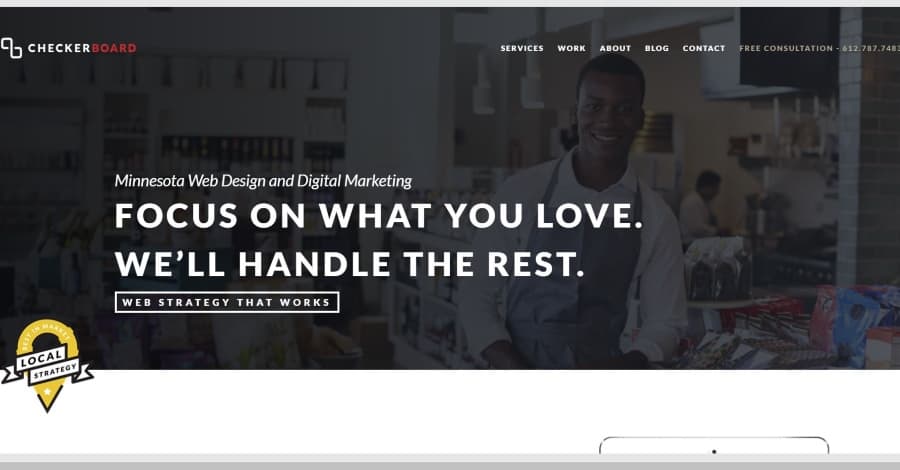
Checkerboard has a unique scroll feature that shows information in and around a tablet screen. It includes a two-column section with information on one side and the tablet on the other. As you scroll, the tablet remains in place while the text in the other column scrolls. The graphics on and around the tablet changes to match the text for the current section. All of the sections with text include a link to see more information. Once you’ve scrolled past the text the tablet will scroll away, revealing a full-screen of projects and case studies.
26. Cock and Bull Festival
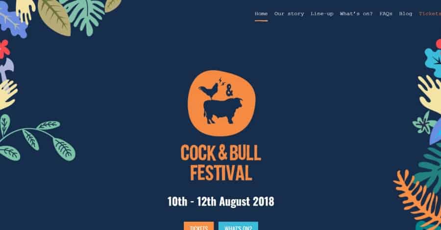
Cock and Bull Festival uses a deep blue background with lots of brightly colored flat graphics to decorate the sides of the site. The graphics, logo, and titles look hand-drawn. The header shows the logo with two CTAs followed by information and an embedded video. I love the next section which shows the information with images that have thick borders, which create a multi-column layout. The images zoom on hover. The newsletter form also looks hand drawn and includes two shades of green. I also like the footer that shows people in silhouette. This site makes excellent use of color.
27. Byte Stand
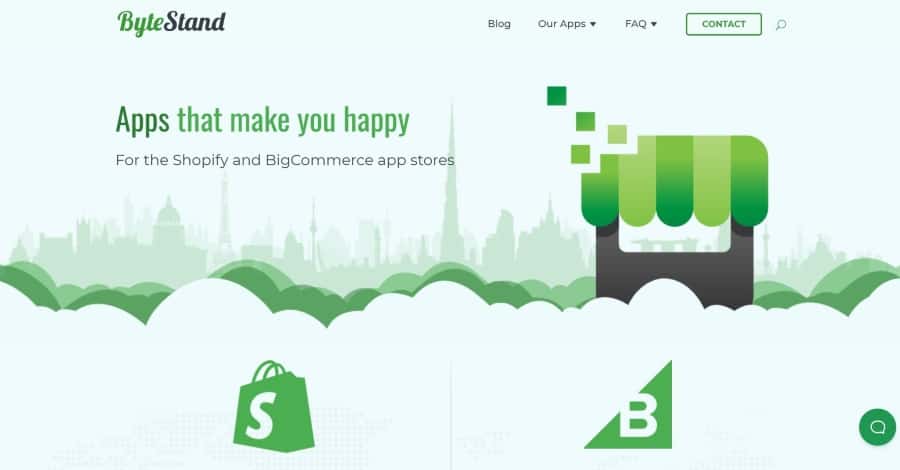
Byte Stand makes interesting use of green as highlights throughout the site. Two or more shades of green help create clouds, blocks of colored backgrounds, the background of meta descriptions for the blog posts, the contact CTA, and the graphics in the footer. The branded green is also used in the titles and graphics for blurbs. I especially like the newsletter form and the FAQ section that includes three different layers of color and overlapping clouds. The site makes excellent use of graphics.
28. Diamond Logistics
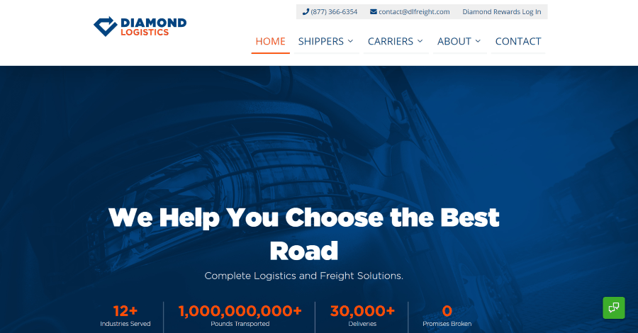
Diamond Logistics uses an interesting header with an oversized primary menu. The secondary menu is placed to the right, and the logo overlaps them. The hero section displays a large tagline with numbered stats over a full-screen image with a dark overlay. Blurbs overlap the next section to provide links to the services. A CTA with a thick border shows a map in the background that shows just enough through to see it. This is also used in the contact section. The testimonial slider shows quotes in the background that help describe the section visually. I love the use of color and typography in this website.
29. Contmar
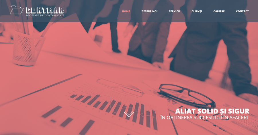
Contmar displays a full-screen background image with a branded red that appears throughout the site within overlays, in the menu, for the title text, and in button backgrounds. A full-width section shows a tagline with large text. Services are shown in blurbs with circled images. Numbered stats with large text are shown stacked within a section next to an image. Other pages follow similar styling with large blocks of color and alternating layouts, while the services page places information within cascading bullets over large blocks of color. This site makes great use of color and typography.
30. Walk on Kunanyi
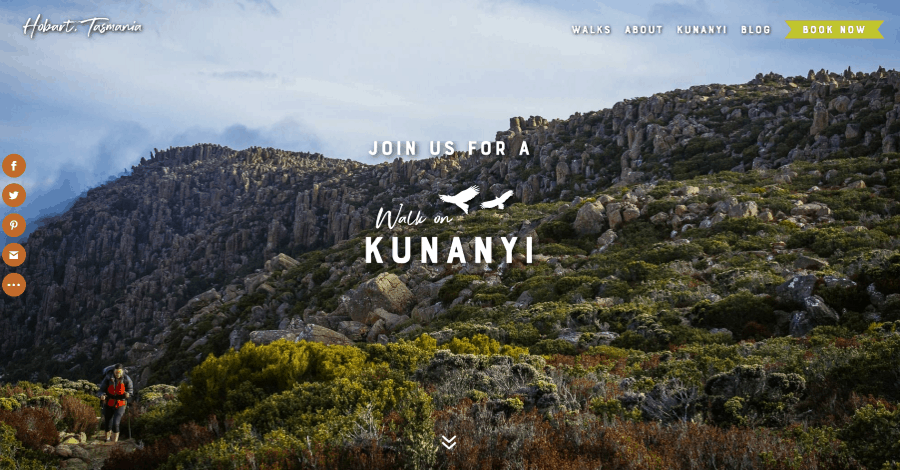
Walk on Kunanyi displays a full-screen image with the logo in the center and a CTA in the menu that includes a nice shadow for the text on hover. Other buttons throughout the site follow this same design. Scrolling reveals a section with company information followed by a two-column section with images, information, and buttons for each of the walks. Another full-screen image introduces a section of benefits that includes images and buttons. Scripted fonts are used for titles of each of the sections as well as blog posts, titles for the walks, and calls to action. The pages for the walks include an embedded video and a booking system.
31. Intersection for the Arts
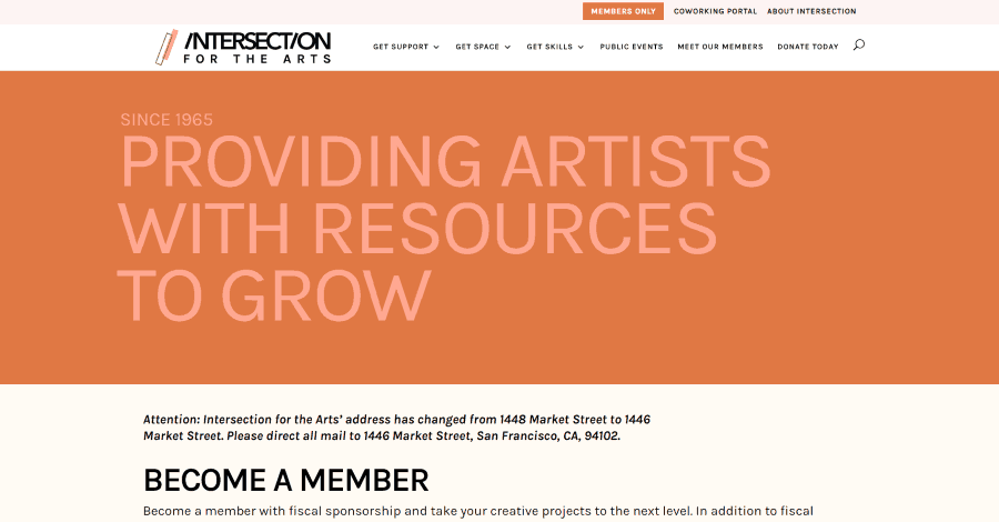
Intersection for the Arts uses various shades of orange, brown, and tan for background colors and fonts, starting with the large block of color for with a tagline to describe the website. The next section provides information with a CTA. Several sections use squiggly lines that go halfway across the screen. Blurbs display information with a blobish background pattern to give it some texture. A two-column section about the members shows the number with a diagonal divider that separates it from the testimonial slider. Embedded social media feeds are placed within tabs next to upcoming events. This site makes interesting use of color.
32. Frauflex
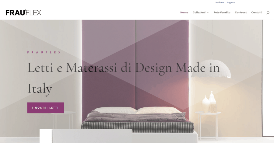
Frauflex is a multi-lingual site that uses lots of images and background patterns to create interesting visuals starting with the very first image which includes a tagline and CTA. The next section includes an image that overlaps the first one and adds information about the company. Collections are shown with images with styled borders. I like the contact CTA that uses a full-width image with a diagonal pattern. Another section shows a set of images of various sizes over a similar pattern that overlaps each other and includes different levels of blur. An Instagram section includes a masonry gallery with lazy loading. The collections pages use lots of sliders and overlapping images with wide borders.
33. Ayotte Dental
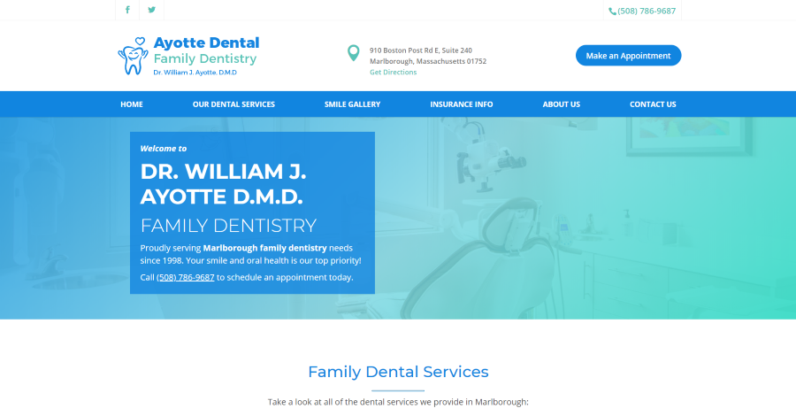
Ayotte Dental has an interesting contact section above the primary menu. It includes the logo, contact info with a button to get directions, and a CTA to make an appointment. Above this is a secondary menu with a clickable call link. The menu places lots of space between the links to give it a unique look. Under this is a full-width image with a blue/green gradient and a welcome message in the overlay with a clickable call link. Services are displayed with an image in the center and links to each of the services on both sides. Logos display payment options. It also includes a full-width CTA and a detailed footer with lots of links and information.
34. Life Hub
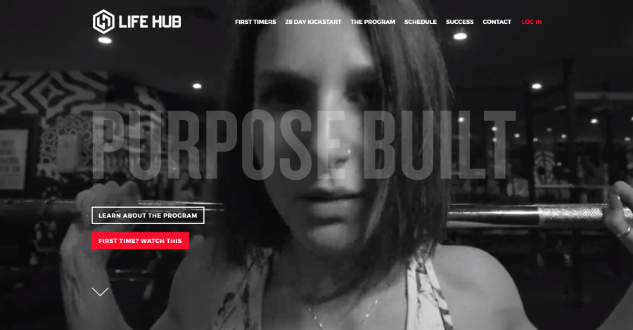
Life Hub plays a full-screen video in the background and shows large text in the center that allows the video to show through. The overlay also includes a CTA to learn more about the program and button to see a video. A down arrow sits on the left under the buttons. Scrolling shows more large text that’s outlined to create a tagline. This section also includes a CTA and blurbs in white over a black background. A ticker sits under this that shows scrolling white text over a red background that changes to black over white on hover. It also includes a styled contact form, about section with a link to see the coaches and another ticker, media logos, and an embedded Instagram feed.
35. JoJo Cooper
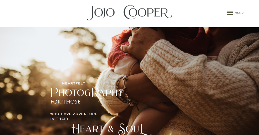
JoJo Cooper displays a large logo in the center of the header with a labeled hamburger menu to the right. The full-screen image shows an example of photography and includes the tagline in an elegant font in multiple sizes and placements. A section of information shows a tagline in a larger font and text to one side with an image overlapping the background on the other. A booking CTA shows an image to one side and text in the other using several different fonts that work perfectly together. Another section has a full-screen background in true parallax with information and includes a title that overlaps the previous section. Overlapping this is a section with an image on one side and a CTA on the other. It also includes a styled blog, download CTA, and custom footer.
36. Bio Bausewein
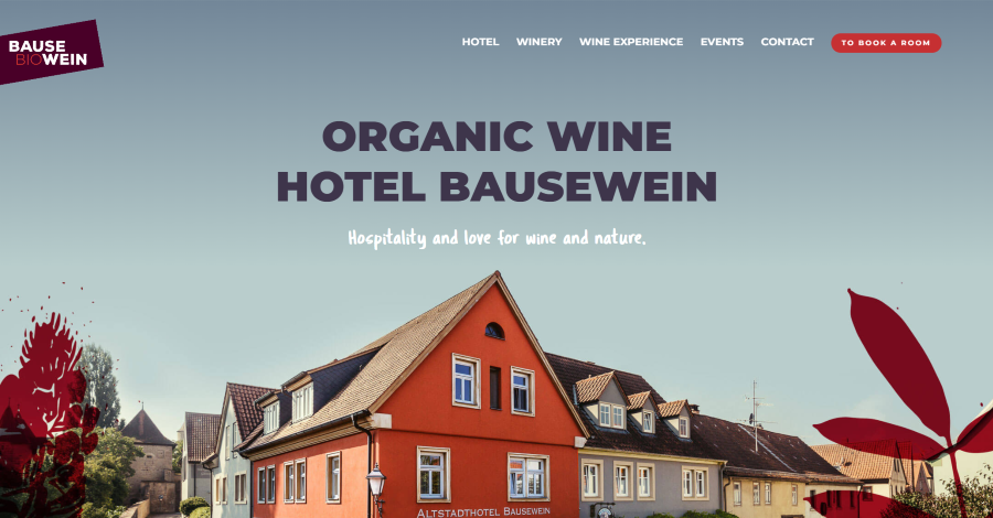
Bio Bausewein displays a full-screen image with a title, tagline, and graphics. The logo is placed over an angled block of color. The menu includes a CTA. Similar graphics in the hero section make their appearance on the edges of the screen throughout the site. The next section is a two-column set of CTAs. Both place text in a red or orange overlay over a background pattern. The site also includes a full-width testimonial, blurbs that link to pages, and a full-screen image of the team members with text modules overlapping them and the next section, which is a custom footer with contact info. All of the pages use lots of large photos and dark but bold colors.
37. Wwf-Scp
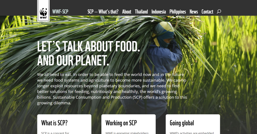
WWF-SCP displays a full-screen background image with an overlapping logo at the top and overlapping blurbs at the bottom. The large title text types onto the screen as the page loads. Locations are shown on a map to one side, taking most of the screen, with text on the other. Information about locations is provided in styled blurbs with large buttons over the images that change color on hover. Another full-screen image displays text in an overlay with overlapping blurbs to show services and lead to a contact CTA. It also includes circle counters with a CTA to learn more and a custom footer with links. The menu includes hover animations. The site uses lots of light green and bold orange.
Also, check our Extra theme examples blog post to see some amazing websites built with the Extra theme.
Ending Thoughts
These Divi theme website examples are simply beaming with inspiration. The next time you’re looking for design inspirations, these outstanding Divi theme examples are sure to spark your imagination.
What’s your favorite of these Divi theme examples? Let us know in the comments.


0 Comments