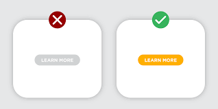
CTA buttons are clear and concise messages that tell visitors exactly what you want them to do. Whether it’s subscribing to your newsletter, downloading an ebook, making a purchase, or even just exploring another page, your CTA acts as a guide, encouraging them to take the next step on their journey.
Why is Call-To-Action (CTAs) Important?
Here’s why CTAs are crucial for your website:
- Increased Engagement: A well-crafted CTA prevents visitors from feeling lost or confused. It tells them what you want them to do next, keeping them engaged and moving through your website.
- Boosted Conversions: By guiding visitors towards desired actions, you increase the chance of them taking that crucial step, whether it’s signing up for your email list or making a purchase.
- Enhanced User Experience: A clear and easy-to-understand CTA contributes in creating a positive overall user experience on your website.
In short, CTAs are powerful tools that tell your visitors what you want them to do next. They encourage engagement, boost conversions, and ultimately contribute to the success of your website. In the following sections, we’ll delve deeper into how to create effective CTAs using the power and flexibility of Divi!
Read more: 6 Divi Call to Actions to Skyrocket Conversions
Read more: Divi Footer Design: 6 Best-Practicing Tips for a User-Friendly Design
How Divi helps create effective CTAs
Divi, the popular drag-and-drop website builder, empowers you to create high-converting CTAs with ease. Here’s how:
- Visually stunning designs: Choose from a variety of pre-designed buttons or create your own with Divi’s intuitive interface.
- Flexibility and customization: Tailor every aspect of your CTA, from colors and Divi Fonts+Typyography to hover effects and the Divi animation builder!
- Responsive design: Ensure your CTAs look perfect and function flawlessly on all devices, from desktops to mobiles.
- A/B testing options: Experiment with different CTA variations to see what resonates best with your audience.
- Seamless integration with other Divi modules: Combine CTAs with other elements like forms, pop-ups, and email opt-in forms for a cohesive user experience.
With Divi, you’re not limited to basic buttons. You can craft CTAs that are not only visually appealing but also strategically placed and packed with persuasive messaging.
Read more: A Look at Divi’s New Global Color System
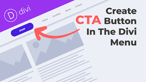
Creating Your First CTA with Divi: A Step-by-Step Guide
Now that we’ve covered the fundamental principles of effective CTA design, let’s get hands-on and create your first CTA button using Divi. We’ll start with a basic example and then explore customization options in later sections.
Step 1: Add the Divi Call to Action Module
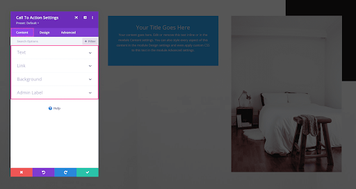
- Open your Divi page in Visual Builder.
- Locate the section where you want to place your CTA.
- Click the grey “+” icon within the desired row.
- Search for “Call to Action” in the module library and add it to the row
Step 2: Craft Your CTA Text
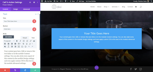
- In the “Title” field, enter the main text of your button. Be clear, concise, and use an action verb.
- (Optional) In the “Body” field, add a short description below the button if needed.
- In the “Button” field, enter the text for your button. Keep it short and benefit-driven.
Step 3: Configure Button Design
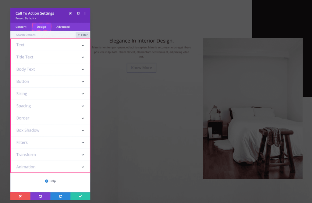
Under the “Design” tab, explore the various options to customize the button’s appearance:
- Font: Choose a font that aligns with your brand and design.
- Color: Select a button color that stands out and aligns with your brand.
- Hover Color: Define a different color for when users hover over the button.
- Border: Choose a border style and color if desired.
- Size: Adjust the button size to ensure it’s visible and clickable.
- Spacing: Set padding and margin values to fine-tune the button’s placement.
Step 4: Set Button Link
- Under the “Link” tab, click “Button URL” and choose the desired action when users click:
- Link to an internal page on your website.
- Link to an external website.
- Collect email addresses with an email opt-in form.
Step 5: Save and Preview
- Click “Save” to finalize your CTA settings.
- Use the Divi previewer to see how your CTA looks on different devices.
Congratulations! You’ve created your first CTA button with Divi. Remember, this is just a basic example. In the next sections, we’ll explore various ways to customize your CTAs for maximum impact!
Read more: Divi Modules Ultimate List
Optimizing CTA Placement: Guiding Users Toward Action
Creating visually appealing and message-driven CTAs is just one piece of the puzzle. To truly maximize their effectiveness, you need to strategically place them where users are most likely to see and click. Here are some key principles to guide your CTA placement strategy:
Above the Fold:
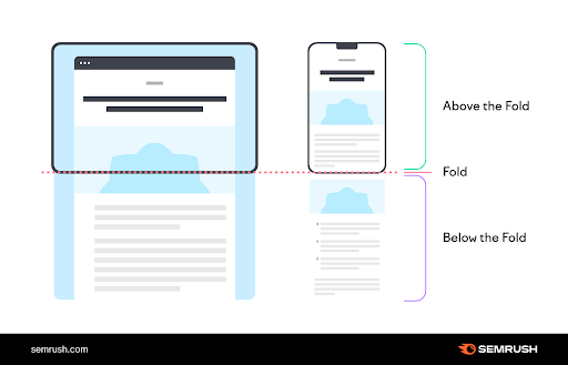
First impressions matter. Capture attention early on by placing a prominent CTA within the visible area of your page (above the fold) before users need to scroll. This is ideal for generating quick actions like subscribing to your newsletter or downloading an ebook.
End of Content:
Reinforce your message and next steps by placing a clear CTA at the end of your content. Summarize the key takeaway and use the CTA to guide users toward the desired action, whether it’s making a purchase, visiting another page, or contacting you.
Strategic Pop-ups:
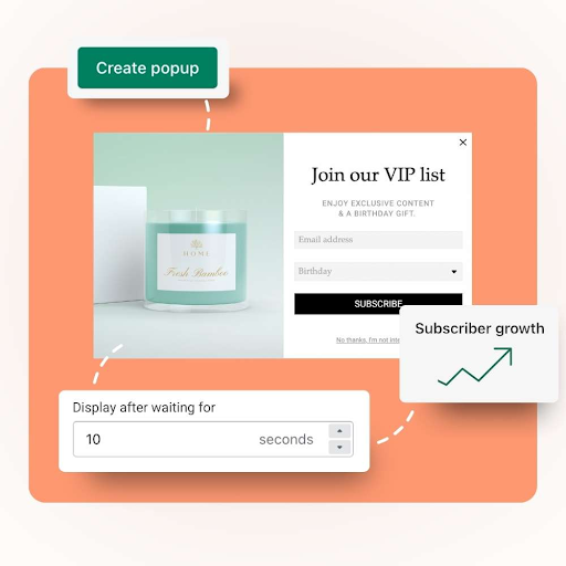
While pop-ups for Divi can be intrusive if used excessively, they can be effective tools for capturing leads or promoting special offers. Use them responsibly and sparingly, targeting relevant segments of your audience with offers they’re likely to find valuable.
Consider User Flow:
Think about the natural flow of your website and guide users towards your CTAs organically. For example, after an engaging blog post, consider placing a CTA for a related product or service nearby. Ensure your CTAs don’t interrupt the user’s journey but rather complement it seamlessly.
Call to Action Throughout the Site:
Don’t limit your CTA strategy to specific pages. Explore opportunities to embed calls to action across various sections of your website, from your header and footer to product pages and blog posts. Every potential touchpoint is an opportunity to encourage engagement.
Remember: There’s no one-size-fits-all solution for CTA placement. Experiment with different locations and track your results to identify what resonates best with your audience and aligns with your specific goals.
Read more: 20 Unique Divi Header and Footer Layout Design Packs in 2024
Read more: Creating Blog Posts and Blog Pages Using Divi
Advanced Techniques for Divi CTA Mastery: Beyond the Basics
Now that you’ve mastered the fundamentals of creating and strategically placing effective CTAs with Divi, let’s unlock the true potential of your calls to action by exploring some advanced techniques:
A/B Testing for Data-Driven Optimization:
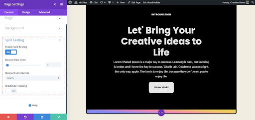
Stop guessing and start knowing! A/B testing allows you to compare different versions of your CTA and see which one performs better with your audience. This data-driven approach helps you optimize your CTAs for maximum impact. Divi offers built-in A/B testing features, or you can utilize third-party plugins for even more granular control.
Here are some elements you can A/B test:
- CTA text: Compare different button messages and see which one drives more clicks.
- Button design: Experiment with color, size, and style to find the most visually appealing option.
- Button placement: Test different locations on your page to see where users are most likely to engage.
- Call to action type: Compare different types of CTAs, such as text links vs. buttons, to see which performs better.
Remember, A/B testing is an ongoing process. Keep testing and iterating to continuously improve your CTA performance.
Conclusion:
As you’ve journeyed through this guide, you’ve explored the fundamentals of crafting effective CTAs with Divi, from clear and concise text to strategic placement and visually appealing design. You’ve also delved into advanced techniques like A/B testing, CSS Hero, and third-party plugins, unlocking even greater potential for maximizing your calls to action.
Remember:
- Focus on clarity and action: Keep your CTA text clear, concise, and action-oriented. Highlight the benefits users gain by clicking.
- Design for impact: Choose visually appealing colors, sizes, and styles that stand out and attract attention. Ensure seamless mobile responsiveness.
- Place strategically: Guide users toward your CTAs naturally by considering user flow and placement opportunities throughout your website.
- Test and iterate: A/B testing is your friend! Continuously experiment and optimize based on data to find what resonates best with your audience.
By following these principles and exploring the advanced techniques covered, you’re well on your way to CTA mastery. Remember, this is an ongoing journey. Keep learning, experimenting, and optimizing your CTAs to unlock their full potential and transform your website into a conversion machine!
Read more: https://divicake.com/go/css-hero/


0 Comments