Ever faced the challenge of designing a captivating layout with the Divi Theme Builder, only to realize the need for a stylish sidebar menu? In this tutorial, we will show you how to make a fixed and collapsible Divi sidebar menu for your Theme Builder template. Without any more delay, let’s jump right in and get started!
Placing the Menu Module in a Theme Builder Template
Imagine you’re designing a webpage using Theme Builder. You’ve got this cool Menu module, right? Try placing it in a small column next to another module in a wider column. It’s like giving your webpage a fresh, stylish look! I’ll show you how to do it step by step, even if you’re not super tech-savvy.
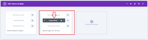
Placing the Menu Module in a Theme Builder Template
Enhance your webpage design by placing the Menu Module in a Theme Builder Template for a seamless and stylish user experience!
Add A Custom CSS Class To The Menu
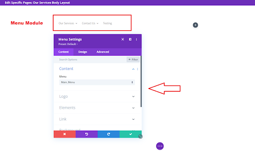
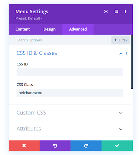
To start off, we need to customize the menu module by adding a special CSS class. This ensures that the changes we make only affect this specific module on your site. Here’s how you do it: open the settings of your Divi Menu module, go to the Advanced tab, and look for the CSS IDs & Classes toggle. In the CSS Class input field, type “sidebar-menu” and you’re good to go! Let’s keep moving forward.
Add A Custom CSS Class To The Menu
Add Some CSS To Adjust The Styling of The Divi Sidebar Menu
Now, let’s move on to the next step – adding some CSS code that does most of the work. This code is important because it hides the desktop menu and brings in the mobile menu, which is necessary because they’re quite different. We want to use the mobile menu to create the effect we’re looking for. The code also helps in adjusting the style of the menu.
A key part of the code sets a maximum height for the menu and allows for overflow. In simple terms, this means that as the menu’s content – like links and submenus – gets longer, the menu will show a scrollbar, letting you scroll through it. You can change or remove this if you want. The code also takes care of making the scrollbar look nice. Paste this code in your Divi>Theme Options>Custom CSS code box. Take a look at the labeled snippets, each providing a glimpse into its purpose.
Copy the code from here
Read More: Divi Logo Guide: Resize, Reset, and Style Like a Pro
Add Some JQuery To Collapse The Divi Menu Submenus
The goal here is to transform the dull, extended list of the Divi menu into a sleek and compact one. Achieving this involves incorporating some jQuery and CSS code. This not only condenses the mobile Divi menu submenu but also introduces stylish toggles. These toggles serve as visual cues, letting users know there’s more content to explore and indicating where to click. Our tutorial unfolds in two parts, each focusing on a specific type of code. Both parts work in harmony, and you’ll need both to make it all come together. Ready to enhance your mobile menu’s look and feel? Let’s dive into the details! Paste this code in your Divi>Theme Options>Integrations tab in the “Add code to the < head > of your blog” code area.
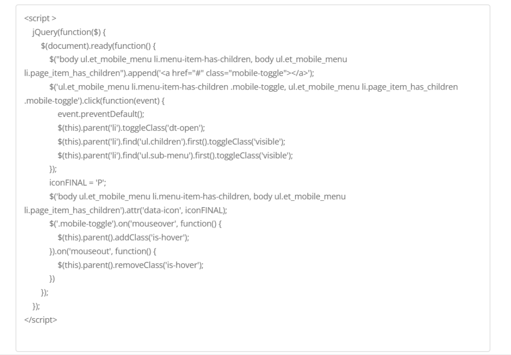
Note: Please Click on the image above to copy the JQuery Code
Read More: What is Divi – Divi WordPress Theme & Visual Page Builder
Add Some CSS To Collapse The Divi Menu Submenus
The next step is to add the corresponding CSS code. This code works alongside the jQuery, and together they create the Divi mobile menu collapse effect. paste this code in your Divi>Theme Options>Custom CSS code box.
Copy the code from here
Final Thoughts:
In wrapping up our journey on creating a fixed and collapsible Divi sidebar menu, you’ve learned how to elevate your website design using the Divi Theme Builder. Tackling the challenge of integrating a stylish sidebar menu into your Theme Builder template, we navigated through the steps seamlessly.
By strategically placing the Menu module in a narrow column, we gave your webpage a fresh and stylish appearance. Even if you’re not tech-savvy, I broke down the process, making it easy for you to follow along.
Adding a custom CSS class to the menu was the first step, ensuring our modifications only affected this specific module. Adding CSS code later on was really important because it changed how the Divi sidebar menu looks. Noteworthy features like a scrollbar with a customizable appearance were seamlessly integrated.
Next, we delved into the world of jQuery and CSS to achieve the transformation of the Divi mobile menu into a sleek and compact version. The addition of stylish toggles provided visual cues to users, indicating the presence of more content and where to explore further.
As a finishing touch, we applied CSS to collapse the Divi menu submenus, enhancing the overall user experience. The code snippets provided in this tutorial work together harmoniously, ensuring a cohesive and effective implementation.
So, with your newfound knowledge and a creatively enhanced menu, you’re well-equipped to take your website design to the next level. Embrace these techniques and witness the transformation of your Divi sidebar menu in action. Happy designing!
Read More: Is Divi Good for SEO: Myths, Realities, and Best Practices


0 Comments