Many Divi web designers rely on the Divi Blurb module for their projects. However, it can be a bit confusing with its default content width set at only 550px. In this guide, we’ll walk you through a simple yet effective method to increase the Divi Blurb content width. Since this issue is a common challenge for Divi designers, we’re here to help you optimize the Divi Blurb module to its full potential.
Changing The Divi Blurb Content Width to 100%
Let’s start by clicking on the Divi Blurb module settings and then head over to the Design tab. In the Sizing toggle, you’ll see that the Content Width is set to 550px by default. As shown in the image below:
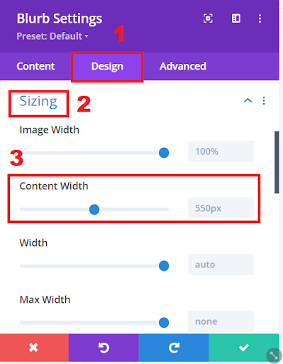
Divi Blurb Content Width
Just type 100% in the input field, and you’ll see the Blurb automatically extending to cover the entire width of its parent column or row.
Read More: Adding a Scroll Down Hover Effect in Divi Website – Step-by-Step Guide
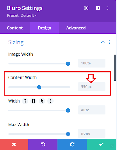
Changing the Blurb Content Width
As you resize the screen, you’ll see that the Divi Blurb adjusts smoothly without stretching uncomfortably to its maximum width. While you can choose any value that works for you, we find it most practical and prefer to set it to 100%.
Apply Style to Active Preset
To make this change across all your Blurb modules using the default preset, follow these steps: Right-click on the Content Width setting and choose Apply Style To Active Preset. This action will update every Blurb module and set the default content width to 100%.
Read More: How to Include a Scroll Down Button in Your Divi Website
Conclusion
Increasing the content width of the Divi Blurb module can significantly improve the visual appeal and responsiveness of your Divi-designed websites. By making a simple adjustment and setting the content width to 100%, you ensure that your Blurb elements gracefully adapt to different screen sizes without any awkward stretching. This user-friendly modification not only enhances the user experience but also aligns with best practices in web design.
Now, armed with this knowledge, you can confidently optimize your Divi Blurb modules and elevate the overall quality of your website projects. We hope you’ve found this tutorial valuable, and we invite you to share your thoughts and questions in the comments below. If you’ve enjoyed this guide, please consider subscribing, as we have more informative tutorials in the pipeline. Your feedback and support are greatly appreciated as we continue to explore and share the world of web design.
Read More: Fixing Divi Bugs: Effective Solutions and Troubleshooting


0 Comments