Gravity Divi Ultimate is a module for the Divi Builder that displays forms you’ve made with Gravity Forms. Since it’s a Divi module, you can style the form with Divi’s built-in styling tools. This plugin expands on and replaces the original, known as Gravity Divi Module, with new options and tons of styling features. It also lets you create a custom submission message. In this article, we’ll look at Gravity Divi Ultimate and see what it can do and help you decide if it’s the right forms plugin for your needs.
For my examples, I’m using the Gravity Forms demo, which allows you to upload Divi and any plugins you want to use to see how it works with Gravity Forms. You can create a free Gravity Forms demo on their demo page.
First, let’s look at the original plugin for comparison.
Original Gravity Divi Module
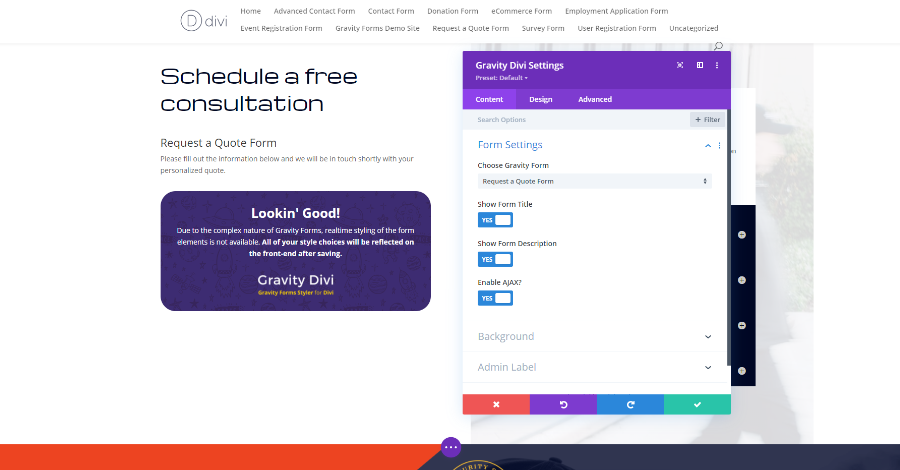
The original Gravity Divi Module includes options to choose the form to use, show the form title, description, and enable AJAX. The form doesn’t display within the Visual Builder, but you can see the title and description. It provides information about real-time styling and what to expect with the module.
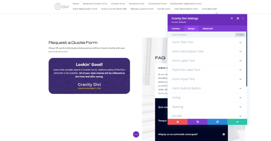
The design settings included the text for the title, description, label, sub label, input text, and submit button. I’ve styled the title and description in this example.
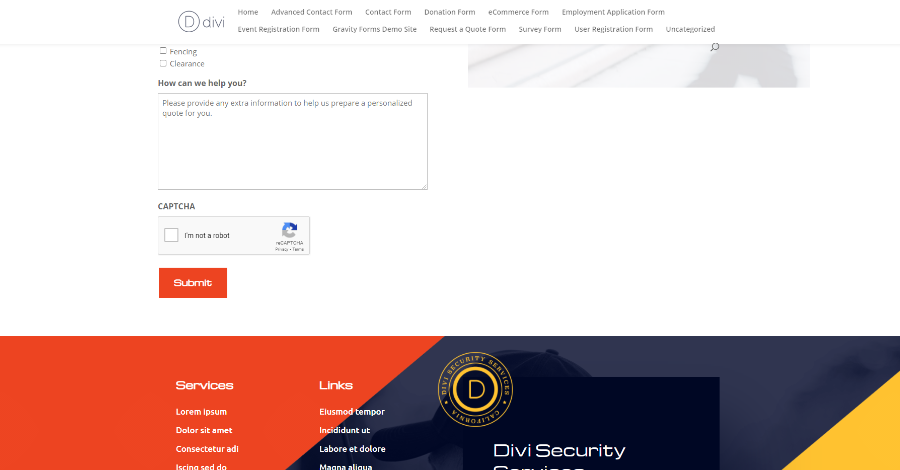
You can see the styling on the front end once you close the Visual Builder. In this example, I’ve styled the button to match other buttons in this layout.
Gravity Divi Ultimate
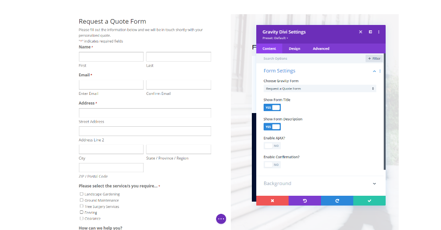
Gravity Divi Ultimate displays the Gravity form in real-time within the Visual Builder. This means you can style the form without having to leave the Visual Builder to see the changes. The options include choosing the form, showing the title, description, using AJAX, and enabling confirmation. Confirmation is a new feature. Let’s take a closer look.
Gravity Divi Ultimate Confirmation
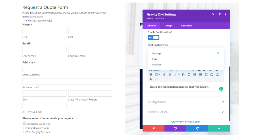
Confirmation lets you choose how the form submission is confirmed to the user. It includes three types:
- Message
- Page
- Redirect
The example above shows Message. It adds a content editor where you can create the message and add any type of content you want.
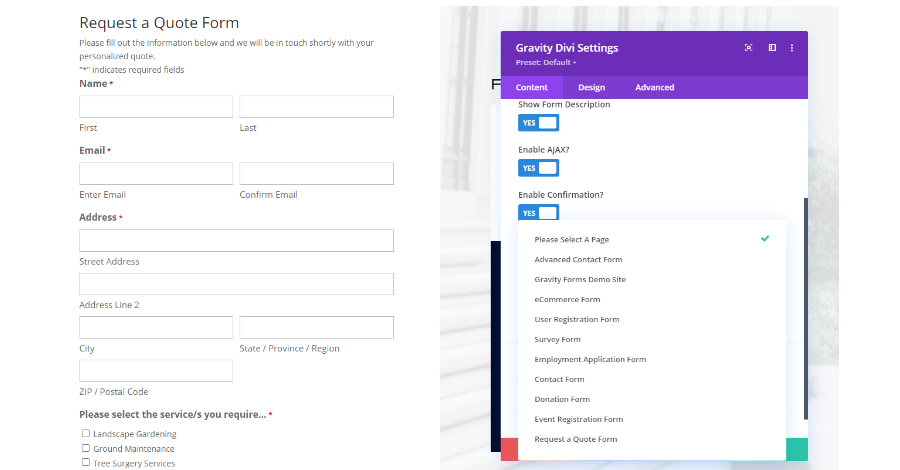
Page opens a list of your pages to redirect the user to once they’ve submitted the form. You can redirect them to any page you want. This gives you options such as calls-to-action or information.
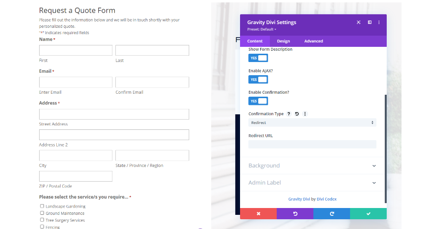
Redirect gives you a field to enter a URL to redirect the user to. This can be a page on your website or any other website.
Gravity Divi Ultimate Real-Time Styling
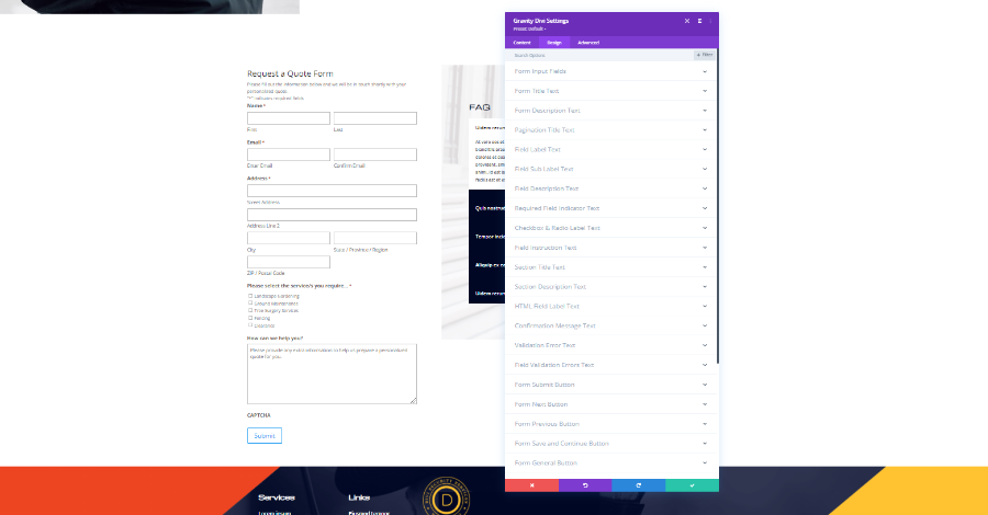
Gravity Divi Ultimate adds a lot more styling options to the Design tab. The original module had 6 design options. We now have 21. Most include the same text styling tools you’d see in any Divi module, while some are more specific to forms. These include fonts, colors, box shadows, spacing, and more. We’ll look at a few examples.
Form Input Fields
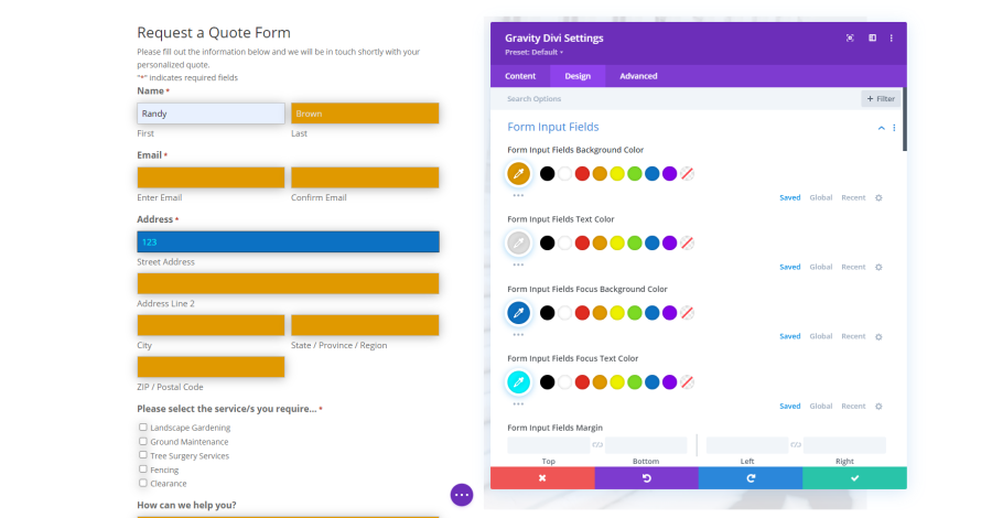
Form Input Fields adjusts everything about the fields including the background color, text color, focus background color, focus text color, and all the standard text settings. I’ve changed the and font colors in the example above.
Form Title Text
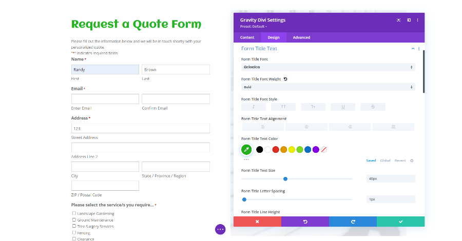
Form Title Text controls all the standard text settings for the title including the font, color, spacing, shadows, etc. I’ve chosen a different font, made the title green, and increased the font size in the example above.
Form Description Text
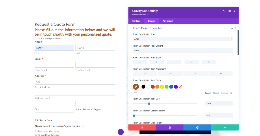
Form Description Text controls all the standard text settings for the form’s description. I’ve changed the font, color, and line height in this example.
Pagination Title Text
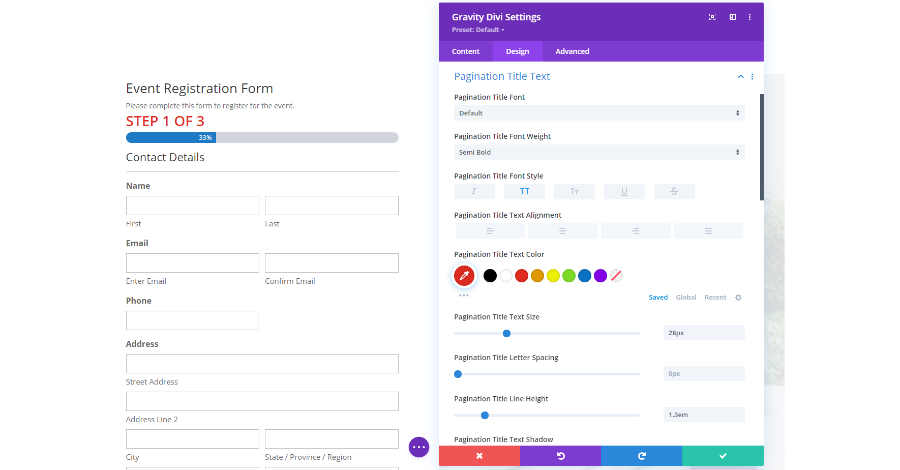
Pagination Title Text works with forms that include multiple pages. It styles the text that shows which step or page you’re on and includes the standard text options. I’ve set the pagination to all caps, changed the color, increased the font size, and added line-height.
Field Label Text
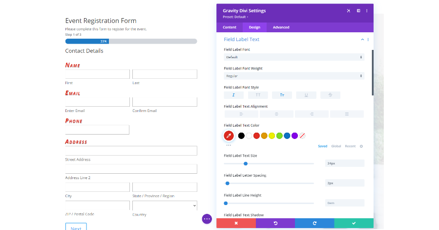
Field Label Text styles the labels that appear above the main sections of the forms. I’ve changed the font, made it italic, upper case, changed the color, and increased the size in this example.
Field Sub Label Text
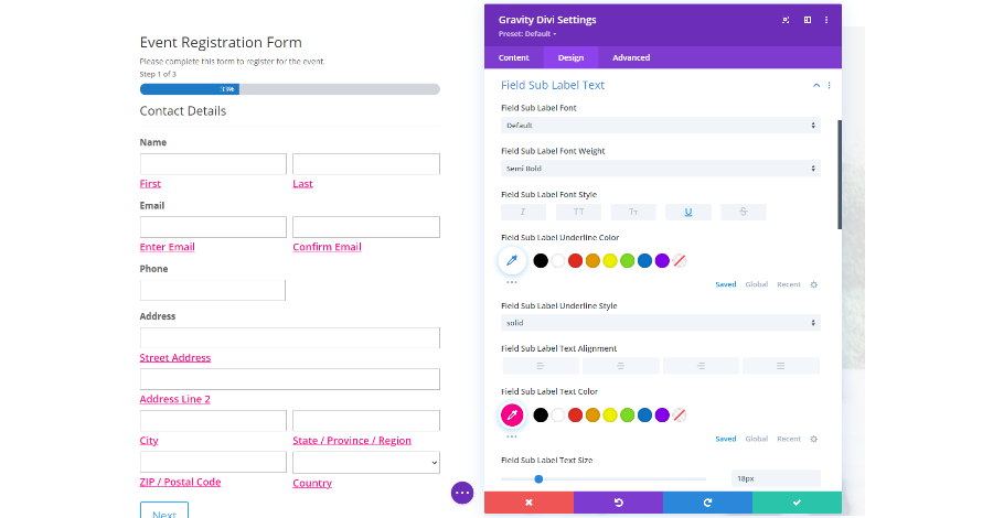
Field Sub Label Text styles the smaller labels that appear under the fields. I’ve made them underlined and changed their colors in this example.
Field Description Text
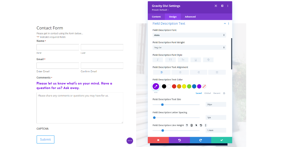
Field Description Text styles any text you add to describe the fields. For this example, I’ve changed the font, color, size, and line-height.
Required Field Indicator Text
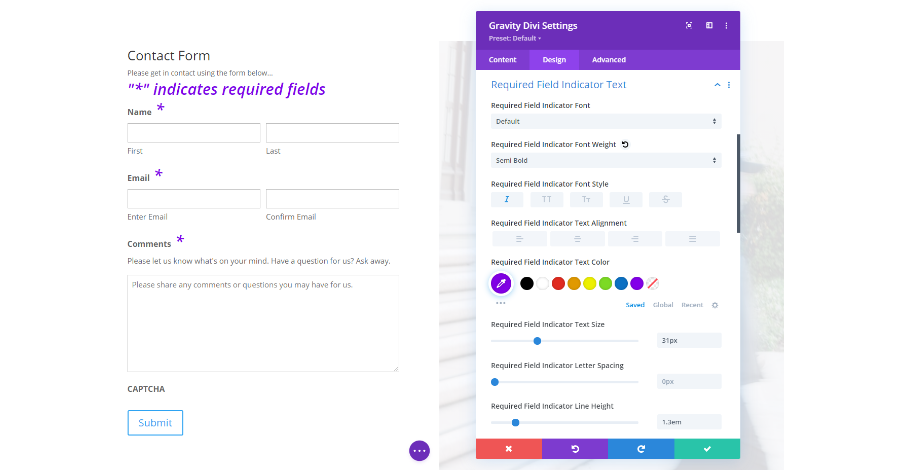
Required Field Indicator Text styles the asterisk and the text that tells what the asterisk means. I’ve set them to italic, changed their color, increased the size, and increased the line height in this example.
Checkbox and Radio Label Text
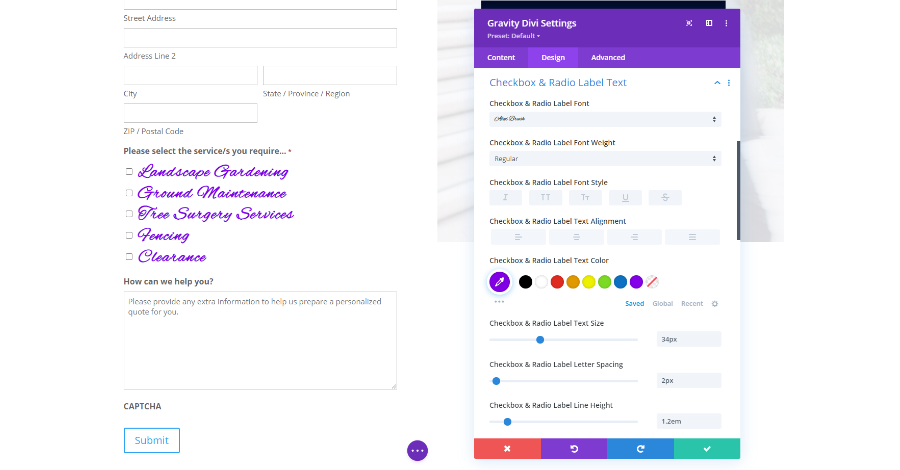
Checkbox and Radio Label Text styles the text for the form’s checkboxes and radio elements. I’ve changed the font, color, size, and line-height in this example.
Section Title Text
If your form has sections, use the Section Title Text to style their titles. For this example, I made the fonts bold, all caps, and underlined. I’ve also changed the color, increased the size, added line spacing, and added line-height.
Section Description Text
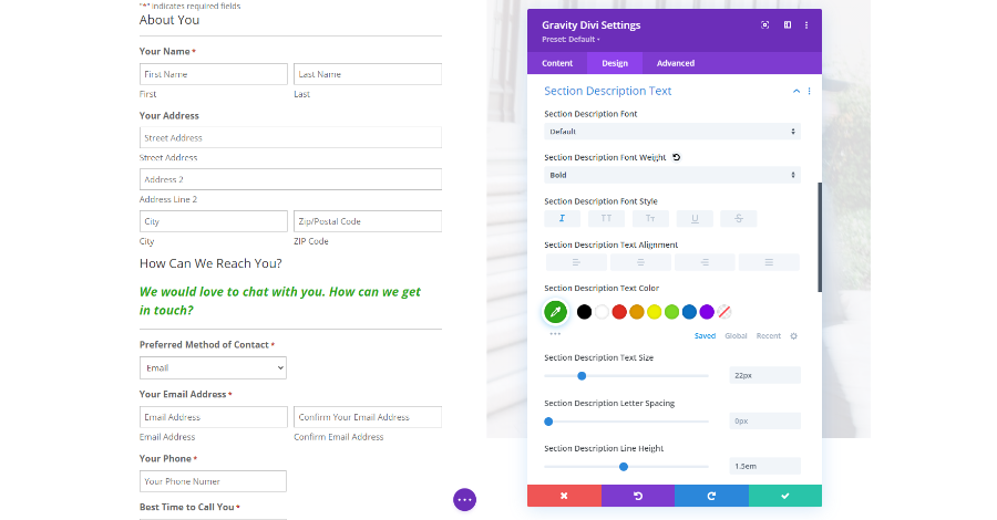
Section Description Text styles any descriptions you’ve added to the sections. For this one, I’ve made the font bold, italic, changed the color, increased the size, and added line-height.
Form Submit Button
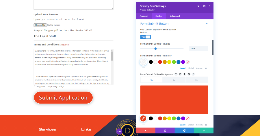
Form Submit Button styles the button that’s used to submit the form. For this example, I’ve changed the background, rounded the corners, changed the font size, and gave the font and button box shadows. I’ve used the background color from other elements in this layout.
Form Next Button
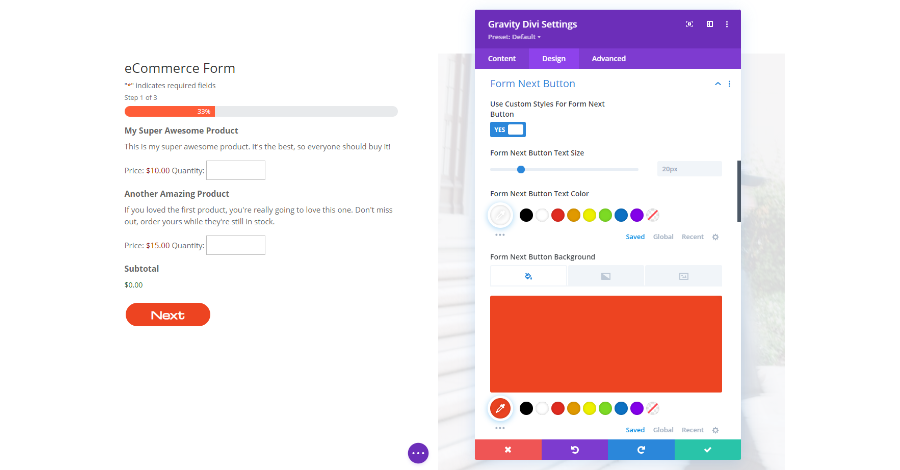
Form Next Button styles the button that takes the user to the next page of the form. I’ve given the button an orange background from the layout, rounded the corners, added padding to the right and left, and changed the font to match the layout.
Gravity Divi Ultimate Example
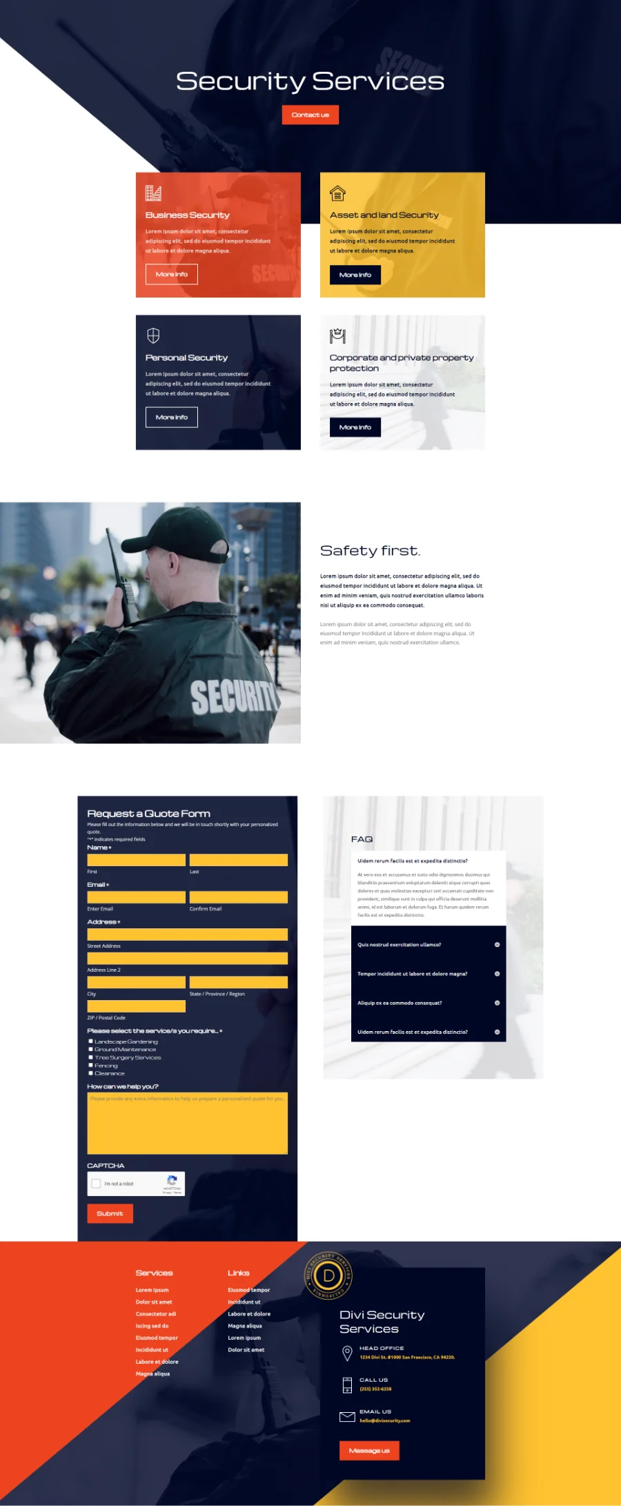
Here’s how my example form looks within a Divi layout. The form is the Request a Quote Form example from Gravity Forms. The page is the contact page from the Security Services layout pack from Elegant Themes. I’ve styled the form with colors and fonts from the layout. I’ve also added a background from one of the blurbs in the layout. The form blends well with the Divi layout, and all the styling is done from the module.
Ending Thoughts on Gravity Divi Ultimate
That’s our look at Gravity Divi Ultimate for the Divi Builder. This plugin integrates with Gravity Forms and makes it easy to style them to fit your website. Forms with better designs generate more submissions. Unfortunately, form design is something that’s often overlooked.
This plugin makes styling Gravity Forms easy and simple. Use the Divi Visual Builder to style the Gravity Forms as you would any Divi module. You can place the module anywhere within your Divi layouts and select the form you want from the list within the module.
We want to hear from you. Have you tried Gravity Divi Ultimate? Let us know what you think about it in the comments.


0 Comments