If you’re diving into Divi’s world of web design, understanding its breakpoints and media queries is key. Why? Well, picture this: you visit a website on your phone, and everything looks jumbled. Frustrating, right? That’s why being responsive matters. Google thinks so too – they want sites to adapt well to any device. And with over 60% of folks browsing on mobile or tablets, it’s crucial.
Now, if you’re already using Divi, you’re on the right track. It’s built to be responsive, meaning it adjusts automatically to different screens. But sometimes, you might want to tweak things to suit your audience better.
So, what’s the secret sauce? It’s all about CSS and media queries. These magical tools help Divi know when to switch up its layout to fit different screen sizes. But if you’re like me, and love getting hands-on with customization, knowing these breakpoints and media queries is a game-changer.
In this guide, we’ll unravel the mystery behind Divi’s breakpoints and media queries. Ever heard of targeting specific devices or screen sizes with CSS? That’s what we’ll be diving into. Before we plunge into the nitty-gritty details, let’s take a moment to grasp the concept of Media Queries.
Understanding Media Queries: How They Work and Why They Matter
Media queries are like the chameleons of web design. They’re a fancy name for a simple concept: adjusting how a webpage looks based on what you’re using to view it. Whether you’re on a big computer screen or a tiny phone, media queries make sure the website looks just right.
So, how do they do it? Well, it’s all about CSS magic. Think of CSS as the painter, and media queries as the brush. They work together to tweak things like width, making sure the site fits your screen perfectly.
But it’s not just about size. Media queries can also pick up on other details, like whether you’re holding your phone upright or sideways, or how sharp your screen is. It’s like having a website that’s tailor-made for you and your device.
So next time you’re browsing the web and everything looks just the way you like it, you can thank media queries for that smooth experience. They might sound fancy, but they’re really just making sure the web works for everyone, no matter what they’re using to surf.
Read More: Mastering Console Errors Checking for Your Divi Website
What are Divi breakpoints, and How to configure them?
In simple terms, breakpoints are like checkpoints that help a website know when to switch its layout based on how big or small your screen is. With Divi, there are three main checkpoints: one for desktops, one for tablets, and one for mobile phones.
Here’s how it works:
- Desktop: If your screen is wider than 981 pixels, Divi will use its desktop layout.
- Tablet: If your screen is between 768 and 980 pixels wide, Divi will switch to its tablet layout.
- Mobile: If your screen is smaller than 768 pixels, Divi will adapt to its mobile layout.
So, depending on what device you’re using, Divi will automatically adjust to make sure everything looks just right. Easy, right?
What are the Divi CSS Media Query Breakpoints?
The Divi CSS Media Query Breakpoints are basically just like the Divi Breakpoints. They both serve the same purpose: helping your website look great on different devices. With these breakpoints, your site adjusts its layout smoothly, whether someone’s browsing on a tiny phone screen or a big desktop monitor.
But here’s where it gets interesting – you can put your own spin on things with CSS. Yep, you heard it right. You’re not stuck with the default styles. With CSS, you have the power to customize how your site behaves at different breakpoints. Want text to be bigger on mobile? No problem. Prefer a different layout for tablets? You got it.
So, think of these breakpoints as your website’s best buddies, making sure it always looks its best. And with a touch of CSS magic, you can take things even further, adding your own personal flair to every screen size. It’s like giving your website a custom-fit suit – stylish and perfectly tailored for every occasion.
/* Desktop */
@media all and (min-width: 981px) {
  /* Your CSS */
}

/* Tablet */
@media all and (min-width: 768px) and (max-width: 980px) {
  /* Your CSS */
}

/* Mobile */
@media all and (max-width: 767px) {
  /* Your CSS */
}
Read More: How to Determine If a Website Is Built with Divi
How to customize the Divi breakpoints settings?
To tweak your Divi settings specifically for mobile or tablet, you’ve got options! Simply click on the little mobile icon next to each property you want to customize. This lets you tailor your website’s appearance and functionality for different devices. Whether you’re fine-tuning fonts, adjusting layouts, or optimizing buttons, this feature makes it easy to ensure your site looks great and works smoothly on every screen size. It is also demonstrated in the picture below:
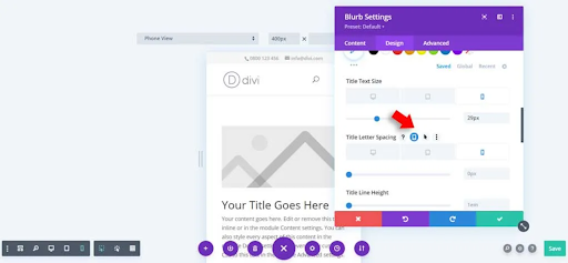
Divi breakpoints settings
Final Thoughts:
In the world of web design, understanding Divi’s breakpoints and media queries can be a game-changer. These tools ensure that your website looks sleek and professional, no matter the device your visitors are using. With over 60% of internet traffic coming from mobile and tablet users, responsiveness is more important than ever.
Divi makes it easy to create responsive designs, automatically adjusting layouts to fit different screens. But for those who love customization, delving into the world of CSS and media queries opens up endless possibilities. By knowing how to utilize breakpoints effectively, you can tailor your site’s appearance and functionality to suit your audience’s preferences.
Media queries act as the behind-the-scenes magic, ensuring your website adapts seamlessly to various screen sizes and orientations. They’re the reason why browsing the web feels smooth and intuitive, regardless of the device you’re using.
And let’s not forget about the power of CSS. With Divi’s CSS media query breakpoints, you can take customization to the next level. Whether you want to adjust font sizes, rearrange layouts, or add unique touches for specific devices, CSS gives you the freedom to make your website truly your own.
So, as you navigate the world of Divi breakpoints and media queries, remember that responsiveness isn’t just about keeping up with trends – it’s about providing a seamless and enjoyable experience for your visitors. By mastering these tools, you can ensure that your website stands out in the crowded online landscape, captivating audiences on every screen size.
Read More: How To Add Shape Dividers In Divi


0 Comments