In today’s digital age, where smartphones and tablets have become an integral part of our daily lives, having a website that adapts seamlessly to various screen sizes is no longer just a nice-to-have – it’s essential. Since 2017, mobile devices have dominated website traffic, making it clear that catering to mobile users is not just a trend but a necessity for any website owner or designer.
That’s where responsive web design comes into play. Responsive design ensures that your website looks great and functions well across all devices, whether it’s a smartphone, tablet, laptop, or desktop computer. And when it comes to creating responsive websites, Divi stands out as a powerful tool that simplifies the process and empowers users to create stunning, mobile-friendly designs effortlessly.
In this blog post, we’ll delve into the basics of Divi responsive design, exploring how you can harness its features to optimize your website for mobile devices in just 10 minutes. Whether you’re a seasoned web designer or a novice looking to enhance your website’s mobile usability, this guide will equip you with the knowledge and skills you need to unlock the full potential of responsive design with Divi. So, let’s dive in and discover how you can elevate your website’s user experience across all devices!
Understanding Responsive Design: What It Really Means
In simple terms, responsive web design ensures that your website looks good on any device, whether it’s a smartphone, tablet, or computer. It’s all about making sure your site adjusts smoothly to different screen sizes, so visitors can easily read and navigate without having to zoom in or struggle with tiny buttons. For example, if your website requires people to pinch and zoom on their phones just to read the text, it’s not designed properly for mobile use. Similarly, if buttons are too close together, it can be frustrating for users trying to tap them on a small screen. So, responsive design focuses on creating a layout that’s user-friendly and easy to use, no matter the device. And surprisingly, even though screens are smaller on mobile devices, they often need more space around elements to make navigation smoother.
Read More: A Look at the New Divi Responsive Views
Divi Is A Responsive WordPress Theme
Divi is designed to be flexible and user-friendly, especially when it comes to making your website look great on all devices. When someone visits your site on a desktop computer, they’ll see a regular menu. But, when they switch to a smartphone or tablet, that menu magically turns into a neat little icon, known as a hamburger menu, making it easy to navigate on smaller screens. Plus, the layout of your content adapts too, with columns neatly stacked for a smoother experience.
And here’s the best part: you have full control over how your site looks on different devices. With Divi’s custom settings, you can tweak things like font sizes and spacing specifically for smartphones, tablets, and desktops. This means your site will always look just right, no matter what device someone is using.
But wait, there’s more! Divi lets you go even further by allowing you to show different content for different devices. So, if you want to tailor your message or showcase different images depending on whether someone is on a phone or a computer, Divi makes it super easy.
With all these features at your fingertips, creating a website that looks amazing on every device has never been easier. Plus, by saving your design settings as global styles, you’ll save time and keep everything looking consistent across your entire site.
Read More: Mastering Divi: Tips and Tricks for a More Efficient Web Design Experience
Mastering Divi’s Responsive Preview Mode: Designing for Every Device
One big misunderstanding many Divi newbies encounter is confusing the mobile and desktop designs. It’s easy to get lost in the Divi theme’s responsive preview mode, thinking any changes made there only affect mobile layouts. But here’s the kicker: tweaking your design for mobile can sometimes mess with how things look on desktop, too. It’s like rearranging your furniture in one room and finding out it affects the vibe in another. So, before you hit that publish button, make sure you double-check how your changes play out across all screen sizes. Don’t let your mobile adjustments throw your desktop design out of whack!
Diving Deep into Divi’s Responsive Preview
In the Divi visual builder, there’s a handy tool called the responsive preview mode. You can find it down in the bottom left corner after you click on the purple ball in the center at the bottom of your screen. This feature lets you see how your website looks on different devices: there’s a wireframe view, a zoomed-out view, and views for desktop, tablet, and phone.
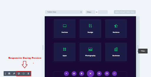
Responsive preview mode
But here’s the thing to keep in mind: when you make changes to your design, it affects all devices, no matter which one you’re currently looking at. So, if you adjust something in the desktop view, it’ll also change in the tablet and phone views. It’s like you’re making universal adjustments that apply everywhere.
From Desktop to Mobile: Exploring Divi’s Responsive Design Settings
When it comes to tweaking your website’s look for different devices like smartphones or tablets, using Divi’s built-in responsive settings is the way to go. Here’s how you do it:
First off, find the section, row, or module you want to adjust by clicking on the little cogwheel. Once you’re in the settings, head over to the Design tab. Now, here’s the cool part: if there are specific settings that can be adjusted for different devices, you’ll see a smartphone icon pop up next to them.
Give that icon a click, and you’ll get a menu where you can pick which device you’re targeting—like a smartphone or tablet. Once you’ve chosen, you can tweak those settings just for that device. Adjust things like text size or padding, then hit save, and you’re all set!
That’s the way to make sure your website looks its best, no matter what device your visitors are using.
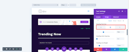
Responsive Design Settings
Read More: How To Create A Divi Mega Menu
Automatic Adaptation: The Design Settings Are Inherited to Smaller Devices By Default
When you’re designing a website using Divi, how you set things up for different devices matters. Let’s say you set a padding of 100 pixels for desktops. If you don’t adjust this for tablets or phones, they’ll just inherit the 100-pixel padding too. But if you tweak the padding to 50 pixels for tablets, then both tablets and phones will also get that 50-pixel padding.
However, if you decide to change the padding to 25 pixels for phones, that change won’t affect any other device because phones are the smallest view. Once you customize a setting for a particular device, it won’t go back to inheriting values from larger devices. So, it’s important to fine-tune your design for each device to make sure everything looks just right.
Conclusion:
Mastering responsive design with Divi opens up a world of possibilities for website creators. With its intuitive interface and powerful features, Divi empowers users to craft websites that not only look stunning but also function seamlessly across all devices. By understanding the principles of responsive design and leveraging Divi’s responsive settings effectively, you can ensure that your website provides an optimal viewing experience for visitors, regardless of whether they’re using a desktop computer, tablet, or smartphone.
Remember, responsive design is not just a trend—it’s a necessity in today’s digital landscape. With mobile devices accounting for the majority of web traffic, catering to mobile users is essential for the success of any website. Divi’s responsive design capabilities enable you to meet this demand effortlessly, allowing you to create websites that are not only visually appealing but also user-friendly on every device.
So, whether you’re a seasoned web designer or just starting out, embracing Divi’s responsive design features will enable you to elevate your website to new heights. By taking advantage of Divi’s customization options, responsive preview mode, and inheritance settings, you can ensure that your website looks polished and professional across all devices, delivering an exceptional user experience every time. So why wait? Dive into Divi’s responsive design tools today and take your website to the next level!
Read More: 12 Highly Responsive Divi Carousel Plugins and Layouts in 2024


0 Comments