Join us in this tutorial as we will guide you through the process of incorporating an icon button into the Divi Blurb module. This simple addition serves as a clear indicator to users that the blurb is clickable. Together, we’ll make your Divi Blurb modules more engaging and user-friendly. Let’s dive in!
Step 1. Customize Design Settings for Divi Blurb Module
Unleash your creativity by designing and personalizing the style of your Divi Blurb just the way you like it. The power is in your hands to make it uniquely yours! If you prefer to adopt our approach, here are the design settings we suggest:
- Padding Top: 40px
- Padding Bottom: 80px
- Padding Left/Right: 30px
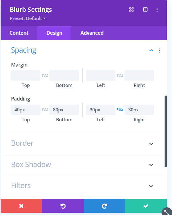
Divi Blurb Module Settings
Step 2: Enhance Your Divi Blurb with a Stylish Arrow Icon Button and Hover Effect!
Let’s talk about the main thing in this tutorial – the icon. We’ll show you how to add it, along with some other cool effects for your Blurb. And guess what? We’re using a simple right-direction arrow from the Divi ETModules font family. It’s like having an easy button for icons – it’s already there, ready for you to put it where you want and make it look just how you like!
Now Let’s Add the Custom CSS Code Snippet
Now, let’s bring in the CSS to give your Blurb those extra effects that the regular Divi settings couldn’t handle. Go to your Divi Blurb module settings, then head to the Advanced tab. In the Custom CSS IDs & Classes toggle, add a custom CSS class named ‘blurb-icon-button’.
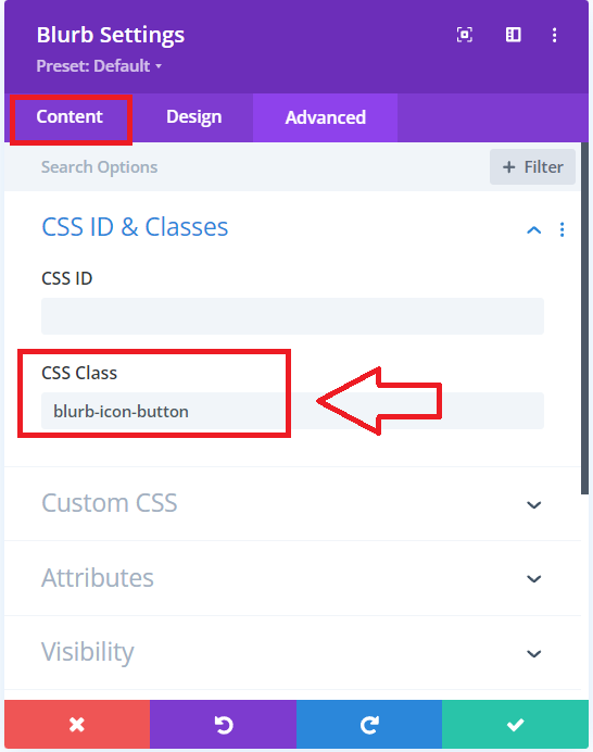
Adding a Custom CSS Class to the Divi Blurb Module
This neat trick ensures that the CSS code we’ll use next will only impact the Blurb modules with that specific class. Ready to make your Blurb stand out? Let’s do it!
.blurb-icon-button {
    transition: box-shadow .2s ease-in-out;
}

.blurb-icon-button:after {
    font-family: ETModules;
    content: "\24";
    font-size: 36px;
    color: #1a73e8;
    position: absolute;
    bottom: 26px;
    right: 25px;
    transition: all .2s ease;
}

.blurb-icon-button:hover {
    box-shadow: 0 5px 10px rgba(0, 0, 0, .15);
    transition: box-shadow .2s ease-in-out;
}

.blurb-icon-button:hover:after {
    color: #174ea6;
    bottom: 30px;
    transition: all .2s ease;
}
Where To Paste The CSS Code
Paste the above code in your Divi>Theme Options>Custom CSS code box.
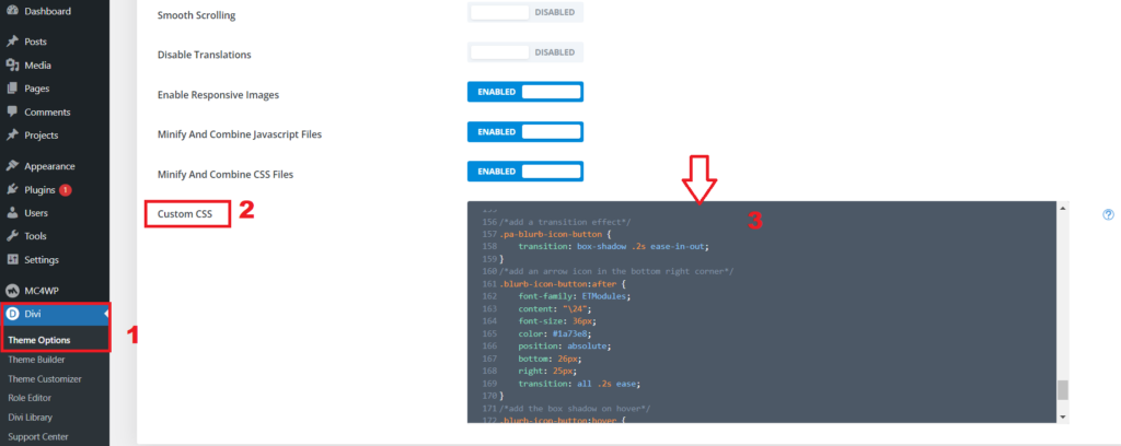
Adding CSS code to the Divi Dashboard
Final Result
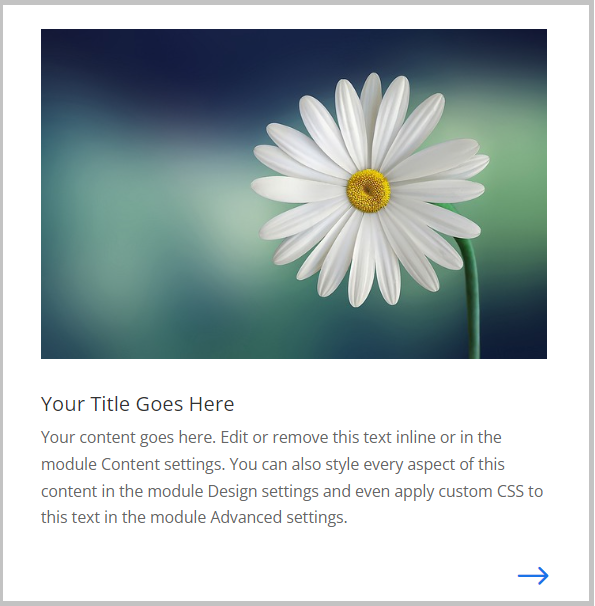
Divi Blurb Module with a Clickable Icon Button
Conclusion:
In this tutorial, we’ve empowered you to add a clickable icon button to your Divi Blurb module, enhancing user interaction and engagement. By following the simple steps outlined above, you can not only customize the design settings of your Divi Blurb but also elevate it with a stylish arrow icon and a captivating hover effect.
To take your Blurb to the next level, we introduced a neat CSS trick, allowing you to seamlessly incorporate additional effects that standard Divi settings might miss. By adding a specific custom class, ‘blurb-icon-button,’ you gain control over the targeted application of CSS code.
The provided CSS snippets bring life to your Blurb with a transition effect, a right-direction arrow icon, and a subtle box shadow on hover. These touches not only enhance visual appeal but also serve as intuitive indicators for users.
Now, armed with this newfound knowledge, you’re ready to make your Divi Blurb modules stand out and leave a lasting impression on your website visitors. If you have any questions or want to share your experiences, feel free to drop a comment below.
Read More: How To Increase The Divi Blurb Content Width




0 Comments