Divi is a responsive theme, meaning that it can adjust the website elements so they fit within the screen size your visitors are using. Divi provides a preview for three different screen sizes to give you an idea of how your site will look on desktop, tablet, and mobile. The problem is there are many sizes for all three types of screens that Divi doesn’t show you, and Divi only shows portrait mode.
An easy solution to this is to use a third-party plugin called Divi Responsive Helper. This plugin gives you more options for the various screen sizes and adds tools to make them easy to use. In this article, we’ll take a look at Divi Responsive Helper and see what it can do.
First, let’s look at Divi’s responsive tools and see why Divi Responsive Helper is needed.
Divi’s Default Responsive Previews
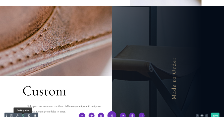
Divi provides previews, or breakpoints, for three different screen sizes. You can customize your layouts for these breakpoints independently in the module’s settings. It doesn’t indicate the size of the screen for any of the screen modes. This is the desktop view.
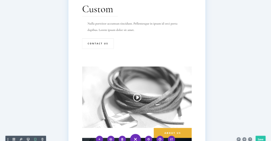
This is the tablet view. It’s about the size and shape of a typical tablet, but no specifics are given.
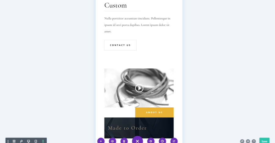
This is the mobile mode. It displays as a typical smartphone screen.
The Divi modules display the options for the screen size you’ve selected. If you hover over most of the options on the list you’ll see a small icon for a screen.
Clicking this adds a selector where you can choose the breakpoint you want to make the adjustments for. This is the same as clicking the desktop, tablet, and mobile icons in the view selector in the bottom left of the screen.
This is good for adjusting to those generic screen sizes, but it only provides one screen size and orientation for each of the breakpoints.
Google Chrome Dev Tools
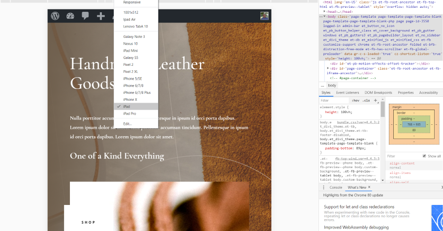
Another option is to use Google Chrome Developer Tools. This allows you to select different devices, enter screen sizes, view as responsive and change the screen size with drag and drop, and view in both portrait and landscape mode. This is a good option to view the layout in the screen sizes, but you’ll still need to open each module to customize them. This requires a lot of extra steps and switching back and forth between the dev tools and normal screen views. It’s a good tool to test your layouts, but it’s not the easiest tool to use for design and making the first set of adjustments.
Divi Responsive Helper Installation and Settings
Divi Responsive Helper solves all of these problems by adding new settings to Divi rows, columns, and modules that give you control over the screen sizes of desktop, tablet, and phone breakpoint views. Upload and activate the plugin as normal. The plugin is now ready to use, but there are a few settings you can implement to get even more control.
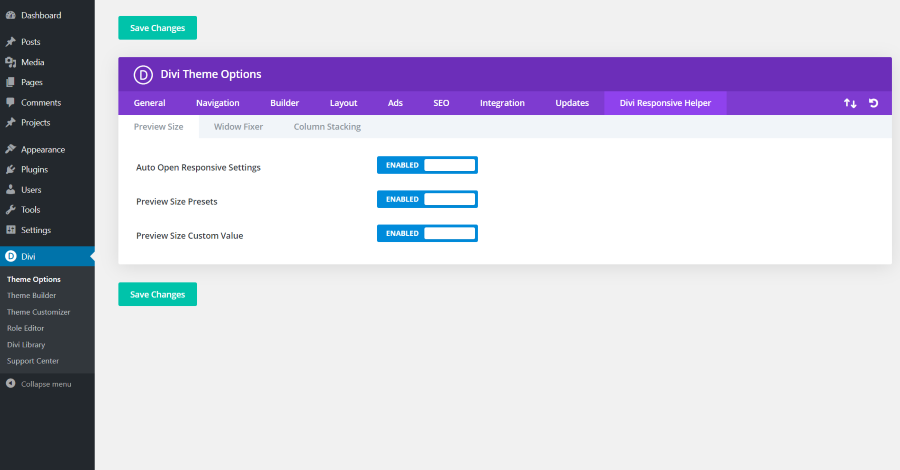
A new tab is added to the Divi theme options screen with tabs for the preview size, widow fixer, and custom stacking. Each includes options you can enable. Preview Size includes Auto Open Responsive Settings, Preview Size Presets, and Preview Size Custom Value.
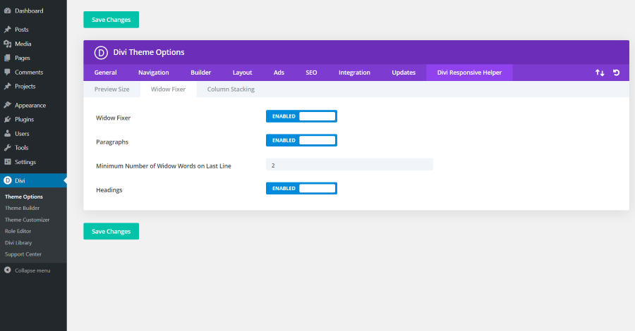
The Widow Fixer tab includes options to enable the Widow Fixer, Paragraphs, enter the minimum number of widow words to display on the last line and Headings. These settings ensure that you don’t have a line of text with just one word on it.
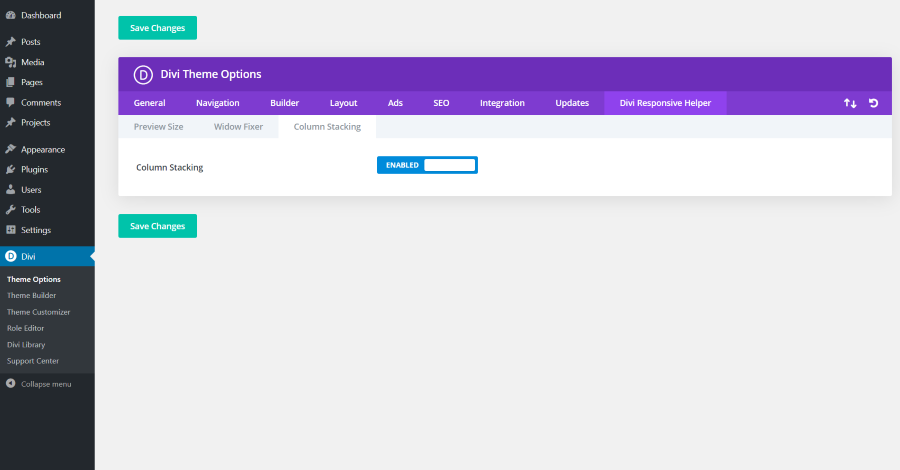
Custom Stacking online includes the one setting, which is disabled by default.
Many of the settings are disabled when you activate the plugin. I’ve enabled all of the settings for this article.
Using Divi Responsive Helper
Divi Responsive Helper adds several new options to the Divi sections, rows, columns, and modules. Rather than having to open the breakpoints for each adjustment, they’re now open by default for every adjustment that includes them.
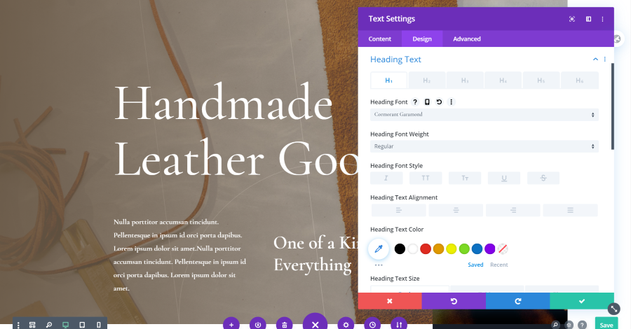
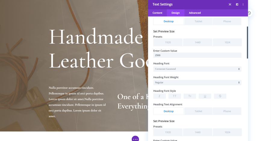
Two new options are added. The first is Presets. This lets you choose between three screen sizes for each breakpoint. The second is Enter Custom Value. This allows you to add custom size. These settings make it easy to see the layout of any size you want. The example above shows the header text in the desktop breakpoint with a custom value of 2500. Let’s look at a few more.
Desktop
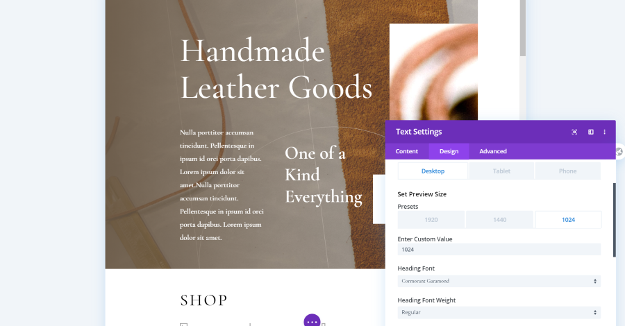
Here’s the desktop with the 1024 preset. Even the slider bar on the right changes to fit the new screen size.
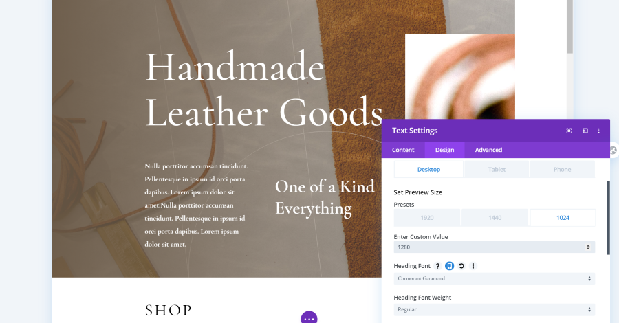
For this example, I’ve entered a custom value of 1280.
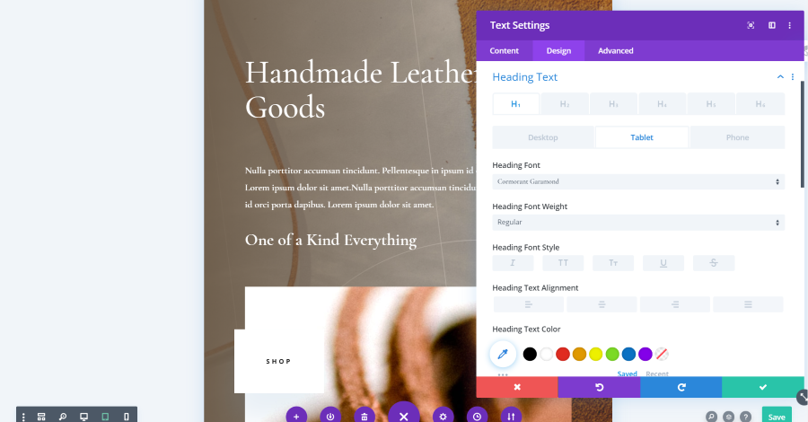
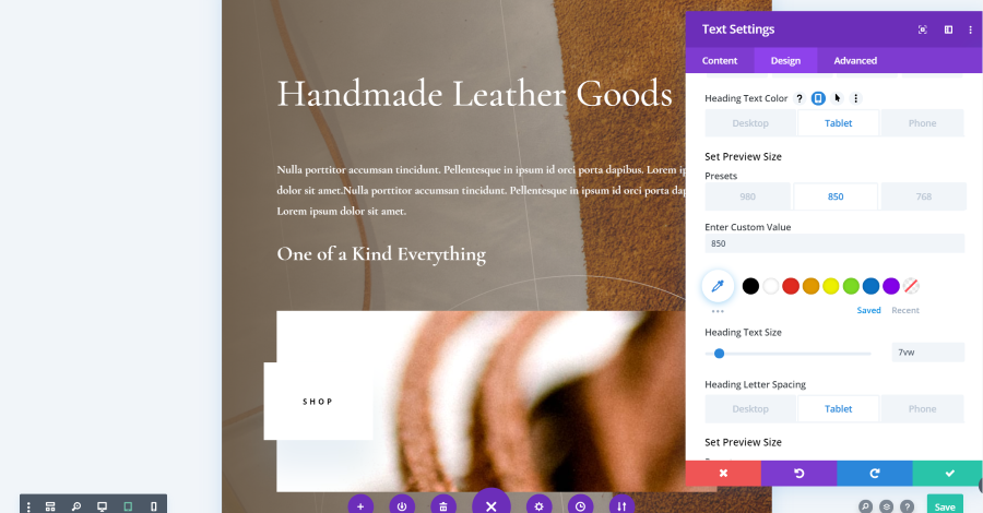
Tablet
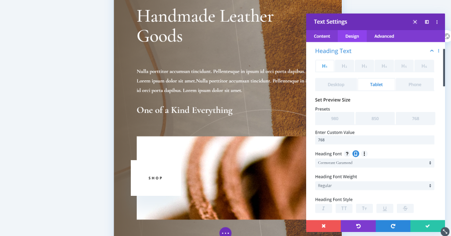
This is Tablet. It includes presets for 980, 850, and 768. This is 768. The heading text looks slightly different than the desktop did. I can now make decisions about how I want to customize it.
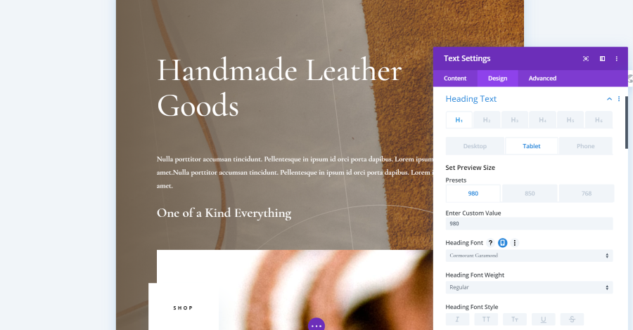
This is the heading text and the 980 preset. The header text looks the same as the 768 preset.
I’ve decided that I wanted the title to only take one line, so I used this information to reduce the size of the font and checked it on all tablet screen sizes.
Phone
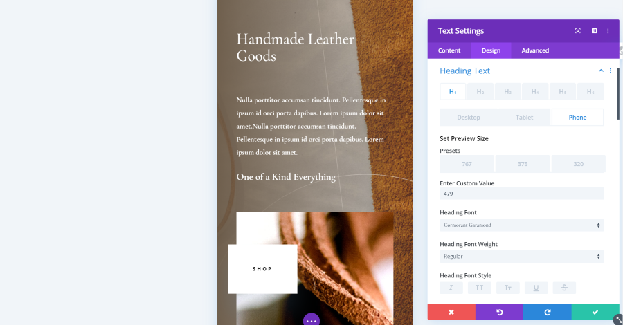
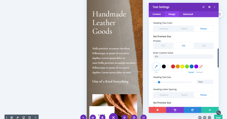
Here are the phone presets. The presets include 767, 375, and 320. This is a custom value of 479. I’m using the original settings for the header font size. My header text matches the tablet layout.
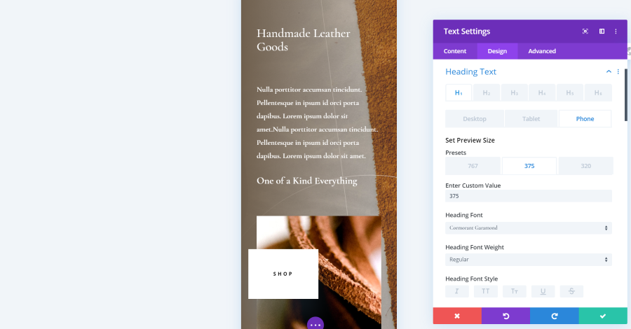
This example uses the 375 preset.
For the phone view, I wanted to stack the text. I used the preview settings to increase the size of the title text and checked it for each size.
Divi Responsive Helper Column Stacking Order
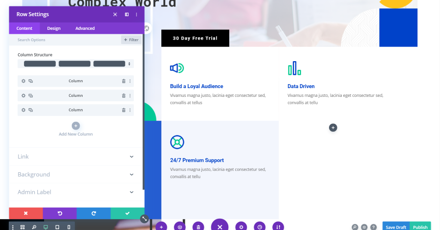
You can adjust the stacking order of columns when the site is viewed on a tablet or mobile screen. For this example, I want to change the stacking order of the blurbs. The desktop shows Build a Loyal Audience and Data Drive for the row I’m working with. They normally stack in that order. I want to change them to stack in the opposite order.
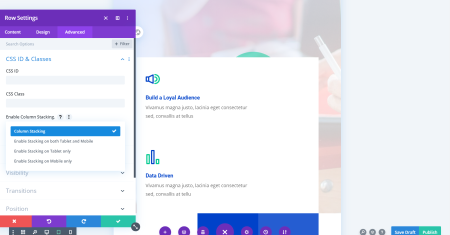
A new feature is added to the Advanced tab under CSS ID for the Row called Enable Column Stacking. This is a dropdown box with several options to enable stacking for both tablet and phone, tablet only, and phone only. I’m enabling stacking for both tablet and phone modes.
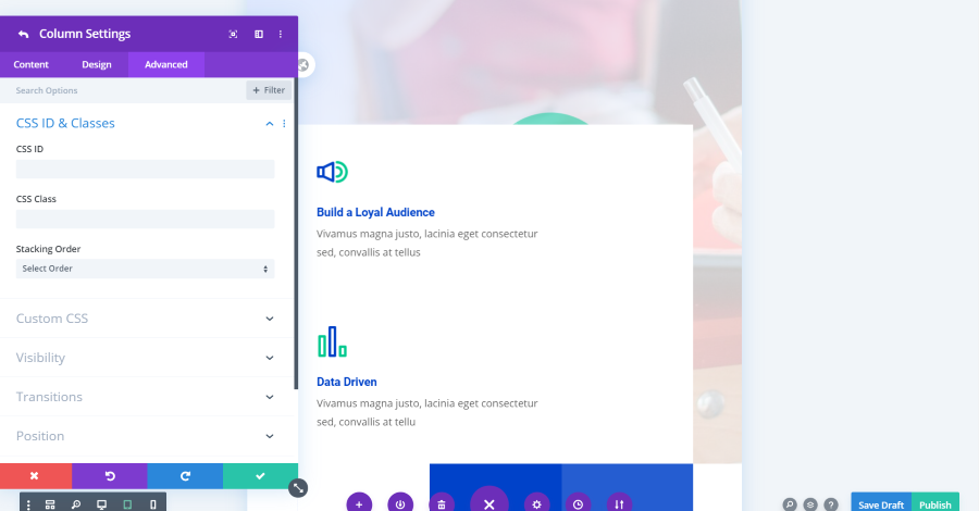
A new feature is added to the Advanced tab of the column settings called Stacking Order.
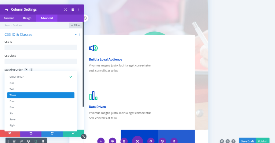
Simply choose the order that you want that column to stack. I’ll set Build a Loyal Following to Three (since it’s in the second column of this layout. The first column is empty).
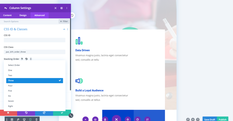
This adds a CSS Class automatically. You don’t need to make any changes or handle the code yourself.
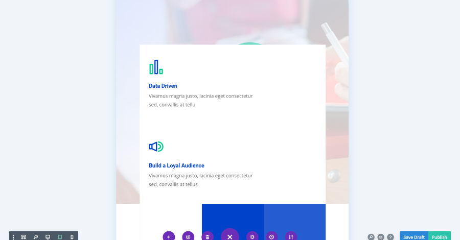
Data Driven is now stacked above Build a Loyal Following for both tablet and phone modes. Here’s the layout in tablet mode.
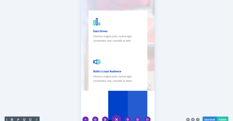
Here’s the layout in phone mode. The Data Driven blurb is on top, just like I wanted.
Ending Thoughts
That’s our look at Divi Responsive Helper. This plugin adds a lot of control over the responsive views. It’s easy to make adjustments without having to leave the screen to test on different devices. You can see the design in any screen size you want just by selecting a preset or by entering a custom value.
I also like the stacking feature. It’s easy to use and gives you a lot of control over how the elements stack for both tablet and mobile screens.
Divi Responsive Helper is an excellent plugin that saves a lot of time in designing and testing. If you’re interested in an easy way to view your layouts with different screen sizes, I recommend taking a look at Divi Responsive Helper in the Divi Cake shop.
We want to hear from you. Have you tried Divi Responsive Helper? Let us know what you think about it in the comments below.


0 Comments