One of the things that makes Divi so powerful and easy to use is the Design settings. Usually, you’d need to have a deep knowledge of CSS to customize elements in your website. Divi’s design setting settings let you customize the look of your sections, rows, columns, and modules with simple sliders and fields. In this article, we’ll take a close look at Divi’s design settings and see how to use them.
Where are the Settings?
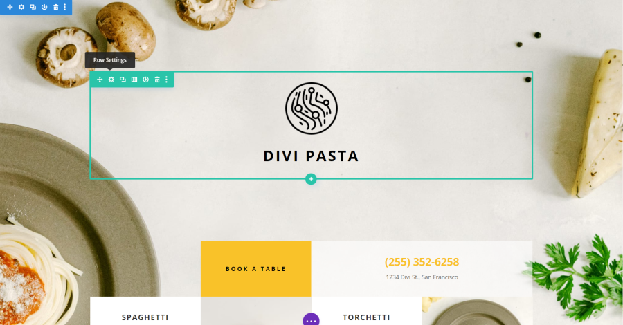
In the Visual Builder, you’ll find the settings by hovering over the elements. You’ll see a small menu with icons. Click on the gear for the element you want to adjust. The elements have different colors: blue for regular sections, green for rows, and dark gray for modules. Special sections are orange and full-width sections are purple.
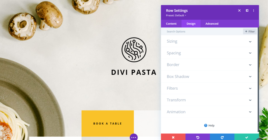
Once the settings window opens, you’ll see three tabs: Content, Design, and Advanced. Select the Design tab. Many of the elements include the same settings. Modules add settings that are specific to them.
How to Adjust the Settings
Available settings will change depending on what is enabled. Most have the same types of tools to make the adjustments including slider controls with a dot that you can grab and drag to the right to increase the amount or to the left to decrease the amount. These controls show the amount in a field to the right of the slider control. In this field, you can enter the number by highlighting the value in the field, or you can increase or decrease the value by clicking on the up or down arrows that appear when you hover over the field.
Controls for spacing adds a slider that appears under the field. Here, you can drag to the right or left. These fields have a chain link between them that’s grayed out. Clicking on this link activates it. Once two fields are linked, any change you make to one field is automatically reflected in the other field.
Design Settings for Sections
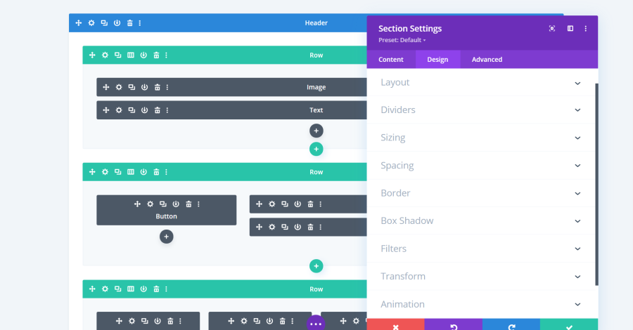
The section settings include the layout, dividers, sizing, spacing, border, box shadow, filters, transform, and animation. Many of the settings include drop-down boxes, sliders, color pickers, and similar controls.
Section Settings Layout
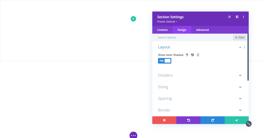
Layout lets you enable an inner shadow. This creates a shadow border that helps the section stand out. It’s just noticeable as a horizontal line in this example.
Section Settings Dividers
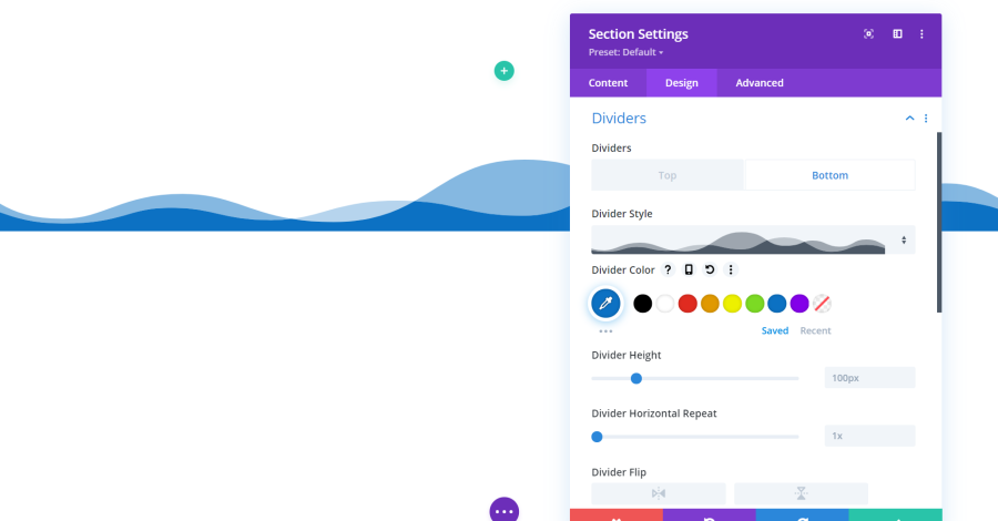
Dividers are some of the most interesting elements. It places a styled divider at the top and/or bottom of the section. Choose the top or the bottom tab, select the divider you want from the drop-down menu, choose the color, adjust the height, repeat, flip it, and set it above or below the content. It has 26 dividers to choose from.
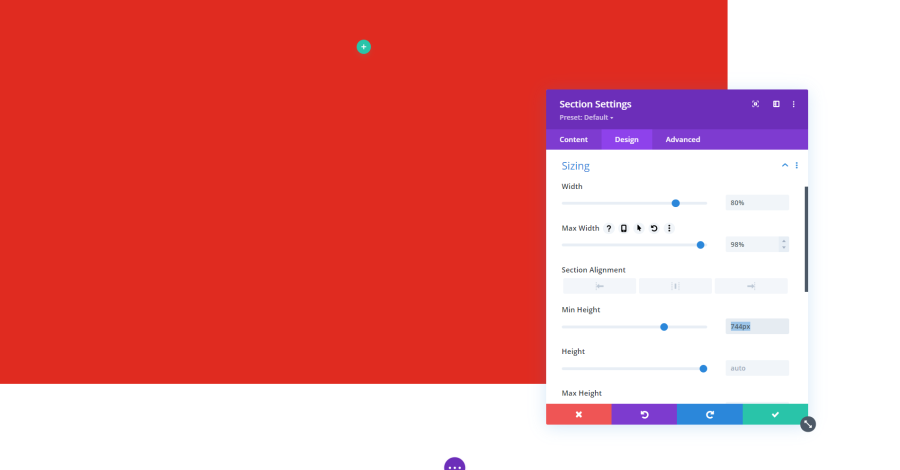
Section Settings Sizing
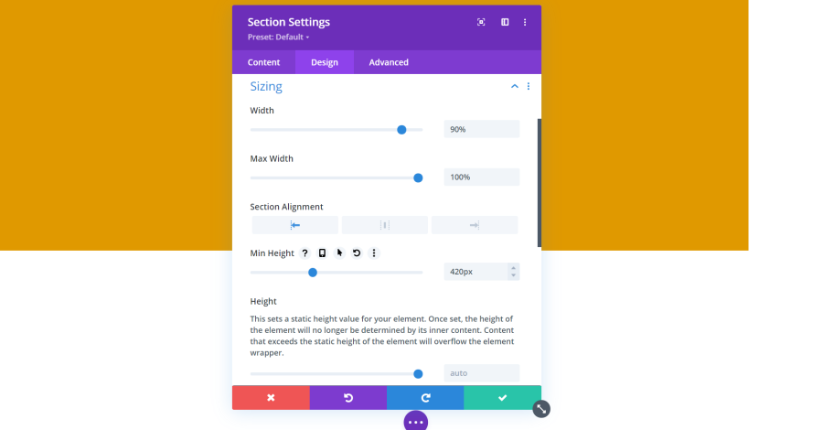
Sizing lets you adjust the width, alignment, and height of the section. In this example, I’ve increased the height to 420px, reduced the width to 90%, and set the alignment to the left. This leaves the right side of the screen empty. I’ve added a background color so it stands out. You can make these adjustments by using the slider, entering a number, or clicking on the arrows that appear when you hover over the values.
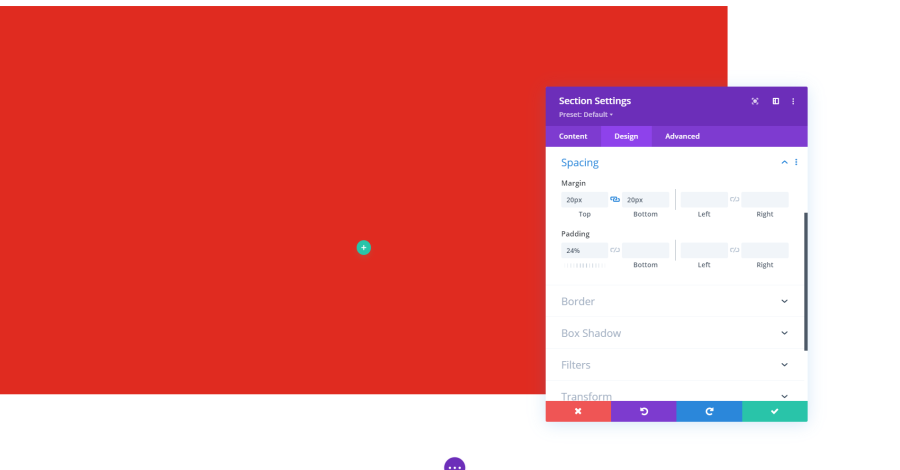
Section Settings Spacing
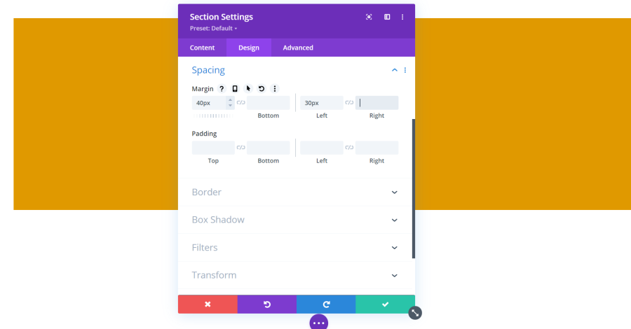
Spacing lets you add a margin and padding to each side of the section. This is used more for modules, so it will make more sense later. Enter the number you want in the fields or use the slider or arrows. You can also link the top and bottom together and the left and right together so when you adjust one it automatically adjusts the other.
Section Settings Border
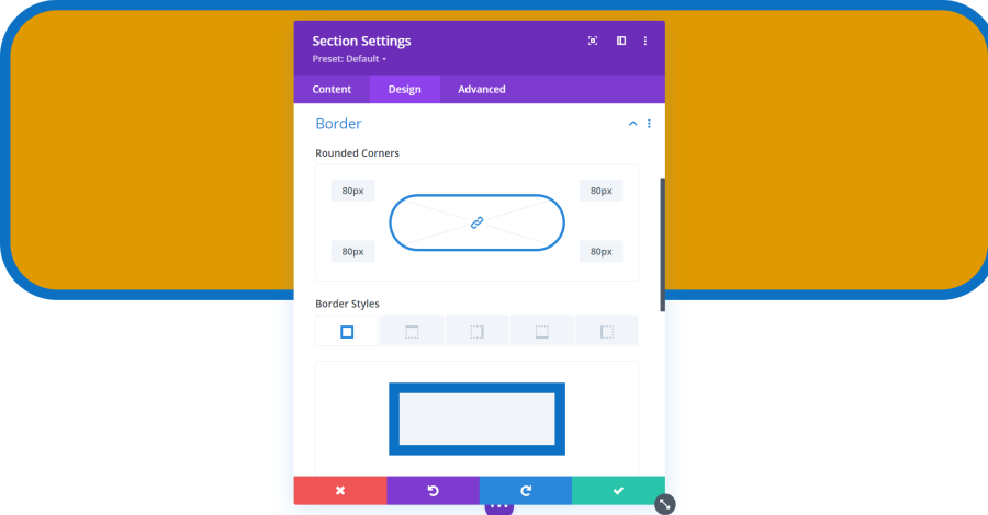
Border adds a visible border to the section. You can adjust the corners, choose which sides of the section has the border, set the width, choose the color, and choose the style. Styles include solid, dashed, dotted, double, groove, ridge, inset, outset, and none.
Section Settings Box Shadow
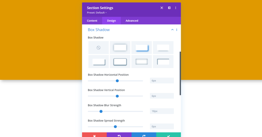
Box Shadow adds a shadow under the element to make it pop off of the background. Choose from 7 different types and then adjust the position, blur strength, spread strength, shadow color, and set it to show as inset or outset.
Section Settings Filters
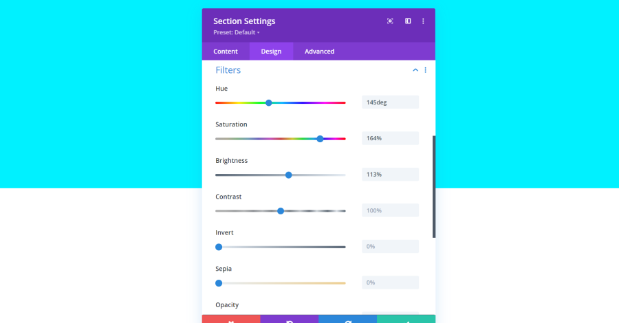
Filters let you adjust the colors. Settings include hue, saturation, brightness, contrast, invert, sepia, opacity, blur, and blend mode. I’ve adjusted the first three settings to my orange background to make a shade of blue.
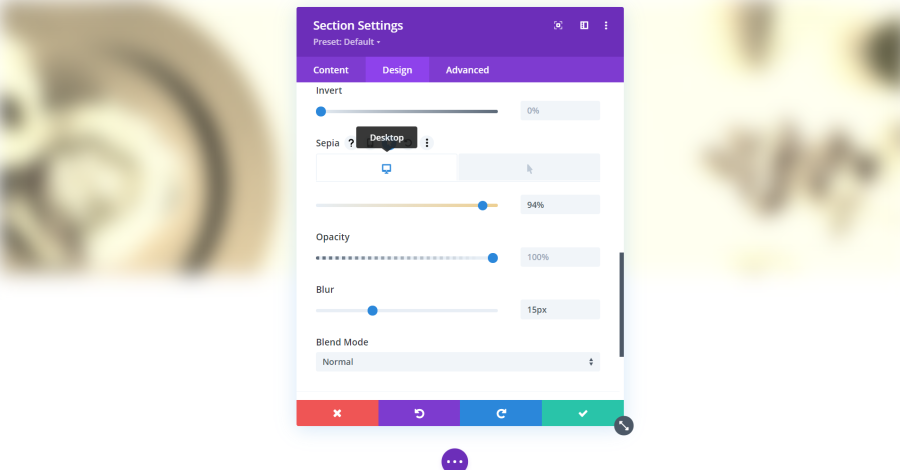
You can set sepia to display different settings on a desktop and on hover. This example also shows blur, which blurs the background image and edges of the section. Blend mode blends with layers under the element.
Section Settings Transform
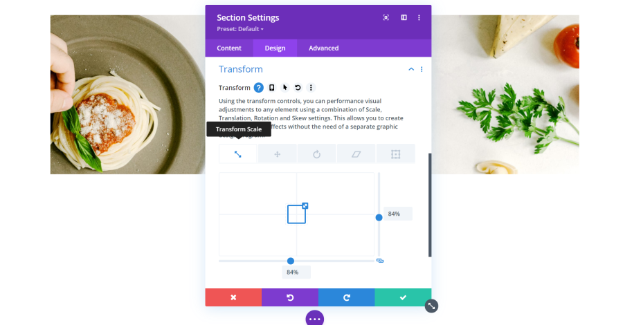
Transform provides 5 settings to adjust how the element reacts. The settings can be used separately or together. Transform Scale changes the starting size of the element and scales it to full size as you scroll to it. Grab the slider controls, the handle on the square, enter a number in the field, or use the field’s arrows to adjust the size.
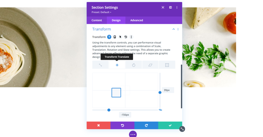
Change the starting position of the element with Transform Translate.
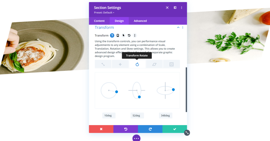
Transform Rotate lets you adjust the angle, skew, and rotation of the starting position.
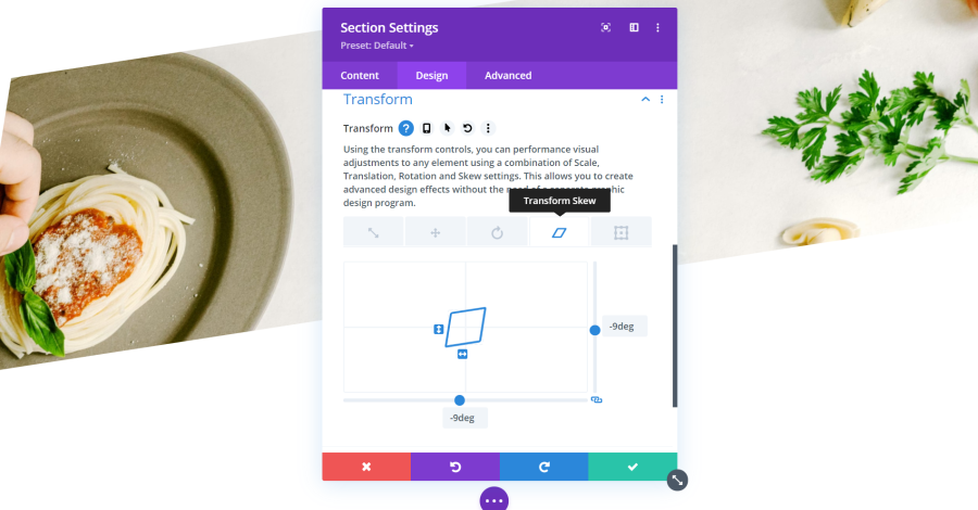
Adjusts the skew of the angle with Transform Skew.
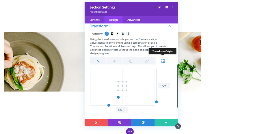
Transform Origin sets a starting point. I’ve also added Transform Scale so the starting point is easier to see.
Section Settings Animation
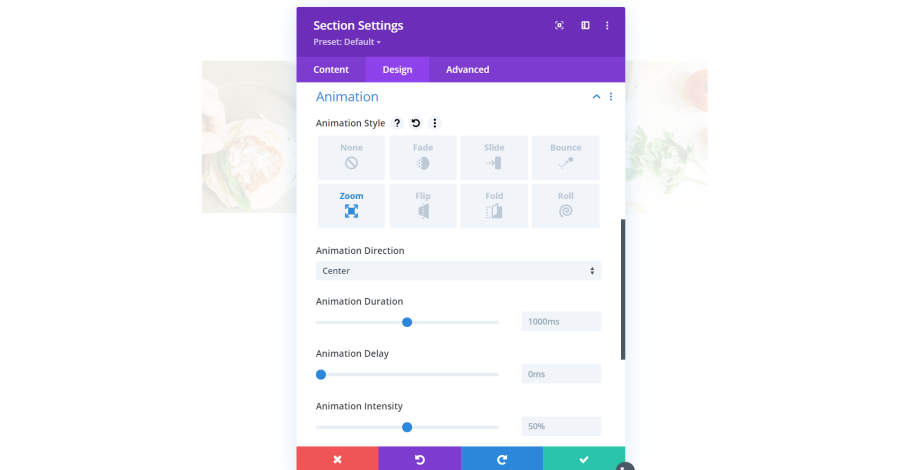
Animation sets how the elements come onto the screen. Choose from 7 animations, set the direction, duration, delay, intensity, opacity, speed curve, and how often it repeats. This example shows Zoom. The section takes one second to zoom into place.
Design Settings for Rows and Columns
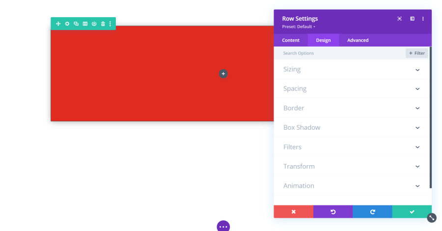
Row design settings include sizing, spacing, border, box shadow, filters, transform, and animation. I’ve added a background color to make the row stand out and adjusting the spacing, gave it a border, and added a box shadow. Most are like those we’ve already seen, but we’ll look at one that’s different.
Row Settings Sizing
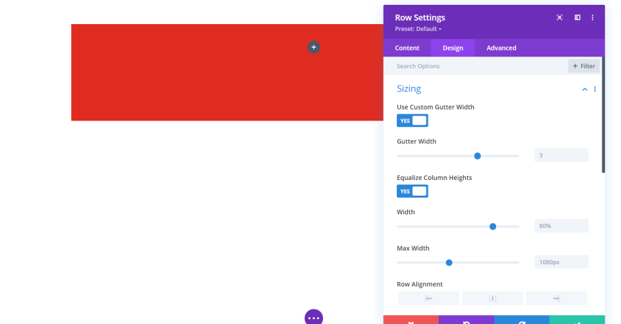
Sizing adds adjustments for a custom gutter width, height equalization, width, alignment, and height. Equalizing the heights makes each column in the row have the same height.
Column Settings
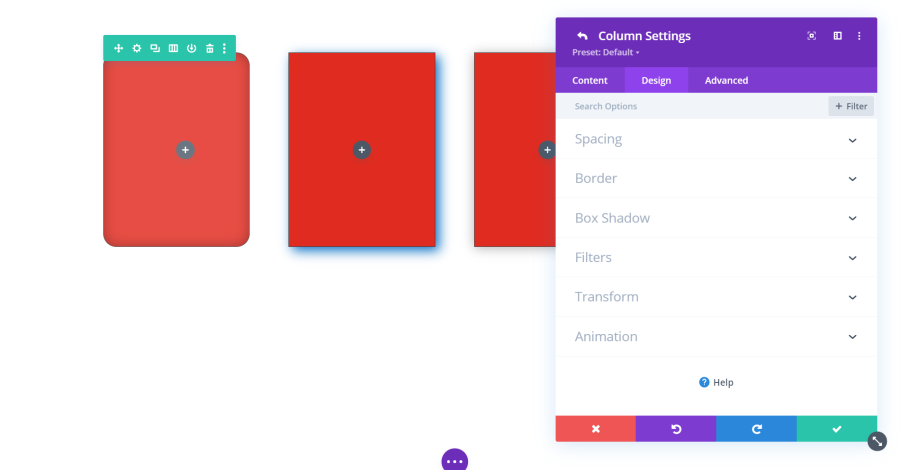
Columns also include design settings. The only one that’s not included is sizing. I’ve adjusted the box shadows and borders separately in this example. I’ve also adjusted the filters for the left column.
Design Settings for Modules
Many of the modules include specialized settings, but most have some settings in common. Here’s a look at the design settings for a blog module, which is one of the most popular modules and includes the most common settings.
Blog Module Design Settings
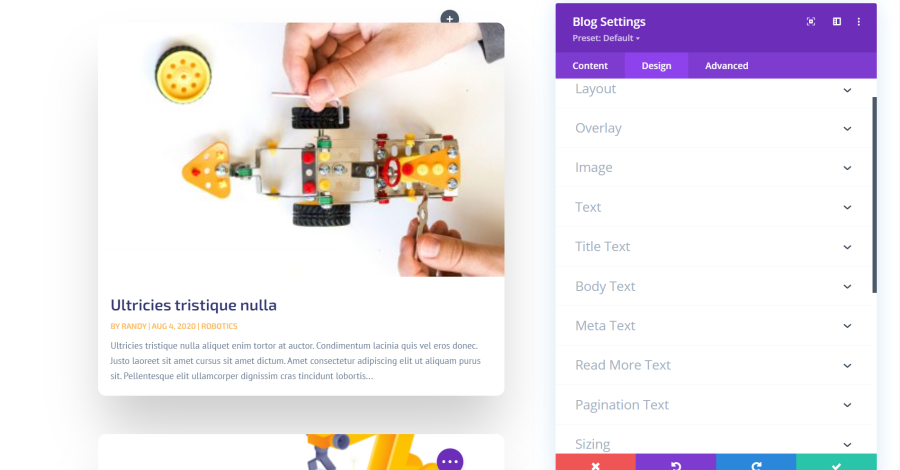
The blog modules include settings for the layout, overlay, image, text, title text, body text, meta text, read more text, pagination text, sizing, spacing, border, box shadow, filters, transform, and animation.
Blog Module Settings Layout
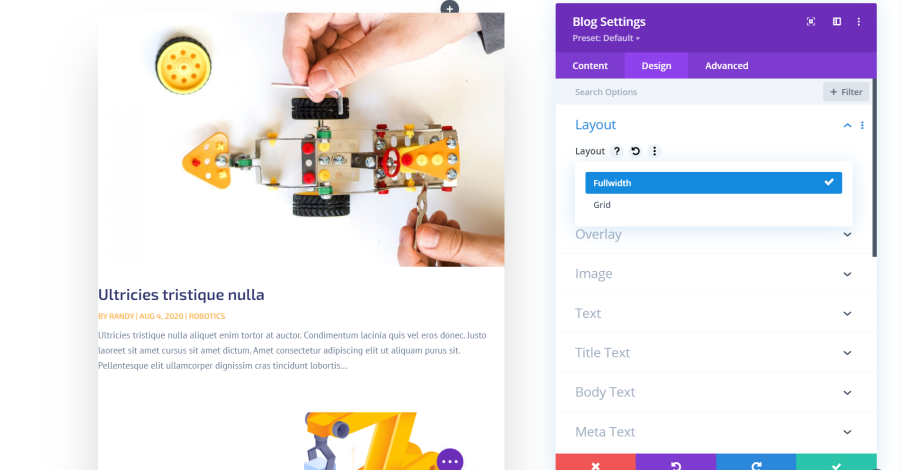
Layout includes fullwidth and grid. Fullwidth connects them while Grid creates cards.
Blog Module Settings Overlay
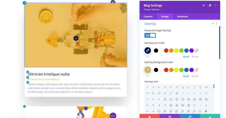
Overlay lets you place an overlay over the featured image. Adjust the icon color, overlay background color, and select an icon.
Blog Module Settings Image
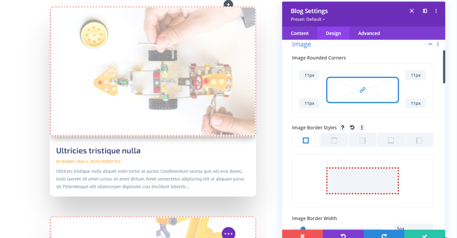
Image settings include rounded corners, border style, box shadow, image settings, etc. In this example, I’ve rounded the corners, added a dotted border, changed the border width and color, added a box shadow, and adjusted the image opacity.
Blog Module Settings Text
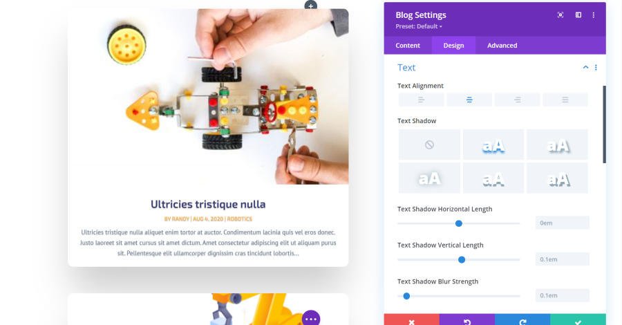
Text includes alignment, shadow with 5 options, shadow horizontal length, vertical length, blur strength, and shadow color. In this example, I’ve set the text alignment to center, selected the first text shadow, and adjusted the blur strength.
Blog Module Settings Title Text
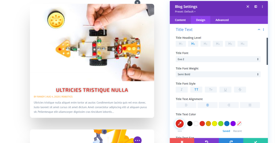
Title text includes the heading level, font, font weight, style, alignment, color, size, spacing, line height, and shadow settings. I’ve selected all-caps, center alignment, changed the color, increased the size and line spacing, and added a shadow.
Blog Module Settings Body Text

The Body Text settings include tabs for the text, links, lists, and quotes. Each has its own settings including some that are specific to their type of text. Choose the font, weight, style, alignment, color, size, spacing, line height, shadow, etc. I’ve made the text italic and changed the color and size.
Blog Module Settings Meta Text
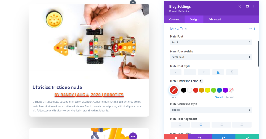
Meta Text includes the font, font weight, style, underline color, underline style, alignment, text color, size, spacing, height, and shadow settings. I’ve adjusted the font size and color, selected underline, changed the underline color and chose a different style, changed the text alignment, added a shadow, and increased the letter spacing and line height.
Blog Module Settings Read More Text
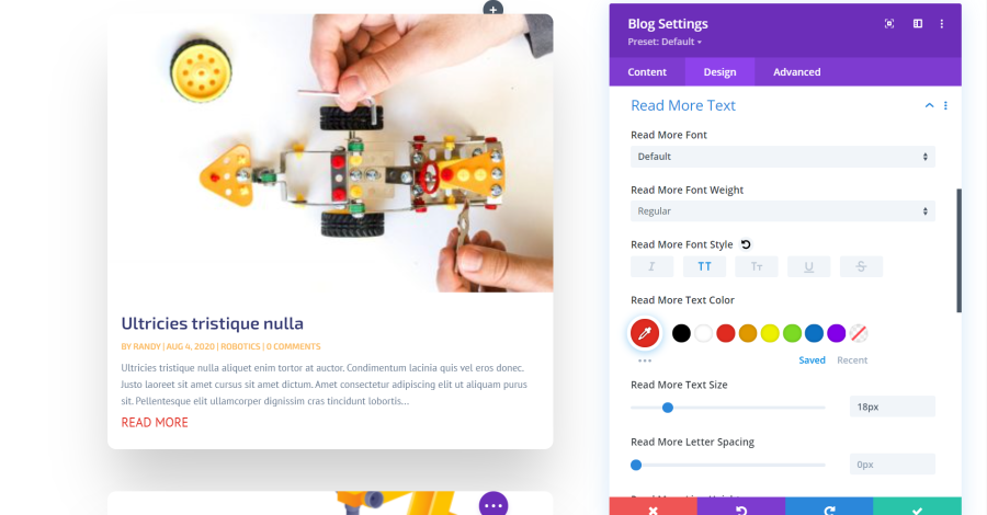
Read More Text includes settings for the font, weight, style, color, size, spacing, line height, and shadow. I’ve set it to all caps and adjusted the font size, color, and line height in this example.
Blog Module Settings Pagination Text
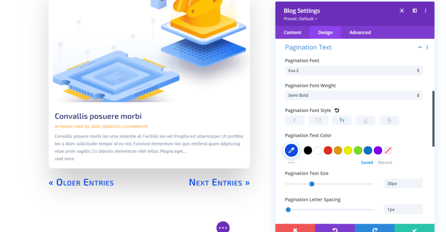
Pagination Text includes font, weight, style, color, size, spacing, height, and shadow settings. I’ve adjusted the style, size, and spacing in this example.
Ending Thoughts
That’s our quick look at Divi design settings. These settings give you a lot of control over the look of your website. The adjustments are not difficult, and they’re standardized throughout the Divi Builder. Just a few adjustments can make your website stand out from the crowd.
For more information about Divi settings, see our previous article: Getting Started with Divi: Content Settings.
We want to hear from you. What are your favorite Divi design settings? Let us know in the comments.


0 Comments